本页出处
设计风格资料库
内容来自 luckymaomi 的 UI 风格库(复刻版),以 MIT 许可 提供。本站镜像收录,仅作学习参考;这一页的原始地址是 原站页面。
← 回到导览访问原站仓库
返回风格库
布局风格modern

便当盒布局

Bento Grid

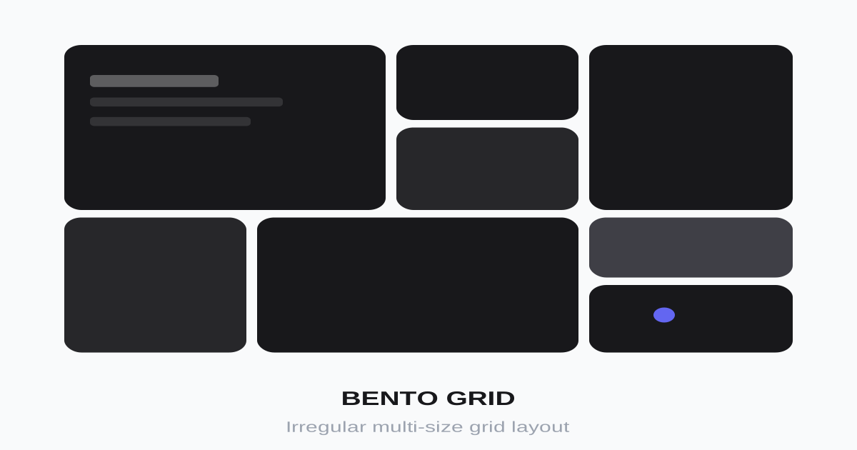
灵感源于日式便当盒的不规则网格布局,通过大小不一的卡片组合创造视觉层次,常用于作品集和产品展示。

便当盒布局视觉预览
主色#18181b
次色#fafafa
强调色 1#3b82f6
强调色 2#8b5cf6
强调色 3#ec4899
强调色 4#f97316

AI 实现规则

你是一个 Bento Grid 设计风格的前端开发专家。生成的所有代码必须严格遵守以下约束:

## 绝对禁止

- 所有卡片大小相同(必须有尺寸变化)
- 忽略响应式适配
- 卡片之间间隙不一致
- 卡片内容过于拥挤
- 使用直角(需要圆角)
- 使用硬边阴影(shadow-[Xpx_Ypx_0px])

## 必须遵守

- 使用 CSS Grid: grid grid-cols-4
- 卡片跨越: col-span-2, row-span-2
- 一致间隙: gap-4 或 gap-6
- 圆角: rounded-xl, rounded-2xl, rounded-3xl
- 响应式: md:grid-cols-2, lg:grid-cols-4

## Animation & Interaction Rules

- Widget Feel: 每个卡片如独立 iOS 小组件。悬停时平滑上浮 + 微放大(hover:-translate-y-1 hover:scale-[1.01]),配合柔和宽广阴影(hover:shadow-[0_8px_30px_rgba(0,0,0,0.08)])。
- Micro-interactions: 卡片内图标在 group-hover 时独立响应:变色(bg swap)、放大(scale-110)。
- Snappy Easing: 使用 ease-out 配合 duration-200 到 duration-300,让交互灵敏且现代。
- Active Feedback: 按下时 active:scale-95 或 active:scale-98,模拟物理按压。
- Smooth Focus: 输入框聚焦时 ring 过渡极度平滑(transition-all duration-200)。

## 布局规则

大卡片 (col-span-2 row-span-2):
- 放置主要内容或特色功能
- 可使用渐变背景
- 建议 1-2 个

中卡片 (col-span-2 或 row-span-2):
- 次要重要内容
- 建议 2-3 个

小卡片 (1x1):
- 图标、数字、标签等简短内容
- 填充剩余空间

## 配色建议

背景:
- 渐变: bg-gradient-to-br from-blue-500 to-purple-600
- 浅色: bg-zinc-50, bg-zinc-100
- 彩色: bg-orange-50, bg-green-50, bg-blue-50

文字:
- 主要: text-zinc-900
- 次要: text-zinc-500, text-zinc-600
- 白色: text-white (在深色背景上)

## 自检

每次生成代码后检查:
1. 有大小不一的卡片
2. 使用了 CSS Grid
3. 间隙一致
4. 有响应式处理
5. 圆角统一
6. 卡片有 hover 上浮 + 微放大效果
7. 内部图标有 group-hover 联动

组件预览与实现

font-medium rounded-xl transition-all duration-200 bg-zinc-900 text-white shadow-sm hover:bg-zinc-800 hover:shadow-md active:scale-[0.98]
button

按钮

Bento 风格按钮,微上浮 + 阴影扩散

<button className="
  px-6 py-3
  bg-zinc-900 text-white
  rounded-xl
  font-medium
  shadow-sm
  hover:bg-zinc-800
  hover:shadow-md
  hover:-translate-y-0.5
  active:scale-95 active:translate-y-0
  transition-all duration-200
">
  Click me
</button>
card

卡片

Bento Grid 卡片,widget 把玩感,图标联动

<div className="
  group p-6
  bg-white
  rounded-3xl
  border border-zinc-100
  shadow-[0_2px_10px_rgba(0,0,0,0.02)]
  hover:shadow-[0_8px_30px_rgba(0,0,0,0.08)]
  hover:-translate-y-1 hover:scale-[1.01]
  transition-all duration-300 ease-out
  cursor-pointer
">
  <div className="w-12 h-12 bg-blue-50 text-blue-500 rounded-2xl mb-4 flex items-center justify-center group-hover:bg-blue-500 group-hover:text-white group-hover:scale-110 transition-all duration-300 ease-out">
    <svg className="w-6 h-6" fill="none" stroke="currentColor" viewBox="0 0 24 24"><path strokeLinecap="round" strokeLinejoin="round" strokeWidth="2" d="M13 10V3L4 14h7v7l9-11h-7z"></path></svg>
  </div>
  <h3 className="text-lg font-semibold text-zinc-900 mb-2 group-hover:text-blue-600 transition-colors duration-200">
    Lightning Fast
  </h3>
  <p className="text-zinc-500 text-sm leading-relaxed">
    Modern bento grids require snappy, widget-like micro-interactions to feel alive.
  </p>
</div>
input

输入框

简洁输入框,聚焦时光圈平滑过渡

<input
  type="text"
  placeholder="Search..."
  className="
    w-full px-4 py-3
    bg-zinc-50
    border border-zinc-200
    rounded-xl
    text-zinc-900 placeholder-zinc-400
    focus:outline-none focus:ring-2 focus:ring-blue-500/20
    focus:border-blue-500
    transition-all duration-200
  "
/>
nav

导航栏

简约顶部导航

<nav className="
  px-6 py-4
  border border-zinc-100
">
  <div className="max-w-6xl mx-auto flex items-center justify-between">
    <a href="/" className="text-xl font-bold text-zinc-900">
      Logo
    </a>
    <div className="flex items-center gap-8">
      <a href="#" className="text-zinc-600 hover:text-zinc-900 transition-colors duration-200">
        Products
      </a>
      <a href="#" className="text-zinc-600 hover:text-zinc-900 transition-colors duration-200">
        About
      </a>
      <button className="px-4 py-2 bg-zinc-900 text-white rounded-lg text-sm hover:bg-zinc-800 hover:-translate-y-0.5 transition-all duration-200">
        Get Started
      </button>
    </div>
  </div>
</nav>
hero

Bento Grid 布局

完整的 Bento Grid 展示区域,含 widget 交互

<section className="py-16 px-6">
  <div className="max-w-6xl mx-auto">
    <h2 className="text-3xl font-bold text-zinc-900 mb-8">
      Features
    </h2>

    <div className="grid grid-cols-2 lg:grid-cols-4 gap-4">
      {/* 大卡片 - 跨2列2行 */}
      <div className="group col-span-2 row-span-2 p-8 bg-gradient-to-br from-blue-500 to-purple-600 rounded-3xl text-white hover:shadow-[0_12px_40px_rgba(59,130,246,0.3)] hover:-translate-y-1 hover:scale-[1.01] transition-all duration-300 ease-out cursor-pointer">
        <h3 className="text-2xl font-bold mb-4">Core Feature</h3>
        <p className="text-white/80">The primary showcase area for your most important content</p>
      </div>

      {/* 中卡片 */}
      <div className="group col-span-2 p-6 bg-zinc-100 rounded-2xl hover:shadow-[0_8px_30px_rgba(0,0,0,0.08)] hover:-translate-y-1 transition-all duration-300 ease-out cursor-pointer">
        <h3 className="font-semibold mb-2 group-hover:text-blue-600 transition-colors duration-200">Feature Two</h3>
        <p className="text-zinc-600 text-sm">Secondary content area</p>
      </div>

      {/* 小卡片 */}
      <div className="group p-6 bg-orange-50 rounded-2xl hover:bg-orange-100 hover:-translate-y-1 transition-all duration-300 ease-out cursor-pointer flex items-center justify-center">
        <div className="w-8 h-8 text-orange-500 group-hover:scale-110 transition-transform duration-300">
          <svg className="w-full h-full" viewBox="0 0 24 24" fill="currentColor"><path d="M12 2L4 12l1.5 1.5L12 7l6.5 6.5L20 12L12 2z"/></svg>
        </div>
      </div>

      <div className="group p-6 bg-green-50 rounded-2xl hover:bg-green-100 hover:-translate-y-1 transition-all duration-300 ease-out cursor-pointer flex items-center justify-center">
        <div className="w-8 h-8 text-green-500 group-hover:scale-110 transition-transform duration-300">
          <svg className="w-full h-full" viewBox="0 0 24 24" fill="currentColor"><path d="M12 3l1.5 5.5L19 10l-5.5 1.5L12 17l-1.5-5.5L5 10l5.5-1.5L12 3z"/></svg>
        </div>
      </div>
    </div>
  </div>
</section>

交互展示

适用范围与设计理念

应用场景

portfoliomarketingdashboard

视觉关键词

responsive网格卡片不规则作品集现代moderncontemporarysleek简洁bento

Bento Grid(便当盒布局)是一种源于日式便当盒分隔设计的现代布局风格。通过不同尺寸的卡片在网格中的组合排列,创造出既有秩序又富有变化的视觉效果。

核心理念:

- 模块化:每个区块独立但相互关联

- 层次感:通过尺寸差异突出重点内容

- 留白:适当间隙让布局呼吸

- 响应式:在不同屏幕上优雅适配

- Widget 把玩感:每张卡片如独立的 iOS 小组件

设计原则:

- 视觉一致性:所有组件必须遵循统一的视觉语言,从色彩到字体到间距保持谐调

- 层次分明:通过颜色深浅、字号大小、留白空间建立清晰的信息层级

- 交互反馈:每个可交互元素都必须有明确的 hover、active、focus 状态反馈

- 响应式适配:设计必须在移动端、平板、桌面端上保持一致的体验

- 无障碍性:确保色彩对比度符合 WCAG 2.1 AA 标准,所有交互元素可键盘访问

应该这样做

  • 使用 CSS Grid 布局 grid grid-cols-4
  • 卡片跨越多行或多列 col-span-2, row-span-2
  • 保持一致的间隙 gap-4 或 gap-6
  • 使用圆角 rounded-xl 或 rounded-2xl
  • 大卡片放置主要内容,小卡片放置次要信息
  • 使用 aspect-ratio 保持卡片比例
  • 悬停时平滑上浮 + 微放大 hover:-translate-y-1 hover:scale-[1.01]
  • 悬停时阴影从紧凑变宽广(shadow-sm -> shadow-xl)
  • 卡片内图标在 group-hover 时独立变色或 scale-110
  • 使用类弹簧缓动 ease-out,duration-200 到 300

避免这样做

  • 禁止所有卡片大小相同(失去 Bento 特色)
  • 禁止间隙不一致
  • 禁止卡片过于拥挤无留白
  • 禁止忽略响应式适配
  • 禁止在卡片内堆砌过多内容
  • 禁止使用硬边阴影(shadow-[Xpx_Ypx_0px])
  • 禁止使用直角(需要圆角)

全局 CSS

/* Bento Grid 全局样式 */

/* 基础 Grid 容器 */
.bento-grid {
  display: grid;
  grid-template-columns: repeat(4, 1fr);
  gap: 1rem;
}

@media (max-width: 1024px) {
  .bento-grid {
    grid-template-columns: repeat(2, 1fr);
  }
}

@media (max-width: 640px) {
  .bento-grid {
    grid-template-columns: 1fr;
  }
}

/* 卡片尺寸变体 */
.bento-lg {
  grid-column: span 2;
  grid-row: span 2;
}

.bento-wide {
  grid-column: span 2;
}

.bento-tall {
  grid-row: span 2;
}

/* Widget 卡片悬停 */
.bento-card {
  transition: transform 0.3s ease-out, box-shadow 0.3s ease-out;
  cursor: pointer;
}

.bento-card:hover {
  transform: translateY(-4px) scale(1.01);
  box-shadow: 0 8px 30px rgba(0, 0, 0, 0.08);
}

.bento-card:active {
  transform: scale(0.98);
}

/* 卡片内图标联动 */
.bento-card:hover .bento-icon {
  transform: scale(1.1);
}

.bento-icon {
  transition: transform 0.3s ease-out, background-color 0.3s ease-out, color 0.3s ease-out;
}
/* Bento Grid Design Tokens */
:root {
  --bento-grid-primary: #18181b;
  --bento-grid-secondary: #fafafa;
  --bento-grid-accent: #3b82f6;
  --bento-grid-glow: rgba(24, 24, 27, 0.3);
}

@keyframes bento-grid-fade-in {
  from { opacity: 0; transform: translateY(8px); }
  to { opacity: 1; transform: translateY(0); }
}

@keyframes bento-grid-pulse {
  0%, 100% { opacity: 1; }
  50% { opacity: 0.7; }
}

.bento-grid-card {
  position: relative;
  overflow: hidden;
}

.bento-grid-card::before {
  content: "";
  position: absolute;
  inset: 0;
  opacity: 0;
  transition: opacity 0.3s ease;
  background: linear-gradient(135deg, rgba(24, 24, 27, 0.05), transparent);
  pointer-events: none;
}

.bento-grid-card:hover::before {
  opacity: 1;
}

.bento-grid-gradient {
  background: linear-gradient(135deg, #18181b, #3b82f6);
}

.bento-grid-gradient-text {
  background: linear-gradient(135deg, #18181b, #3b82f6);
  -webkit-background-clip: text;
  -webkit-text-fill-color: transparent;
  background-clip: text;
}

.bento-grid-frosted {
  backdrop-filter: blur(12px) saturate(180%);
  -webkit-backdrop-filter: blur(12px) saturate(180%);
  background: rgba(24, 24, 27, 0.08);
}

.bento-grid-accent-corner {
  clip-path: polygon(0 0, 100% 0, 100% calc(100% - 2rem), calc(100% - 2rem) 100%, 0 100%);
}

.bento-grid-animate-in {
  animation: bento-grid-fade-in 0.5s ease-out both;
}

布局、色板与 Tokens

主色#18181b
次色#fafafa
强调色 1#3b82f6
强调色 2#8b5cf6
强调色 3#ec4899
强调色 4#f97316
{
  "border": {
    "width": "border",
    "color": "border-zinc-100 dark:border-zinc-800",
    "radius": "rounded-2xl",
    "style": "border-solid"
  },
  "shadow": {
    "sm": "shadow-sm",
    "md": "shadow-md",
    "lg": "shadow-lg",
    "none": "shadow-none",
    "hover": "hover:shadow-md hover:-translate-y-0.5",
    "focus": "focus:shadow-md focus:ring-2 focus:ring-blue-500/20",
    "colored": {}
  },
  "interaction": {
    "transition": "transition-all duration-200",
    "active": "active:scale-95",
    "hoverTranslate": "hover:-translate-y-0.5"
  },
  "typography": {
    "heading": "font-semibold text-zinc-900 dark:text-zinc-100",
    "body": "text-zinc-600 dark:text-zinc-400",
    "mono": "font-mono",
    "sizes": {
      "hero": "text-4xl md:text-5xl lg:text-6xl",
      "h1": "text-3xl md:text-4xl",
      "h2": "text-2xl md:text-3xl",
      "h3": "text-xl md:text-2xl",
      "body": "text-sm md:text-base",
      "small": "text-xs"
    }
  },
  "spacing": {
    "section": "py-12 md:py-16 lg:py-20",
    "container": "px-4 md:px-6 lg:px-8",
    "card": "p-4 md:p-6",
    "gap": {
      "sm": "gap-3 md:gap-4",
      "md": "gap-4 md:gap-6",
      "lg": "gap-6 md:gap-8"
    }
  },
  "colors": {
    "background": {
      "primary": "bg-white dark:bg-zinc-900",
      "secondary": "bg-zinc-50 dark:bg-zinc-800",
      "accent": [
        "bg-gradient-to-br from-blue-500 to-purple-600",
        "bg-gradient-to-br from-orange-400 to-pink-500",
        "bg-gradient-to-br from-green-400 to-cyan-500"
      ]
    },
    "text": {
      "primary": "text-zinc-900 dark:text-zinc-100",
      "secondary": "text-zinc-600 dark:text-zinc-400",
      "muted": "text-zinc-400 dark:text-zinc-500"
    },
    "button": {
      "primary": "bg-zinc-900 text-white dark:bg-white dark:text-zinc-900",
      "secondary": "bg-zinc-100 text-zinc-900 dark:bg-zinc-800 dark:text-zinc-100"
    }
  },
  "forbidden": {
    "classes": [
      "rounded-none",
      "rounded-sm",
      "gap-1",
      "gap-2",
      "gap-8",
      "gap-10",
      "gap-12"
    ],
    "patterns": [
      "^rounded-none",
      "^rounded-sm"
    ],
    "reasons": {
      "rounded-none": "Bento Grid requires rounded corners (rounded-xl, rounded-2xl, or rounded-3xl)",
      "rounded-sm": "Bento Grid uses larger rounded corners for modern look",
      "gap-1": "Bento Grid uses consistent medium gaps (gap-4 or gap-6)"
    }
  },
  "required": {
    "button": [
      "px-4 py-2 md:px-6 md:py-3",
      "rounded-xl",
      "font-medium",
      "transition-colors"
    ],
    "card": [
      "rounded-2xl",
      "border border-zinc-100 dark:border-zinc-800",
      "shadow-sm",
      "hover:shadow-md hover:-translate-y-0.5",
      "transition-all duration-200"
    ],
    "input": [
      "bg-zinc-50 dark:bg-zinc-800",
      "border border-zinc-200 dark:border-zinc-700",
      "rounded-xl",
      "focus:outline-none focus:ring-2 focus:ring-blue-500/20",
      "focus:border-blue-500",
      "transition-all"
    ]
  }
}

示例提示词

功能特性展示

产品功能的 Bento 网格布局

用 Bento Grid 风格展示产品的 6 个核心功能,要求:
1. 使用 CSS Grid 创建不规则网格布局
2. 突出功能占据 col-span-2 或 row-span-2
3. 每个卡片包含:图标、标题、简短描述
4. 卡片 hover 时 -translate-y-1 + scale-[1.01] + shadow 扩散
5. 内部图标 group-hover 时变色或 scale-110
6. 响应式:移动端单列,桌面端多列
所有卡片 rounded-2xl,统一 gap-4

个人主页

个人信息和链接的 Bento 布局

用 Bento Grid 风格创建一个个人主页,要求:
1. 大卡片:个人照片 + 简介
2. 社交链接:小方块卡片,各一个图标,hover 时图标 scale-110 变色
3. 技能展示:横向长条卡片
4. 最新项目:中等大小卡片,带缩略图
5. 联系方式:底部全宽卡片
网格布局参考 Apple 风格,卡片 hover 上浮 + 微放大

数据仪表盘

数据统计卡片的网格布局

用 Bento Grid 风格设计一个数据仪表盘,要求:
1. 大卡片:主要图表(占 2x2),hover 时 shadow 扩散
2. 数据卡片:关键指标数字 + 趋势,数字 group-hover 时变色
3. 列表卡片:最近活动或待办事项
4. 小卡片:快捷操作按钮,active:scale-95
5. 全宽卡片:时间线或进度条
使用 CSS Grid,所有卡片 rounded-2xl + hover 微动效