本页出处
设计风格资料库
内容来自 luckymaomi 的 UI 风格库(复刻版),以 MIT 许可 提供。本站镜像收录,仅作学习参考;这一页的原始地址是 原站页面。
← 回到导览访问原站仓库
返回风格库
视觉风格minimal

企业简洁风

Corporate Clean

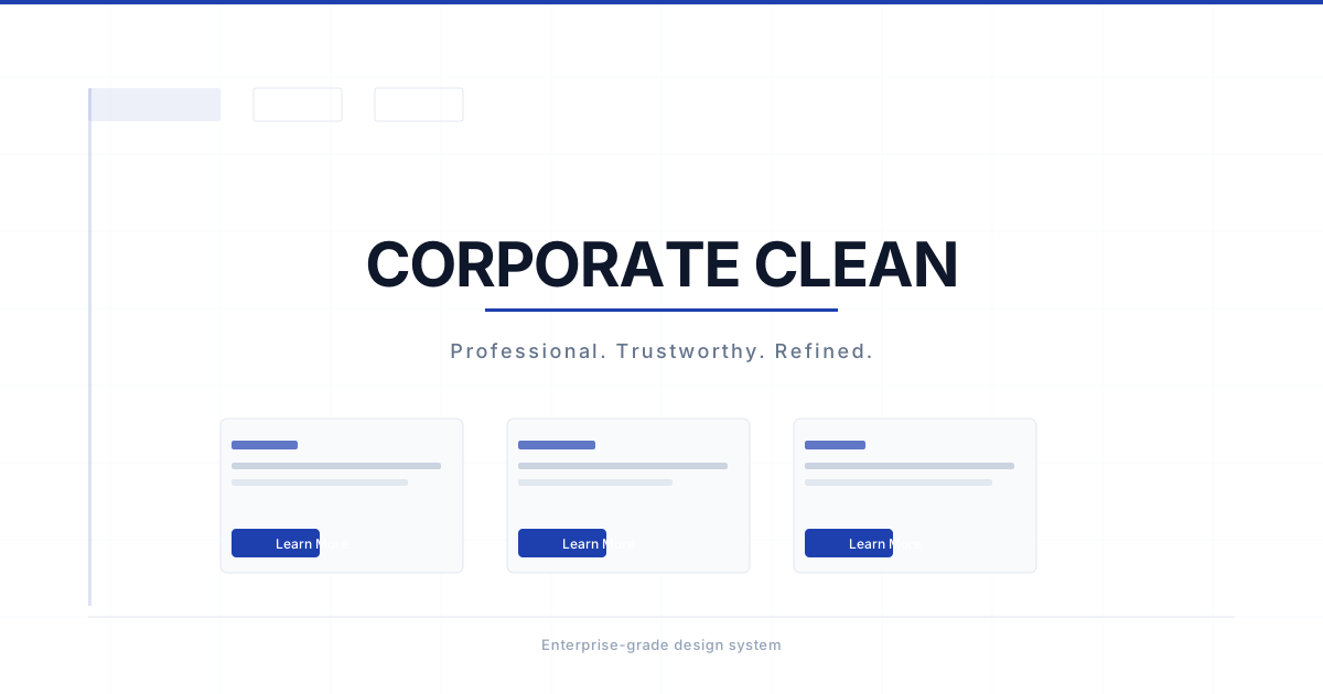
专业简洁的企业风格,强调可读性、一致性和信任感。适合B2B SaaS、企业官网、后台管理系统。

企业简洁风视觉预览
主色#1e40af
次色#f8fafc
强调色 1#3b82f6
强调色 2#64748b
强调色 3#10b981
强调色 4#c559f0

AI 实现规则

You are a Corporate Clean style frontend development expert. All generated code must follow modern enterprise UI standards.

## Absolutely Forbidden

- rounded-none (too harsh for enterprise)
- shadow-2xl or above (too heavy)
- Gradient backgrounds on buttons
- Neon or overly bright colors
- Decorative/display fonts for body text
- transition duration above 200ms (enterprise UI must feel snappy, not dreamy)
- focus:ring without focus:ring-offset-2 (violates WCAG 2.1 AA contrast requirements for focus indicators)
- Buttons without active:scale-[0.98] (no tactile confirmation = button feels like decoration)

## Must Follow

- rounded-lg or rounded-xl for all components
- shadow-sm for cards and buttons at rest
- Blue color palette (blue-600/700) for primary actions
- Gray palette (gray-50/100/200/300) for backgrounds and borders
- font-medium or font-semibold for interactive elements
- focus:ring-2 focus:ring-blue-500 focus:ring-offset-2 for ALL focusable elements

## Animation & Interaction Rules

- Frictionless Float: On hover, elements rise slightly with hover:-translate-y-0.5 combined with shadow micro-upgrade (shadow-sm → shadow). This creates a "hover above the surface" sensation — professional and responsive.
- Tactile Confirmation: On :active, ALL buttons must use active:scale-[0.98] combined with active:translate-y-0 and active:shadow-sm to create a "button pressed" sensation. Without this, buttons feel unresponsive. The scale-[0.98] is barely perceptible (2%) but critical.
- Focus Ring Offset: Always use focus:ring-offset-2 alongside focus:ring-2. The offset separates the ring from the element border, meeting WCAG 2.1 AA contrast for focus indicators. Never use focus:ring alone.
- Icon Micro-interaction: Icon containers use group class. On hover: bg transitions to brand color (hover:bg-blue-500), icon color transitions to white (group-hover:text-white), and container scales up (hover:scale-110). Use transition-all duration-200 ease-out.
- Snappy Easing: Use duration-150 ease-out for buttons and interactive controls. Use duration-200 ease-out for cards and larger containers. Never go above 200ms.

## Color Palette

- Primary: Blue (blue-600 buttons, blue-50 backgrounds, blue-500 focus rings)
- Secondary: Slate/Gray (slate-50 page bg, gray-50 input bg, gray-200 borders)
- Success: Green (green-500/600)
- Warning: Amber (amber-500/600)
- Error: Red (red-500/600)
- Text: gray-900 headings, gray-600 body, gray-500 secondary, gray-400 placeholder

## Spacing

- Card padding: p-6
- Section padding: py-16 md:py-24
- Gap between elements: gap-4 or gap-6

## Self-Check

After generating code, verify:
1. All buttons have active:scale-[0.98] active:translate-y-0
2. All focusable elements have focus:ring-2 focus:ring-{color}-500 focus:ring-offset-2
3. Cards have hover:-translate-y-0.5 hover:shadow-md
4. Icon containers use group + hover:bg-{color}-500 + group-hover:text-white
5. No duration above 200ms
6. No rounded-none anywhere

组件预览与实现

font-medium rounded-lg shadow-sm transition-all duration-200 bg-blue-600 text-white hover:bg-blue-700 hover:shadow-md active:scale-[0.98]
button

按钮

企业级按钮三态:hover 轻微上浮 + 阴影微升,active:scale-[0.98] 触觉按压确认,focus:ring-offset-2 WCAG 合规焦点环

{/* Primary Button */}
<button className="
  px-4 py-2
  bg-blue-600 text-white
  rounded-lg shadow-sm font-medium
  hover:bg-blue-700 hover:-translate-y-0.5 hover:shadow
  focus:outline-none focus:ring-2 focus:ring-blue-500 focus:ring-offset-2
  active:scale-[0.98] active:translate-y-0 active:shadow-sm
  transition-all duration-150 ease-out
">
  Get Started
</button>

{/* Secondary Button */}
<button className="
  px-4 py-2
  bg-white text-gray-700
  border border-gray-300 rounded-lg shadow-sm font-medium
  hover:bg-gray-50 hover:-translate-y-0.5 hover:shadow
  focus:outline-none focus:ring-2 focus:ring-gray-300 focus:ring-offset-2
  active:scale-[0.98] active:translate-y-0 active:shadow-sm
  transition-all duration-150 ease-out
">
  Learn More
</button>

{/* Ghost Button */}
<button className="
  px-4 py-2
  text-blue-600
  rounded-lg font-medium
  hover:bg-blue-50 hover:-translate-y-0.5
  focus:outline-none focus:ring-2 focus:ring-blue-500 focus:ring-offset-2
  active:scale-[0.98] active:translate-y-0 active:bg-blue-100
  transition-all duration-150 ease-out
">
  Cancel
</button>
card

卡片

企业卡片:hover 时轻微上浮 + 阴影微升;图标容器 hover 时蓝色填充 + scale-110 微交互

<div className="
  bg-white rounded-xl shadow-sm border border-gray-200 p-6
  hover:shadow-md hover:-translate-y-0.5
  transition-all duration-200 ease-out
">
  <div className="flex items-center gap-3 mb-4">
    {/* Icon container — hover triggers color fill + scale */}
    <div className="
      group w-10 h-10
      bg-blue-50 rounded-lg
      flex items-center justify-center
      hover:bg-blue-500 hover:scale-110
      transition-all duration-200 ease-out
      cursor-default
    ">
      <svg className="w-5 h-5 text-blue-600 group-hover:text-white transition-colors duration-200" fill="none" stroke="currentColor" viewBox="0 0 24 24">
        <path strokeLinecap="round" strokeLinejoin="round" strokeWidth={1.5} d="M13 10V3L4 14h7v7l9-11h-7z" />
      </svg>
    </div>
    <h3 className="text-lg font-semibold text-gray-900">Feature Title</h3>
  </div>
  <p className="text-gray-600 leading-relaxed text-sm">
    Description of the feature with clear, professional language.
  </p>
  <button className="
    mt-4 px-3 py-1.5
    bg-blue-600 text-white text-sm
    rounded-lg shadow-sm font-medium
    hover:bg-blue-700 hover:-translate-y-0.5 hover:shadow
    focus:outline-none focus:ring-2 focus:ring-blue-500 focus:ring-offset-2
    active:scale-[0.98] active:translate-y-0 active:shadow-sm
    transition-all duration-150 ease-out
  ">
    Learn More
  </button>
</div>
input

输入框

企业风格输入框:聚焦时蓝色焦点环 + ring-offset,无 outline

<div className="space-y-1.5">
  <label className="block text-sm font-medium text-gray-700">Email Address</label>
  <input
    type="email"
    className="
      w-full px-3 py-2
      bg-white border border-gray-300
      rounded-lg text-gray-900
      placeholder:text-gray-400
      focus:outline-none focus:ring-2 focus:ring-blue-500 focus:ring-offset-2 focus:border-blue-500
      transition-all duration-150 ease-out
    "
    placeholder="you@company.com"
  />
  <p className="text-xs text-gray-500">We'll never share your email.</p>
</div>
nav

导航栏

企业风格顶部导航,链接 hover 轻微上移,CTA 按钮带触觉反馈

<nav className="bg-white border border-gray-200 px-6 py-3">
  <div className="max-w-6xl mx-auto flex items-center justify-between">
    <span className="text-lg font-semibold text-gray-900">Acme Corp</span>
    <div className="flex items-center gap-6">
      <a href="#" className="text-sm font-medium text-gray-600 hover:text-gray-900 hover:-translate-y-0.5 transition-all duration-150">Product</a>
      <a href="#" className="text-sm font-medium text-gray-600 hover:text-gray-900 hover:-translate-y-0.5 transition-all duration-150">Pricing</a>
      <a href="#" className="text-sm font-medium text-gray-600 hover:text-gray-900 hover:-translate-y-0.5 transition-all duration-150">Docs</a>
    </div>
    <button className="
      px-4 py-2
      bg-blue-600 text-white text-sm
      rounded-lg shadow-sm font-medium
      hover:bg-blue-700 hover:-translate-y-0.5 hover:shadow
      focus:outline-none focus:ring-2 focus:ring-blue-500 focus:ring-offset-2
      active:scale-[0.98] active:translate-y-0
      transition-all duration-150 ease-out
    ">
      Sign in
    </button>
  </div>
</nav>
hero

Hero 区块

企业 SaaS Hero:badge 徽章 + 大号粗体标题 + 双按钮 CTA

<section className="bg-slate-50 py-20 px-4">
  <div className="max-w-5xl mx-auto text-center">
    {/* Badge */}
    <div className="inline-flex items-center gap-2 px-3 py-1 bg-blue-50 text-blue-600 rounded-full text-sm font-medium mb-6 border border-blue-100">
      <span className="w-1.5 h-1.5 rounded-full bg-blue-500" />
      Now available
    </div>
    <h1 className="text-4xl md:text-6xl font-bold text-gray-900 tracking-tight mb-6">
      Build better products,<br />
      <span className="text-blue-600">faster.</span>
    </h1>
    <p className="text-lg text-gray-500 max-w-2xl mx-auto mb-10 leading-relaxed">
      The professional toolkit trusted by 10,000+ teams. Clean, reliable, and ready for enterprise.
    </p>
    <div className="flex flex-col sm:flex-row items-center justify-center gap-3">
      <button className="
        px-6 py-3
        bg-blue-600 text-white
        rounded-lg shadow-sm font-medium
        hover:bg-blue-700 hover:-translate-y-0.5 hover:shadow
        focus:outline-none focus:ring-2 focus:ring-blue-500 focus:ring-offset-2
        active:scale-[0.98] active:translate-y-0 active:shadow-sm
        transition-all duration-150 ease-out
      ">
        Get started free
      </button>
      <button className="
        px-6 py-3
        bg-white text-gray-700
        border border-gray-300 rounded-lg shadow-sm font-medium
        hover:bg-gray-50 hover:-translate-y-0.5 hover:shadow
        focus:outline-none focus:ring-2 focus:ring-gray-300 focus:ring-offset-2
        active:scale-[0.98] active:translate-y-0 active:shadow-sm
        transition-all duration-150 ease-out
      ">
        View demo
      </button>
    </div>
  </div>
</section>

交互展示

适用范围与设计理念

应用场景

saasadmindashboard

视觉关键词

企业专业简洁B2BSaaS后台Dashboardminimalcleansimple

Corporate Clean 设计风格源于现代企业软件的设计语言,强调专业性、可信度和高效的信息传达。

核心理念:

- 专业可信:通过一致的视觉语言建立信任

- 信息层次:清晰的标题、正文、辅助信息层级

- 功能优先:设计服务于功能,不牺牲可用性

- 响应迅速:流畅的交互和即时的视觉反馈

设计原则:

- 视觉一致性:所有组件必须遵循统一的视觉语言,从色彩到字体到间距保持谐调

- 层次分明:通过颜色深浅、字号大小、留白空间建立清晰的信息层级

- 交互反馈:每个可交互元素都必须有明确的 hover、active、focus 状态反馈

- 响应式适配:设计必须在移动端、平板、桌面端上保持一致的体验

- 无障碍性:确保色彩对比度符合 WCAG 2.1 AA 标准,所有交互元素可键盘访问

应该这样做

  • 使用 rounded-lg 或 rounded-xl 作为主要圆角
  • 按钮使用 shadow-sm 增加层次感
  • 主色使用蓝色系 (blue-600, blue-700) 传达专业感
  • 背景使用 bg-slate-50 或 bg-gray-50 的浅色调
  • 卡片使用 bg-white shadow-sm border border-gray-200
  • 按钮 hover 时轻微上浮 hover:-translate-y-0.5 + 阴影微升 hover:shadow
  • 按钮 active 时轻微缩小 active:scale-[0.98] 传达"已按下"的触觉确认
  • 焦点状态使用 focus:ring-2 focus:ring-blue-500 focus:ring-offset-2(ring-offset 是 WCAG 合规关键)
  • 卡片 hover 时 hover:-translate-y-0.5 hover:shadow-md 给出悬浮感
  • 图标容器 hover 时 hover:bg-blue-500 hover:scale-110 + 图标色 group-hover:text-white 产生微交互
  • 表格行使用 hover:bg-gray-50 的悬停高亮

避免这样做

  • 禁止使用过于鲜艳的颜色组合
  • 禁止使用 rounded-none 的尖锐边角
  • 禁止使用 shadow-2xl 等过重的阴影
  • 禁止使用渐变按钮(保持扁平设计)
  • 禁止在正文中使用花哨字体
  • 禁止元素间距过于紧凑
  • 禁止使用超过 duration-200 的动画(企业 UI 要利落,不要飘逸)
  • 禁止 focus:ring 缺少 focus:ring-offset-2(ring-offset 让焦点环与元素分离,符合 WCAG)
  • 禁止按钮缺少 active:scale-[0.98](没有按压反馈,按钮像装饰品)

全局 CSS

/* Corporate Clean Global Styles */
@layer base {
  :root {
    --corporate-blue: 37 99 235;
    --corporate-gray: 100 116 139;
  }

  body {
    @apply bg-slate-50 text-gray-900 antialiased;
  }

  h1, h2, h3, h4, h5, h6 {
    @apply font-semibold tracking-tight text-gray-900;
  }
}
@keyframes corporate-clean-fade-in {
  from { opacity: 0; transform: translateY(8px); }
  to { opacity: 1; transform: translateY(0); }
}

@keyframes corporate-clean-pulse {
  0%, 100% { opacity: 1; }
  50% { opacity: 0.7; }
}

.corporate-clean-card {
  position: relative;
  overflow: hidden;
}

.corporate-clean-card::before {
  content: "";
  position: absolute;
  inset: 0;
  opacity: 0;
  transition: opacity 0.3s ease;
  background: linear-gradient(135deg, rgba(30, 64, 175, 0.05), transparent);
  pointer-events: none;
}

.corporate-clean-card:hover::before {
  opacity: 1;
}

.corporate-clean-gradient {
  background: linear-gradient(135deg, #1e40af, #3b82f6);
}

.corporate-clean-gradient-text {
  background: linear-gradient(135deg, #1e40af, #3b82f6);
  -webkit-background-clip: text;
  -webkit-text-fill-color: transparent;
  background-clip: text;
}

.corporate-clean-frosted {
  backdrop-filter: blur(12px) saturate(180%);
  -webkit-backdrop-filter: blur(12px) saturate(180%);
  background: rgba(30, 64, 175, 0.08);
}

.corporate-clean-accent-corner {
  clip-path: polygon(0 0, 100% 0, 100% calc(100% - 2rem), calc(100% - 2rem) 100%, 0 100%);
}

.corporate-clean-animate-in {
  animation: corporate-clean-fade-in 0.5s ease-out both;
}

布局、色板与 Tokens

主色#1e40af
次色#f8fafc
强调色 1#3b82f6
强调色 2#64748b
强调色 3#10b981
强调色 4#c559f0
{
  "border": {
    "width": "border",
    "color": "border-gray-200",
    "radius": "rounded-lg",
    "style": "border-solid"
  },
  "shadow": {
    "sm": "shadow-sm",
    "md": "shadow",
    "lg": "shadow-md",
    "none": "shadow-none",
    "hover": "shadow-md",
    "focus": "ring-2 ring-blue-500",
    "colored": {}
  },
  "interaction": {
    "transition": "transition-all duration-200",
    "active": "active:scale-95",
    "hoverScale": "hover:shadow-md"
  },
  "typography": {
    "heading": "font-semibold tracking-tight",
    "body": "font-normal",
    "mono": "font-mono",
    "sizes": {
      "hero": "text-4xl md:text-5xl lg:text-6xl",
      "h1": "text-3xl md:text-4xl",
      "h2": "text-2xl md:text-3xl",
      "h3": "text-xl md:text-2xl",
      "body": "text-sm md:text-base",
      "small": "text-xs"
    }
  },
  "spacing": {
    "section": "py-12 md:py-16 lg:py-20",
    "container": "px-4 md:px-6 lg:px-8",
    "card": "p-6",
    "gap": {
      "sm": "gap-4",
      "md": "gap-6",
      "lg": "gap-8"
    }
  },
  "colors": {
    "background": {
      "primary": "bg-white",
      "secondary": "bg-slate-50",
      "accent": [
        "bg-blue-600",
        "bg-blue-500"
      ]
    },
    "text": {
      "primary": "text-gray-900",
      "secondary": "text-gray-700",
      "muted": "text-gray-500"
    },
    "button": {
      "primary": "bg-blue-600 text-white hover:bg-blue-700",
      "secondary": "bg-white text-gray-700 border border-gray-300",
      "danger": "bg-red-600 text-white hover:bg-red-700"
    }
  },
  "forbidden": {
    "classes": [
      "rounded-none",
      "shadow-2xl",
      "border-4",
      "bg-gradient-to-r",
      "text-neon"
    ],
    "patterns": [
      "^shadow-2xl",
      "^bg-gradient-",
      "^border-[48]"
    ],
    "reasons": {
      "rounded-none": "Corporate Clean uses rounded corners",
      "shadow-2xl": "Shadows should be subtle (shadow-sm to shadow-md)",
      "bg-gradient-to-r": "Use solid colors for professional look"
    }
  },
  "required": {
    "button": [
      "px-4 py-2",
      "rounded-lg",
      "font-medium",
      "transition-all duration-200"
    ],
    "card": [
      "bg-white",
      "rounded-xl",
      "shadow-sm",
      "border border-gray-200"
    ],
    "input": [
      "px-3 py-2",
      "border border-gray-300",
      "rounded-lg",
      "focus:ring-2 focus:ring-blue-500",
      "focus:border-blue-500"
    ]
  }
}

示例提示词

SaaS Dashboard

生成企业级 SaaS 仪表板

Create a SaaS dashboard using Corporate Clean style:
- Header with logo, search, and user menu
- Sidebar navigation with icons (icon containers: hover:bg-blue-500 hover:scale-110 + group-hover:text-white)
- Main content area with metric cards (hover:-translate-y-0.5 hover:shadow-md)
- Data table with pagination and hover:bg-gray-50 row highlight
- Use blue-600 for all primary actions
- rounded-xl for cards, shadow-sm at rest
- All buttons: hover:-translate-y-0.5, active:scale-[0.98], focus:ring-2 focus:ring-offset-2
- All inputs: focus:ring-2 focus:ring-blue-500 focus:ring-offset-2

企业登录页

专业安全感的企业登录页面

Create an enterprise login page using Corporate Clean style:
1. Centered card on slate-50 background, rounded-xl shadow-sm border border-gray-200
2. Company logo at top
3. Email and password inputs with focus:ring-2 focus:ring-blue-500 focus:ring-offset-2
4. Primary submit button: hover:-translate-y-0.5, active:scale-[0.98], focus:ring-offset-2
5. "Forgot password?" as ghost text link
6. "Sign in with SSO" as secondary button
7. Footer with privacy policy and terms links
8. Clean, no decoration, maximum trust

作品集展示

生成 企业简洁风风格的作品集页面

Create a portfolio showcase page using Corporate Clean style with project grid, about section, contact form, and consistent visual language.