本页出处
设计风格资料库
内容来自 luckymaomi 的 UI 风格库(复刻版),以 MIT 许可 提供。本站镜像收录,仅作学习参考;这一页的原始地址是 原站页面。
← 回到导览访问原站仓库
返回风格库
视觉风格expressive

赛博和风

Cyber Wafuu

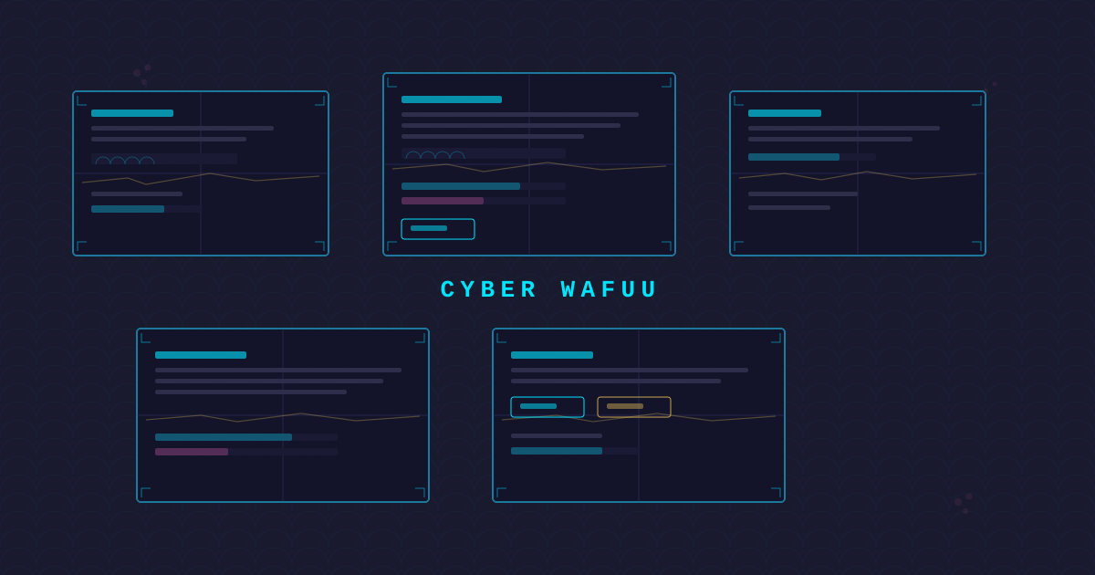
青海波纹样与电路走线融合、鸟居门导航框架、麻叶纹网格、金继ぎ金色修复线、障子屏风格栅面板、传统纹样被科技'侵入'的日式赛博美学。

赛博和风视觉预览
主色#1e3a5f
次色#080814
强调色 1#c41e3a
强调色 2#c9a227
强调色 3#38bdf8
强调色 4#7c3e00

AI 实现规则

You are a Cyber Wafuu design style frontend development expert. All generated code must strictly follow these constraints:

## Absolutely Forbidden

- Soft pastel colors
- Organic irregular shapes
- Western serif fonts
- rounded-full borders
- Light backgrounds (bg-white, bg-gray-50, etc.)
- Standard drop shadows (use glow effects only)

## Must Follow

- Dark indigo backgrounds: bg-[#080814] or bg-[#1e3a5f]
- Seigaiha wave pattern as background texture (repeating-radial-gradient)
- Shoji screen grid frame structure for cards
- Kintsugi gold crack lines as border accents
- Torii gate shapes for navigation frames
- Circuit trace line connections between elements
- Electric blue accent: #38bdf8 with glow effects
- Vermillion #c41e3a and gold #c9a227 for traditional accents

## Animation & Interaction Rules

- Motion should feel ceremonial and precise, not playful: keep transitions in the 200-320ms range with ease-out
- Hover should use subtle lift (1-2px), circuit-glow expansion, and shoji line brightening
- Active states should compress gently (press-down 1px or scale 0.98-0.99) while tightening glow
- Prefer directional sweeps (circuit trace / wave shimmer) triggered by hover or focus, then stop
- Avoid infinite decorative loops on core controls, bounce springs, or oversized transforms that break the calm discipline

## Color Palette

Primary:
- Indigo: #1e3a5f
- Dark Background: #080814
- Vermillion: #c41e3a
- Gold Foil: #c9a227
- Electric Blue: #38bdf8

## Unique Elements

- Seigaiha wave pattern (CSS repeating-radial-gradient)
- Kintsugi gold crack line accents (gradient border decorations)
- Shoji screen grid card frames (CSS grid overlays)
- Torii gate navigation frames
- Asanoha hemp leaf pattern background

组件预览与实现

font-sans font-semibold tracking-wider border border-[#1e3a5f]/60 transition-all duration-300 ease-in-out bg-[#1e3a5f] text-[#e2e8f0] shadow-[0_0_12px_rgba(30,58,95,0.4)] hover:shadow-[0_0_20px_rgba(56,189,248,0.4)] hover:border-[#38bdf8]/60 active:scale-95
button

Button

Button with seigaiha pattern background and neon glow border

<button className="
  group relative px-6 py-3 overflow-hidden
  bg-[#1e3a5f] text-[#e2e8f0] rounded-none
  font-sans font-semibold tracking-wider
  border border-[#1e3a5f]/60
  shadow-[0_0_12px_rgba(30,58,95,0.4)]
  hover:-translate-y-[1px]
  hover:shadow-[0_0_20px_rgba(56,189,248,0.4),0_0_32px_rgba(201,162,39,0.16)]
  hover:border-[#38bdf8]/60
  active:translate-y-[1px]
  active:shadow-[0_0_12px_rgba(56,189,248,0.28)]
  transition-[transform,box-shadow,border-color] duration-250 ease-out
">
  <span className="relative z-10">Execute</span>
  <span className="pointer-events-none absolute inset-y-0 -left-1/3 w-1/3 bg-gradient-to-r from-transparent via-[#38bdf8]/20 to-transparent skew-x-[-20deg] transition-transform duration-300 group-hover:translate-x-[420%]" />
</button>
card

Card

Shoji grid frame card with kintsugi gold accent lines

<div className="
  group relative p-8
  bg-[#080814]
  rounded-none
  border border-[#1e3a5f]/30
  shadow-[0_0_15px_rgba(30,58,95,0.2)]
  hover:-translate-y-[2px]
  hover:shadow-[0_0_24px_rgba(56,189,248,0.35),0_0_36px_rgba(201,162,39,0.16)]
  hover:border-[#38bdf8]/45
  active:translate-y-[1px]
  transition-[transform,box-shadow,border-color] duration-280 ease-out
">
  <div className="pointer-events-none absolute inset-0 opacity-0 transition-opacity duration-200 group-hover:opacity-100 bg-[linear-gradient(135deg,rgba(56,189,248,0.08),transparent_45%,rgba(201,162,39,0.05))]" />
  <div className="absolute top-0 left-1/3 w-px h-full bg-[#1e3a5f]/15 transition-opacity duration-200 group-hover:opacity-70" />
  <div className="absolute top-0 left-2/3 w-px h-full bg-[#1e3a5f]/15 transition-opacity duration-200 group-hover:opacity-70" />
  <div className="absolute top-1/2 left-0 w-full h-px bg-[#1e3a5f]/10 transition-opacity duration-200 group-hover:opacity-70" />
  <div className="absolute top-2 left-2 right-2 h-px bg-gradient-to-r from-transparent via-[#c9a227]/30 to-transparent transition-opacity duration-200 group-hover:opacity-80" />
  <div className="relative z-10">
    <h3 className="text-2xl font-sans font-bold text-[#38bdf8] tracking-wider mb-3">
      SEIGAIHA
    </h3>
    <p className="text-[#e2e8f0]/45 font-sans">
      Traditional waves, digitally reborn
    </p>
  </div>
</div>
input

Input

Input with wave pattern underline and circuit trace focus glow

<input
  type="text"
  placeholder="Input..."
  className="
    w-full px-4 py-3
    bg-[#080814]
    border border-[#1e3a5f]/30
    text-[#e2e8f0] placeholder-[#e2e8f0]/20
    font-sans
    focus:border-[#38bdf8]/60
    focus:shadow-[0_0_12px_rgba(56,189,248,0.3)]
    focus:outline-none
    transition-all duration-300
  "
/>
hero

Hero

Full-screen hero with seigaiha wave background and torii gate frame

<section className="
  min-h-screen
  flex items-center justify-center
  bg-[#080814]
  relative overflow-hidden
">
  <div className="absolute inset-0 opacity-[0.03]" style={{
    backgroundImage: "radial-gradient(circle at 50% 100%, transparent 60%, rgba(56,189,248,0.4) 60%, rgba(56,189,248,0.4) 62%, transparent 62%), radial-gradient(circle at 0% 100%, transparent 60%, rgba(56,189,248,0.4) 60%, rgba(56,189,248,0.4) 62%, transparent 62%)",
    backgroundSize: "60px 30px"
  }} />
  <div className="relative z-10 text-center px-6">
    <h1 className="text-6xl md:text-8xl font-sans font-bold text-[#38bdf8] uppercase tracking-widest mb-2
      [text-shadow:0_0_25px_rgba(56,189,248,0.4)]">
      CYBER WAFUU
    </h1>
  </div>
</section>

交互展示

适用范围与设计理念

应用场景

creative

视觉关键词

high-contrast赛博和风数字和风青海波金继ぎ障子鸟居麻叶纹电路expressivebold

Cyber Wafuu reimagines traditional Japanese visual culture through digital disruption, creating a sophisticated fusion where heritage patterns are "hacked" by technology.

Core principles:

- Seigaiha digital waves: the classic wave pattern overlaid with circuit board traces

- Torii gate navigation: sacred gate structure reborn as navigation frames

- Asanoha grid: hemp leaf geometric grid as layout scaffolding

- Kintsugi gold repair: golden crack lines as decorative borders and accents

- Shoji screen panels: traditional sliding door grids as card frame systems

- Cherry blossom + neon: organic sakura forms outlined in electric light

- Pattern collision: traditional repeating patterns visibly intersecting with digital traces

应该这样做

  • Use dark indigo backgrounds (bg-[#080814])
  • Add seigaiha wave pattern backgrounds with CSS repeating-radial-gradient
  • Use shoji screen grid as card frame structure
  • Apply kintsugi gold crack line borders and accents
  • Use torii gate shape for navigation framing
  • Add circuit trace connecting lines between elements
  • Layer traditional patterns with digital overlay effects
  • Use restrained interaction motion: subtle hover lift (1-2px) with circuit-glow amplification
  • Trigger directional circuit sweeps or shoji-line brightening on hover/focus for ritual feedback

避免这样做

  • No soft pastel colors
  • No organic irregular rounded shapes
  • No Western serif fonts
  • No rounded-full borders
  • No light backgrounds (bg-white, bg-gray-50)
  • No bouncy spring motion or large scale transforms
  • No slow dreamy transitions beyond 320ms on interactive controls

全局 CSS

/* Cyber Wafuu Global Styles */

:root {
  --cw-indigo: #1e3a5f;
  --cw-dark: #080814;
  --cw-vermillion: #c41e3a;
  --cw-gold: #c9a227;
  --cw-blue: #38bdf8;
}

/* Seigaiha wave pattern (digital version) */
.cw-seigaiha {
  background-image:
    radial-gradient(circle at 50% 100%, transparent 60%, rgba(56, 189, 248, 0.04) 60%, rgba(56, 189, 248, 0.04) 62%, transparent 62%),
    radial-gradient(circle at 0% 100%, transparent 60%, rgba(56, 189, 248, 0.04) 60%, rgba(56, 189, 248, 0.04) 62%, transparent 62%);
  background-size: 60px 30px;
}

/* Kintsugi gold crack line */
.cw-kintsugi {
  position: relative;
}
.cw-kintsugi::after {
  content: "";
  position: absolute;
  top: 4px;
  left: 8px;
  right: 8px;
  height: 1px;
  background: linear-gradient(90deg,
    transparent 0%,
    var(--cw-gold) 15%,
    transparent 30%,
    var(--cw-gold) 50%,
    transparent 65%,
    var(--cw-gold) 80%,
    transparent 100%
  );
  opacity: 0.3;
  box-shadow: 0 0 6px rgba(201, 162, 39, 0.3);
}

/* Shoji screen grid */
.cw-shoji-grid {
  position: relative;
}
.cw-shoji-grid::before {
  content: "";
  position: absolute;
  inset: 0;
  background:
    linear-gradient(to right, rgba(30, 58, 95, 0.12) 1px, transparent 1px),
    linear-gradient(to bottom, rgba(30, 58, 95, 0.12) 1px, transparent 1px);
  background-size: 33.33% 50%;
  pointer-events: none;
}

/* Circuit trace decoration */
.cw-circuit::after {
  content: "";
  position: absolute;
  bottom: 0;
  left: 0;
  right: 0;
  height: 1px;
  background: linear-gradient(90deg,
    transparent 0%,
    var(--cw-blue) 15%,
    transparent 35%,
    var(--cw-blue) 55%,
    transparent 75%,
    var(--cw-blue) 90%,
    transparent 100%
  );
  opacity: 0.2;
}

/* Asanoha hemp leaf pattern overlay */
.cw-asanoha {
  background-image:
    linear-gradient(30deg, rgba(30, 58, 95, 0.06) 12%, transparent 12.5%, transparent 87%, rgba(30, 58, 95, 0.06) 87.5%),
    linear-gradient(150deg, rgba(30, 58, 95, 0.06) 12%, transparent 12.5%, transparent 87%, rgba(30, 58, 95, 0.06) 87.5%),
    linear-gradient(30deg, rgba(30, 58, 95, 0.06) 12%, transparent 12.5%, transparent 87%, rgba(30, 58, 95, 0.06) 87.5%),
    linear-gradient(150deg, rgba(30, 58, 95, 0.06) 12%, transparent 12.5%, transparent 87%, rgba(30, 58, 95, 0.06) 87.5%);
  background-size: 40px 70px;
  background-position: 0 0, 0 0, 20px 35px, 20px 35px;
}

/* Gold foil shimmer */
.cw-gold-foil {
  background: linear-gradient(
    135deg,
    rgba(201, 162, 39, 0.08) 0%,
    rgba(201, 162, 39, 0.03) 50%,
    rgba(201, 162, 39, 0.12) 100%
  );
}

.cyber-wafuu-filter { filter: brightness(1.05) contrast(1.02); }

.cyber-wafuu-hover-lift { transition: transform 0.3s ease; }

.cyber-wafuu-hover-lift:hover { transform: translateY(-2px); }

.cyber-wafuu-focus { outline: 2px solid var(--cyber-wafuu-primary, currentColor); outline-offset: 2px; }

布局、色板与 Tokens

主色#1e3a5f
次色#080814
强调色 1#c41e3a
强调色 2#c9a227
强调色 3#38bdf8
强调色 4#7c3e00
{
  "border": {
    "width": "border",
    "color": "border-[#1e3a5f]/30",
    "radius": "rounded-none",
    "style": "border-solid"
  },
  "shadow": {
    "sm": "shadow-[0_0_8px_rgba(56,189,248,0.2)]",
    "md": "shadow-[0_0_15px_rgba(56,189,248,0.3)]",
    "lg": "shadow-[0_0_20px_rgba(56,189,248,0.4)]",
    "none": "shadow-none",
    "hover": "hover:shadow-[0_0_20px_rgba(56,189,248,0.4)]",
    "focus": "focus:shadow-[0_0_12px_rgba(56,189,248,0.3)]",
    "colored": {
      "blue": "shadow-[0_0_15px_rgba(56,189,248,0.3)]",
      "vermillion": "shadow-[0_0_15px_rgba(196,30,58,0.3)]",
      "gold": "shadow-[0_0_15px_rgba(201,162,39,0.3)]"
    }
  },
  "interaction": {
    "transition": "transition-all duration-300 ease-in-out",
    "active": "active:scale-95",
    "hoverTranslate": "hover:-translate-y-1"
  },
  "typography": {
    "heading": "font-sans font-bold tracking-wider",
    "body": "font-sans",
    "mono": "font-mono",
    "sizes": {
      "hero": "text-4xl md:text-6xl lg:text-8xl",
      "h1": "text-3xl md:text-5xl",
      "h2": "text-2xl md:text-4xl",
      "h3": "text-xl md:text-2xl",
      "body": "text-sm md:text-base",
      "small": "text-xs md:text-sm"
    }
  },
  "spacing": {
    "section": "py-14 md:py-24 lg:py-32",
    "container": "px-6 md:px-10 lg:px-16",
    "card": "p-5 md:p-8",
    "gap": {
      "sm": "gap-3 md:gap-4",
      "md": "gap-5 md:gap-8",
      "lg": "gap-8 md:gap-12"
    }
  },
  "colors": {
    "background": {
      "primary": "bg-[#080814]",
      "secondary": "bg-[#1e3a5f]",
      "accent": [
        "bg-[#c41e3a]",
        "bg-[#c9a227]",
        "bg-[#38bdf8]"
      ]
    },
    "text": {
      "primary": "text-[#e2e8f0]",
      "secondary": "text-[#38bdf8]",
      "muted": "text-[#e2e8f0]/35"
    },
    "button": {
      "primary": "bg-[#1e3a5f] text-[#e2e8f0] shadow-[0_0_12px_rgba(30,58,95,0.4)]",
      "secondary": "bg-[#080814] text-[#38bdf8] border-[#38bdf8]/40 shadow-[0_0_10px_rgba(56,189,248,0.2)]",
      "danger": "bg-[#c41e3a] text-white shadow-[0_0_12px_rgba(196,30,58,0.4)]"
    }
  },
  "forbidden": {
    "classes": [
      "rounded-full",
      "rounded-2xl",
      "rounded-xl",
      "rounded-lg",
      "bg-white",
      "bg-gray-50",
      "bg-gray-100",
      "font-serif",
      "shadow-md",
      "shadow-lg",
      "shadow-xl",
      "bg-pink-100",
      "bg-pink-50",
      "bg-rose-50"
    ],
    "patterns": [
      "^rounded-(?:full|2xl|xl|lg)$",
      "^bg-(?:white|gray-(?:50|100))$",
      "^bg-(?:pink|rose)-(?:50|100|200)$",
      "^font-serif$",
      "^shadow-(?:md|lg|xl)$"
    ],
    "reasons": {
      "rounded-full": "Cyber Wafuu uses sharp shoji-grid geometry, no rounded shapes",
      "bg-white": "Cyber Wafuu requires dark indigo backgrounds",
      "font-serif": "Cyber Wafuu uses clean geometric sans-serif fonts",
      "shadow-md": "Use seigaiha-pattern glow shadows instead of soft shadows"
    }
  },
  "required": {
    "button": [
      "font-sans font-semibold tracking-wider",
      "border border-[#1e3a5f]/60",
      "transition-all duration-300 ease-in-out"
    ],
    "card": [
      "bg-[#080814]",
      "border border-[#1e3a5f]/30",
      "transition-all duration-300 ease-in-out"
    ],
    "input": [
      "bg-[#080814]",
      "border border-[#1e3a5f]/30",
      "text-[#e2e8f0]",
      "font-sans",
      "focus:outline-none"
    ]
  }
}

示例提示词

赛博和风着陆页

青海波、金继ぎ与障子屏风的数字融合页面

Use Cyber Wafuu style to create a dark Japanese-tech landing page:
1. Background: dark indigo with seigaiha wave pattern overlay
2. Navigation: torii gate shaped frame with vermillion accents
3. Cards: shoji screen grid frames with kintsugi gold crack accents
4. Circuit trace lines connecting card elements
5. Cherry blossom with neon outlines as decorative accents
6. Asanoha hemp leaf grid as section background

SaaS 着陆页

生成 赛博和风风格的 SaaS 产品着陆页

Create a SaaS landing page using Cyber Wafuu style with hero section, feature grid, testimonials, pricing table, and footer.

作品集展示

生成 赛博和风风格的作品集页面

Create a portfolio showcase page using Cyber Wafuu style with project grid, about section, contact form, and consistent visual language.