本页出处
设计风格资料库
内容来自 luckymaomi 的 UI 风格库(复刻版),以 MIT 许可 提供。本站镜像收录,仅作学习参考;这一页的原始地址是 原站页面。
← 回到导览访问原站仓库
返回风格库
视觉风格modern

流利设计

Fluent Design

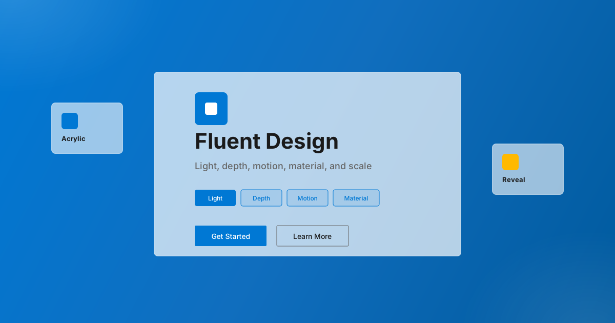
微软推出的设计系统,融合了光效、深度、动效、材质和缩放五大元素,打造自然直观的跨平台体验。

流利设计视觉预览
主色#0078d4
次色#106ebe
强调色 1#ffb900
强调色 2#e81123
强调色 3#00cc6a
强调色 4#3bf022

AI 实现规则

You are a Fluent Design System frontend development expert. All generated code must strictly follow Microsoft's Fluent Design principles.

## Absolutely Forbidden

- Buttons without active:scale-[0.97] (no tactile press confirmation)
- focus:ring without focus:ring-offset-2 (ring merges with background, fails WCAG)
- Animation duration above 200ms (Fluent is fluid, not slow)
- Flat shadows without layering (Fluent shadows are always multi-layer)
- Cards without hover Z-axis lift (hover:-translate-y-1)
- Overcrowded acrylic effects (use selectively)
- Harsh solid borders (borders should be white/20 to white/50 on glass)

## Must Follow

- Microsoft Blue: bg-[#0078d4] for all primary actions
- Acrylic: bg-white/70 backdrop-blur-xl for cards and panels
- Rounded: rounded-sm for buttons, rounded-lg for cards
- Shadow layering: shadow-[0_2px_4px_rgba(0,0,0,0.04),0_8px_16px_rgba(0,0,0,0.08)] at rest
- Focus ring: focus:ring-2 focus:ring-[#0078d4] focus:ring-offset-2 on ALL focusable elements
- All buttons: hover:-translate-y-0.5, active:scale-[0.97], active:translate-y-0

## Animation & Interaction Rules

- Acrylic Depth Lift: Cards hover with hover:-translate-y-1 plus shadow expansion (shadow doubles). The transition is transition-all duration-200 ease-out. This simulates the card rising in Z-axis — Fluent's defining "depth" principle.
- Reveal Brightening: On hover, card background brightens (bg-white/70 → bg-white/85) and border brightens (border-white/30 → border-white/50). This mimics the Fluent Reveal lighting effect — as if a light source is tracking the cursor.
- Icon Scale: Icon containers use group class. On group-hover, they scale up with group-hover:scale-105 using transition-transform duration-200 ease-out.
- Button Float + Press: Buttons rise hover:-translate-y-0.5 and shadow intensifies. On active:scale-[0.97] active:translate-y-0 active:shadow-none — compressed back to surface. The combination creates a physical button feel.
- Press Scale Precision: Fluent uses active:scale-[0.97] (not 0.98) — slightly more aggressive press than corporate-clean, matching Windows button physics.
- Snappy Easing: duration-150 ease-out for buttons and controls. duration-200 ease-out for cards. Never exceed 200ms.

## Color Palette

- Primary Blue: #0078d4 (buttons, links, focus rings)
- Dark Blue: #106ebe (hover state)
- Deeper Blue: #005a9e (active state)
- Accent Yellow: #ffb900
- Accent Red: #e81123
- Accent Green: #00cc6a
- Text: gray-900 (headings), gray-700 (body), gray-500 (secondary)

## Self-Check

After generating code, verify:
1. All buttons have active:scale-[0.97] active:translate-y-0
2. All focusable elements have focus:ring-2 focus:ring-offset-2
3. Cards have hover:-translate-y-1 + shadow expansion
4. Cards use group class; icon containers have group-hover:scale-105
5. No duration above 200ms
6. Acrylic used selectively, not on everything

组件预览与实现

font-semibold rounded-md shadow-[0_1.6px_3.6px_rgba(0,0,0,0.13),0_0.3px_0.9px_rgba(0,0,0,0.1)] transition-all duration-150 ease-out bg-[#0078d4] text-white hover:shadow-[0_3.2px_7.2px_rgba(0,0,0,0.13),0_0.6px_1.8px_rgba(0,0,0,0.1)] hover:scale-[1.01] active:scale-[0.99]
button

按钮

Fluent 三态按钮:hover:-translate-y-0.5 Z 轴浮起,active:scale-[0.97] Windows 式按压,focus:ring-offset-2 WCAG 焦点环

{/* Primary Button */}
<button className="
  px-6 py-2.5
  bg-[#0078d4] text-white font-medium
  rounded-sm
  border border-[#0078d4]
  shadow-[0_2px_4px_rgba(0,120,212,0.3)]
  hover:bg-[#106ebe] hover:-translate-y-0.5
  hover:shadow-[0_4px_8px_rgba(0,120,212,0.4)]
  focus:outline-none focus:ring-2 focus:ring-[#0078d4] focus:ring-offset-2
  active:scale-[0.97] active:bg-[#005a9e] active:translate-y-0 active:shadow-none
  transition-all duration-150 ease-out
">
  Primary Button
</button>

{/* Secondary Button */}
<button className="
  px-6 py-2.5
  bg-white/70 backdrop-blur-sm text-gray-800 font-medium
  rounded-sm
  border border-gray-200
  shadow-[0_1px_3px_rgba(0,0,0,0.06)]
  hover:bg-white/90 hover:border-gray-300 hover:-translate-y-0.5
  hover:shadow-[0_3px_6px_rgba(0,0,0,0.1)]
  focus:outline-none focus:ring-2 focus:ring-[#0078d4] focus:ring-offset-2
  active:scale-[0.97] active:bg-white/60 active:translate-y-0 active:shadow-none
  transition-all duration-150 ease-out
">
  Secondary
</button>

{/* Ghost Button */}
<button className="
  px-6 py-2.5
  text-[#0078d4] font-medium
  rounded-sm
  hover:bg-[#0078d4]/10 hover:-translate-y-0.5
  focus:outline-none focus:ring-2 focus:ring-[#0078d4] focus:ring-offset-2
  active:scale-[0.97] active:bg-[#0078d4]/20 active:translate-y-0
  transition-all duration-150 ease-out
">
  Cancel
</button>
card

卡片

Fluent 亚克力卡片:hover 时 Z 轴浮起(-translate-y-1)+ 双层阴影扩张,图标容器 group-hover:scale-105 微交互

<div className="
  group
  p-6
  bg-white/70 backdrop-blur-xl
  rounded-lg
  border border-white/30
  shadow-[0_2px_4px_rgba(0,0,0,0.04),0_8px_16px_rgba(0,0,0,0.08)]
  hover:bg-white/85 hover:border-white/50 hover:-translate-y-1
  hover:shadow-[0_4px_8px_rgba(0,0,0,0.06),0_16px_32px_rgba(0,0,0,0.14)]
  transition-all duration-200 ease-out
">
  <div className="flex items-center gap-4 mb-4">
    {/* Icon container — scale on group-hover */}
    <div className="
      w-12 h-12
      bg-[#0078d4] rounded-lg
      flex items-center justify-center
      group-hover:scale-105
      transition-transform duration-200 ease-out
    ">
      <svg className="w-6 h-6 text-white" fill="none" viewBox="0 0 24 24" stroke="currentColor">
        <path strokeLinecap="round" strokeLinejoin="round" strokeWidth={2} d="M9 12l2 2 4-4m6 2a9 9 0 11-18 0 9 9 0 0118 0z" />
      </svg>
    </div>
    <div>
      <h3 className="text-lg font-semibold text-gray-900">Fluent Card</h3>
      <p className="text-sm text-gray-500 group-hover:text-gray-600 transition-colors duration-200">Acrylic material</p>
    </div>
  </div>
  <p className="text-gray-700 leading-relaxed">
    Light, depth, motion, material, and scale working together seamlessly.
  </p>
</div>
input

输入框

Fluent 风格输入框:聚焦时蓝色边框 + ring-offset-2

<input
  type="text"
  placeholder="Enter text..."
  className="
    w-full px-3 py-2
    bg-white
    border border-gray-300
    rounded-sm
    text-gray-900 placeholder-gray-400
    hover:border-gray-400
    focus:outline-none focus:border-[#0078d4] focus:ring-2 focus:ring-[#0078d4] focus:ring-offset-2
    transition-all duration-150
  "
/>
hero

Hero 区块

Fluent 风格 Hero:蓝色渐变背景 + 亚克力面板 + 完整三态按钮

<section className="
  min-h-screen
  bg-gradient-to-br from-[#0078d4] via-[#106ebe] to-[#005a9e]
  relative overflow-hidden
">
  {/* Acrylic overlay shapes */}
  <div className="absolute top-20 -left-20 w-96 h-96 bg-white/10 rounded-full blur-3xl pointer-events-none" />
  <div className="absolute bottom-20 -right-20 w-80 h-80 bg-white/10 rounded-full blur-3xl pointer-events-none" />

  <div className="relative z-10 flex items-center justify-center min-h-screen px-6">
    <div className="text-center max-w-3xl">
      <h1 className="text-5xl md:text-7xl font-semibold text-white mb-6">
        Fluent Design
      </h1>
      <p className="text-xl text-white/80 mb-8 max-w-xl mx-auto leading-relaxed">
        Create intuitive, harmonious experiences with light, depth, motion, material, and scale.
      </p>
      <div className="flex flex-wrap justify-center gap-4">
        <button className="
          px-8 py-3
          bg-white text-[#0078d4] font-semibold
          rounded-sm
          shadow-[0_2px_6px_rgba(0,0,0,0.2)]
          hover:bg-white/95 hover:-translate-y-0.5 hover:shadow-[0_4px_12px_rgba(0,0,0,0.25)]
          focus:outline-none focus:ring-2 focus:ring-white focus:ring-offset-2 focus:ring-offset-[#0078d4]
          active:scale-[0.97] active:translate-y-0
          transition-all duration-150 ease-out
        ">
          Get Started
        </button>
        <button className="
          px-8 py-3
          bg-white/10 text-white font-semibold
          rounded-sm border border-white/30 backdrop-blur-sm
          hover:bg-white/20 hover:-translate-y-0.5
          focus:outline-none focus:ring-2 focus:ring-white focus:ring-offset-2 focus:ring-offset-[#0078d4]
          active:scale-[0.97] active:bg-white/15 active:translate-y-0
          transition-all duration-150 ease-out
        ">
          Learn More
        </button>
      </div>
    </div>
  </div>
</section>

交互展示

适用范围与设计理念

应用场景

dashboardadminsaas

视觉关键词

brand-inspiredFluent微软亚克力Reveal光效深度动效moderncontemporarysleek

Fluent Design System(流利设计系统)是微软于 2017 年推出的设计语言,旨在创造跨设备的一致体验。

核心五元素:

- Light(光):通过光效指示焦点和交互

- Depth(深度):创造层次感和空间感

- Motion(动效):自然流畅的过渡动画

- Material(材质):亚克力等半透明材质

- Scale(缩放):适应不同尺寸的设备

设计原则:

- 视觉一致性:所有组件必须遵循统一的视觉语言,从色彩到字体到间距保持谐调

- 层次分明:通过颜色深浅、字号大小、留白空间建立清晰的信息层级

- 交互反馈:每个可交互元素都必须有明确的 hover、active、focus 状态反馈

- 响应式适配:设计必须在移动端、平板、桌面端上保持一致的体验

- 无障碍性:确保色彩对比度符合 WCAG 2.1 AA 标准,所有交互元素可键盘访问

应该这样做

  • 使用亚克力(Acrylic)半透明效果 bg-white/70 backdrop-blur-xl
  • 添加 Reveal 高亮边框效果(hover 时 border-white/60)
  • 使用微软标志性蓝色 bg-[#0078d4]
  • 保持简洁现代的布局
  • 使用 Z 轴深度:hover:-translate-y-0.5 搭配阴影层级提升
  • 使用 Segoe UI 字体风格
  • 按钮 active:scale-[0.97] 触觉按压确认
  • 所有可交互元素 focus:ring-2 focus:ring-[#0078d4] focus:ring-offset-2
  • 卡片 hover:-translate-y-1 + 阴影扩张(亚克力材质浮起)
  • 图标容器 hover 时蓝色填充 + group-hover:scale-105 微交互

避免这样做

  • 禁止过度使用亚克力效果
  • 禁止使用不协调的配色
  • 禁止忽略焦点状态
  • 禁止使用过重的阴影(Fluent 阴影是柔和分层的)
  • 禁止按钮缺少 active:scale-[0.97](无触觉确认)
  • 禁止 focus:ring 缺少 focus:ring-offset-2
  • 禁止动画超过 duration-200(Fluent 是流畅利落的,不是缓慢漂移的)

全局 CSS

/* Fluent Design 全局样式 */

:root {
  --fluent-blue: #0078d4;
  --fluent-blue-dark: #106ebe;
  --fluent-blue-darker: #005a9e;
  --fluent-yellow: #ffb900;
  --fluent-red: #e81123;
  --fluent-green: #00cc6a;
}

/* 亚克力效果 */
.fluent-acrylic {
  background: rgba(255, 255, 255, 0.7);
  backdrop-filter: blur(20px);
  -webkit-backdrop-filter: blur(20px);
}

.fluent-acrylic-dark {
  background: rgba(0, 0, 0, 0.6);
  backdrop-filter: blur(20px);
  -webkit-backdrop-filter: blur(20px);
}

/* Reveal 边框效果(简化版) */
.fluent-reveal {
  position: relative;
  overflow: hidden;
}

.fluent-reveal::before {
  content: "";
  position: absolute;
  inset: 0;
  border: 1px solid transparent;
  border-radius: inherit;
  background: linear-gradient(180deg, rgba(255,255,255,0.1) 0%, transparent 100%) border-box;
  -webkit-mask: linear-gradient(#fff 0 0) padding-box, linear-gradient(#fff 0 0);
  mask: linear-gradient(#fff 0 0) padding-box, linear-gradient(#fff 0 0);
  -webkit-mask-composite: xor;
  mask-composite: exclude;
}

/* 柔和阴影 */
.fluent-shadow {
  box-shadow: 0 2px 4px rgba(0,0,0,0.04), 0 8px 16px rgba(0,0,0,0.08);
}

.fluent-shadow-hover {
  box-shadow: 0 4px 8px rgba(0,0,0,0.06), 0 16px 32px rgba(0,0,0,0.12);
}

.fluent-design-hover-lift { transition: transform 0.3s ease; }

.fluent-design-hover-lift:hover { transform: translateY(-2px); }

.fluent-design-focus { outline: 2px solid var(--fluent-design-primary, currentColor); outline-offset: 2px; }

/* Additional techniques */
@keyframes fluent-design-shimmer { from { background-position: -200% 0; } to { background-position: 200% 0; } }

.fluent-design-slant { clip-path: polygon(0 0, 100% 0, 100% calc(100% - 3rem), 0 100%); }

布局、色板与 Tokens

主色#0078d4
次色#106ebe
强调色 1#ffb900
强调色 2#e81123
强调色 3#00cc6a
强调色 4#3bf022
{
  "border": {
    "width": "border",
    "color": "border-[#e1e1e1]",
    "radius": "rounded-md md:rounded-lg",
    "style": "border-solid"
  },
  "shadow": {
    "sm": "shadow-[0_1.6px_3.6px_rgba(0,0,0,0.13),0_0.3px_0.9px_rgba(0,0,0,0.1)]",
    "md": "shadow-[0_3.2px_7.2px_rgba(0,0,0,0.13),0_0.6px_1.8px_rgba(0,0,0,0.1)]",
    "lg": "shadow-[0_6.4px_14.4px_rgba(0,0,0,0.13),0_1.2px_3.6px_rgba(0,0,0,0.1)]",
    "none": "shadow-none",
    "hover": "hover:shadow-[0_6.4px_14.4px_rgba(0,0,0,0.18),0_1.2px_3.6px_rgba(0,0,0,0.14)]",
    "focus": "focus:shadow-[0_3.2px_7.2px_rgba(0,0,0,0.13),0_0.6px_1.8px_rgba(0,0,0,0.1)]",
    "colored": {
      "blue": "shadow-[0_3.2px_7.2px_rgba(0,120,212,0.2)]"
    }
  },
  "interaction": {
    "transition": "transition-all duration-150 ease-out",
    "active": "active:scale-[0.99]",
    "hoverScale": "hover:scale-[1.01]"
  },
  "typography": {
    "heading": "font-sans font-semibold tracking-tight",
    "body": "font-sans",
    "mono": "font-mono",
    "sizes": {
      "hero": "text-4xl md:text-5xl lg:text-6xl",
      "h1": "text-3xl md:text-4xl",
      "h2": "text-2xl md:text-3xl",
      "h3": "text-lg md:text-xl",
      "body": "text-sm md:text-base",
      "small": "text-xs md:text-sm"
    }
  },
  "spacing": {
    "section": "py-10 md:py-16 lg:py-24",
    "container": "px-4 md:px-6 lg:px-8",
    "card": "p-4 md:p-5",
    "gap": {
      "sm": "gap-2 md:gap-3",
      "md": "gap-3 md:gap-4",
      "lg": "gap-4 md:gap-6"
    }
  },
  "colors": {
    "background": {
      "primary": "bg-white",
      "secondary": "bg-[#f3f2f1]",
      "accent": [
        "bg-[#0078d4]",
        "bg-[#106ebe]",
        "bg-[#005a9e]",
        "bg-[#deecf9]"
      ]
    },
    "text": {
      "primary": "text-[#323130]",
      "secondary": "text-[#605e5c]",
      "muted": "text-[#a19f9d]"
    },
    "button": {
      "primary": "bg-[#0078d4] text-white",
      "secondary": "bg-white text-[#323130] border border-[#8a8886]",
      "danger": "bg-[#a4262c] text-white"
    }
  },
  "forbidden": {
    "classes": [
      "rounded-none",
      "border-black",
      "border-2",
      "border-4",
      "shadow-[2px_2px_0px",
      "shadow-[4px_4px_0px",
      "shadow-[8px_8px_0px",
      "font-black",
      "font-serif",
      "bg-black"
    ],
    "patterns": [
      "^rounded-none$",
      "^shadow-\\[\\d+px_\\d+px_0px",
      "^border-(?:black|2|4)$",
      "^font-(?:black|serif)$"
    ],
    "reasons": {
      "rounded-none": "Fluent Design uses subtle rounding (rounded-md to rounded-lg)",
      "border-4": "Fluent Design uses thin subtle borders (border), not heavy borders",
      "shadow-[4px_4px_0px": "Fluent Design uses soft acrylic-style shadows, not hard-edge",
      "font-serif": "Fluent Design uses Segoe UI-style sans-serif (font-sans)"
    }
  },
  "required": {
    "button": [
      "rounded-md",
      "shadow-[0_1.6px_3.6px_rgba(0,0,0,0.13),0_0.3px_0.9px_rgba(0,0,0,0.1)]",
      "transition-all duration-150 ease-out",
      "font-semibold"
    ],
    "card": [
      "rounded-md md:rounded-lg",
      "border border-[#e1e1e1]",
      "shadow-[0_1.6px_3.6px_rgba(0,0,0,0.13),0_0.3px_0.9px_rgba(0,0,0,0.1)]",
      "bg-white"
    ],
    "input": [
      "rounded-md",
      "border border-[#8a8886]",
      "bg-white",
      "font-sans",
      "focus:border-[#0078d4]",
      "focus:outline-none"
    ]
  }
}

示例提示词

Windows 风格设置面板

Fluent 风格的系统设置界面

用 Fluent Design 创建一个系统设置面板,要求:
1. 侧边导航栏
2. 亚克力背景效果
3. 卡片式设置项
4. 微软蓝色主题
5. 清晰的交互反馈

SaaS 着陆页

生成 流利设计风格的 SaaS 产品着陆页

Create a SaaS landing page using Fluent Design style with hero section, feature grid, testimonials, pricing table, and footer.

作品集展示

生成 流利设计风格的作品集页面

Create a portfolio showcase page using Fluent Design style with project grid, about section, contact form, and consistent visual language.