本页出处
设计风格资料库
内容来自 luckymaomi 的 UI 风格库(复刻版),以 MIT 许可 提供。本站镜像收录,仅作学习参考;这一页的原始地址是 原站页面。
← 回到导览访问原站仓库
返回风格库
视觉风格modern

GitHub 风格

GitHub Style

GitHub设计语言风格,简洁的界面层次、柔和的灰度系统、蓝色交互色、等宽代码字体与开发者友好的信息架构。

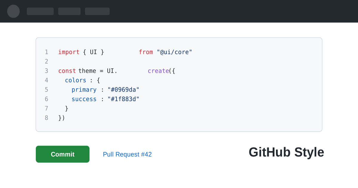
GitHub 风格视觉预览
主色#0969da
次色#ffffff
强调色 1#1f883d
强调色 2#9a6700
强调色 3#cf222e
强调色 4#1d7f98

AI 实现规则

你是一个 GitHub Style 设计风格的前端开发专家。生成的所有代码必须严格遵守以下约束:

## 绝对禁止

- 使用渐变背景 bg-gradient-*
- 使用大圆角 rounded-2xl, rounded-3xl (头像除外)
- 使用重阴影 shadow-lg, shadow-xl
- 使用非语义化装饰色彩
- 使用衬线字体
- 使用过大字体或过宽间距
- 使用动感动画

## 必须遵守

- 蓝色 #0969da 作为主交互色
- 背景: #ffffff, #f6f8fa
- 文字: #1f2328 (主), #656d76 (次)
- 边框: border-[#d0d7de]
- 圆角: rounded-md (6px)
- 代码: font-mono bg-[#f6f8fa]

## 功能色语义

- 成功/合并: #1f883d (绿)
- 警告/等待: #9a6700 (黄)
- 危险/删除: #cf222e (红)
- 交互/链接: #0969da (蓝)

## 配色

灰度系统:
- 文字: #1f2328
- 次要文字: #656d76
- 浅文字: #8b949e
- 边框: #d0d7de
- 浅背景: #f6f8fa
- 背景: #ffffff
- 深色导航: #24292f

## Animation & Interaction Rules

- Extreme Utility: 交互以状态表达为先,避免位移/放大等吸睛动效,时长控制在 duration-75 到 150。
- Micro-Tactility: 按钮按下仅提供轻微确认(如 active:scale-[0.98] + 背景加深),不过度拟物。
- A11y Focus Rings: 焦点态必须提供清晰 ring(focus:ring-4 + 品牌蓝/绿透明度),不能只改边框色。
- Subtle Borders: 卡片 hover 优先微调背景与边框深浅,不使用明显投影。  

## 自检

每次生成代码后检查:
1. 没有使用渐变
2. 圆角统一 rounded-md
3. 阴影极轻或无
4. 颜色使用语义正确
5. 整体感觉简洁专业

组件预览与实现

font-medium leading-5 rounded-md border transition-all duration-150 bg-[#1f883d] text-white border-[#1f883d] hover:brightness-95 hover:shadow-[0_1px_0_rgba(27,31,36,0.04)] active:shadow-inner
button

按钮

GitHub 风格按钮,强调克制反馈与可访问聚焦

<button className="
  px-4 py-1.5
  bg-[#1f883d] text-white
  border border-[#1b7f37]
  rounded-md
  text-sm font-semibold
  shadow-[0_1px_0_rgba(27,31,36,0.04)]
  hover:bg-[#1a7f37]
  active:bg-[#197935]
  active:scale-[0.98]
  focus:outline-none focus:ring-4 focus:ring-[#1f883d]/30
  transition-all duration-100
">
  Merge pull request
</button>
card

卡片

GitHub 风格卡片/仓库列表项,细边框与轻量 hover 提示

<div className="
  group
  p-4
  bg-white
  border border-[#d0d7de]
  rounded-md
  hover:bg-[#f6f8fa]
  hover:border-[#8c959f]
  transition-colors duration-150
">
  <div className="flex items-center gap-2 mb-2">
    <span className="text-[#0969da] text-sm font-semibold group-hover:underline cursor-pointer">
      ui-library/design-system
    </span>
    <span className="px-1.5 py-0.5 text-xs font-medium text-[#656d76] border border-[#d0d7de] rounded-full">
      Public
    </span>
  </div>
  <p className="text-[#656d76] text-sm mb-3">
    A comprehensive design token system for building consistent UIs
  </p>
  <div className="flex items-center gap-4 text-xs text-[#656d76]">
    <span className="flex items-center gap-1">
      <span className="w-3 h-3 rounded-full bg-[#3178c6]" />
      TypeScript
    </span>
    <span>1.2k stars</span>
    <span>Updated 2 hours ago</span>
  </div>
</div>
input

输入框

GitHub 风格输入框

<input
  type="text"
  placeholder="Search or jump to..."
  className="
    w-full px-3 py-1.5
    bg-[#f6f8fa]
    border border-[#d0d7de]
    rounded-md
    text-sm text-[#1f2328] placeholder-[#656d76]
    focus:bg-white
    focus:border-[#0969da]
    focus:shadow-[0_0_0_3px_rgba(9,105,218,0.3)]
    focus:outline-none
    transition-all duration-150
  "
/>
nav

导航栏

GitHub 风格顶部导航

<nav className="
  w-full px-4 py-3
  bg-[#24292f]
  flex items-center gap-4
">
  <div className="text-white">
    <svg height="32" viewBox="0 0 16 16" width="32" fill="currentColor">
      <path d="M8 0c4.42 0 8 3.58 8 8a8.013 8.013 0 0 1-5.45 7.59c-.4.08-.55-.17-.55-.38 0-.27.01-1.13.01-2.2 0-.75-.25-1.23-.54-1.48 1.78-.2 3.65-.88 3.65-3.95 0-.88-.31-1.59-.82-2.15.08-.2.36-1.02-.08-2.12 0 0-.67-.22-2.2.82-.64-.18-1.32-.27-2-.27-.68 0-1.36.09-2 .27-1.53-1.03-2.2-.82-2.2-.82-.44 1.1-.16 1.92-.08 2.12-.51.56-.82 1.28-.82 2.15 0 3.06 1.86 3.75 3.64 3.95-.23.2-.44.55-.51 1.07-.46.21-1.61.55-2.33-.66-.15-.24-.6-.83-1.23-.82-.67.01-.27.38.01.53.34.19.73.9.82 1.13.16.45.68 1.31 2.69.94 0 .67.01 1.3.01 1.49 0 .21-.15.45-.55.38A7.995 7.995 0 0 1 0 8c0-4.42 3.58-8 8-8Z" />
    </svg>
  </div>
  <input
    type="text"
    placeholder="Search or jump to..."
    className="px-3 py-1 bg-[#24292f] border border-[#57606a] rounded-md text-sm text-white placeholder-[#8b949e] w-72 focus:bg-[#0d1117] focus:border-[#58a6ff] focus:outline-none transition-all"
  />
  <div className="flex items-center gap-3 text-sm text-white font-semibold">
    <a href="#" className="hover:text-[#8b949e] transition-colors">Pull requests</a>
    <a href="#" className="hover:text-[#8b949e] transition-colors">Issues</a>
    <a href="#" className="hover:text-[#8b949e] transition-colors">Marketplace</a>
  </div>
</nav>
hero

Hero 区块

GitHub 风格仓库 Hero

<div className="max-w-5xl mx-auto px-4 py-6">
  <div className="flex items-center gap-2 mb-4">
    <span className="text-[#656d76] text-sm">ui-library</span>
    <span className="text-[#656d76]">/</span>
    <span className="text-[#0969da] text-xl font-semibold">design-system</span>
    <span className="ml-2 px-2 py-0.5 text-xs font-medium text-[#656d76] border border-[#d0d7de] rounded-full">
      Public
    </span>
  </div>

  <div className="flex items-center gap-3 pb-4 border border-[#d0d7de]">
    <button className="px-3 py-1.5 text-sm font-semibold text-[#1f2328] border-2 border-[#fd8c73]">
      Code
    </button>
    <button className="px-3 py-1.5 text-sm text-[#656d76] hover:text-[#1f2328] transition-colors">
      Issues <span className="ml-1 px-1.5 py-0.5 text-xs bg-[#e8e8e8] rounded-full">12</span>
    </button>
    <button className="px-3 py-1.5 text-sm text-[#656d76] hover:text-[#1f2328] transition-colors">
      Pull requests <span className="ml-1 px-1.5 py-0.5 text-xs bg-[#e8e8e8] rounded-full">3</span>
    </button>
    <button className="px-3 py-1.5 text-sm text-[#656d76] hover:text-[#1f2328] transition-colors">
      Actions
    </button>
  </div>

  <div className="mt-4 p-4 bg-[#f6f8fa] border border-[#d0d7de] rounded-md">
    <p className="text-sm text-[#1f2328]">
      A comprehensive design token system for building consistent, accessible user interfaces.
    </p>
  </div>
</div>

交互展示

适用范围与设计理念

应用场景

saasportfoliodocs

视觉关键词

brand-inspiredGitHub开发者代码简洁灰度蓝色设计系统moderncontemporarysleek

GitHub Style 是一种源于 GitHub 平台的设计语言,为全球数以千万计的开发者提供清晰、高效、无干扰的工作界面。它的设计哲学是"让内容说话"。

核心理念:

- 内容至上:代码和文档是主角,UI 是配角。所有设计决策都服务于内容的可读性和可操作性

- 灰度系统:精细的灰度层级构建视觉层次——从 #1f2328(文字)到 #f6f8fa(背景),每一级灰色都有明确的语义角色

- 蓝色交互:#0969da 作为唯一的主交互色,在灰色世界中精准引导用户注意力

- 功能色语义:绿色代表成功/合并,黄色代表警告/等待,红色代表危险/删除——每种颜色都有明确含义

这种风格适用于开发者工具、代码平台、技术文档、项目管理和任何面向技术受众的产品。

GitHub 的设计证明了一个道理:在信息密集的场景中,克制的视觉设计反而能创造最好的用户体验。每一个像素的装饰都必须有明确的功能理由,否则就不应该存在。

应该这样做

  • 使用 GitHub 蓝 #0969da 作为主交互色
  • 背景使用白色 #ffffff 和浅灰 bg-[#f6f8fa]
  • 文字使用 #1f2328(深灰)和 #656d76(次要灰)
  • 边框统一使用 border-[#d0d7de]
  • 圆角使用 rounded-md(6px),保持一致性
  • 代码块使用等宽字体 font-mono 和 bg-[#f6f8fa]
  • 使用功能色语义:green #1f883d, yellow #9a6700, red #cf222e
  • 保持紧凑但清晰的间距

避免这样做

  • 禁止使用渐变背景或彩色装饰
  • 禁止使用大圆角 rounded-2xl, rounded-full(除头像外)
  • 禁止使用重阴影 shadow-lg, shadow-xl
  • 禁止使用非语义化的装饰色彩
  • 禁止使用衬线字体
  • 禁止使用过大的字体或过宽的间距
  • 禁止使用动感十足的动画效果

全局 CSS

/* GitHub Style 全局样式 */

:root {
  --gh-blue: #0969da;
  --gh-green: #1f883d;
  --gh-yellow: #9a6700;
  --gh-red: #cf222e;
  --gh-fg: #1f2328;
  --gh-fg-muted: #656d76;
  --gh-bg: #ffffff;
  --gh-bg-subtle: #f6f8fa;
  --gh-border: #d0d7de;
  --gh-nav-bg: #24292f;
}

/* 基础文字样式 */
body {
  font-family: -apple-system, BlinkMacSystemFont, "Segoe UI", "Noto Sans", Helvetica, Arial, sans-serif;
  color: var(--gh-fg);
  line-height: 1.5;
  font-size: 14px;
}

/* 代码块 */
.gh-code {
  font-family: ui-monospace, SFMono-Regular, "SF Mono", Menlo, Consolas, "Liberation Mono", monospace;
  font-size: 85%;
  background: var(--gh-bg-subtle);
  border-radius: 6px;
  padding: 0.2em 0.4em;
}

/* 仓库名称链接 */
.gh-repo-link {
  color: var(--gh-blue);
  font-weight: 600;
  text-decoration: none;
}
.gh-repo-link:hover {
  text-decoration: underline;
}

/* 标签/徽章 */
.gh-label {
  display: inline-block;
  padding: 0 7px;
  font-size: 12px;
  font-weight: 500;
  line-height: 18px;
  border: 1px solid transparent;
  border-radius: 2em;
}

/* 分隔线 */
.gh-divider {
  border: none;
  border: 1px solid var(--gh-border);
  margin: 1rem 0;
}
@keyframes github-style-fade-in {
  from { opacity: 0; transform: translateY(8px); }
  to { opacity: 1; transform: translateY(0); }
}

@keyframes github-style-pulse {
  0%, 100% { opacity: 1; }
  50% { opacity: 0.7; }
}

.github-style-card {
  position: relative;
  overflow: hidden;
}

.github-style-card::before {
  content: "";
  position: absolute;
  inset: 0;
  opacity: 0;
  transition: opacity 0.3s ease;
  background: linear-gradient(135deg, rgba(9, 105, 218, 0.05), transparent);
  pointer-events: none;
}

.github-style-card:hover::before {
  opacity: 1;
}

.github-style-gradient {
  background: linear-gradient(135deg, #0969da, #1f883d);
}

.github-style-gradient-text {
  background: linear-gradient(135deg, #0969da, #1f883d);
  -webkit-background-clip: text;
  -webkit-text-fill-color: transparent;
  background-clip: text;
}

.github-style-frosted {
  backdrop-filter: blur(12px) saturate(180%);
  -webkit-backdrop-filter: blur(12px) saturate(180%);
  background: rgba(9, 105, 218, 0.08);
}

.github-style-accent-corner {
  clip-path: polygon(0 0, 100% 0, 100% calc(100% - 2rem), calc(100% - 2rem) 100%, 0 100%);
}

.github-style-animate-in {
  animation: github-style-fade-in 0.5s ease-out both;
}

布局、色板与 Tokens

主色#0969da
次色#ffffff
强调色 1#1f883d
强调色 2#9a6700
强调色 3#cf222e
强调色 4#1d7f98
{
  "border": {
    "width": "border",
    "color": "border-[#d0d7de]",
    "radius": "rounded-md",
    "style": "border-solid"
  },
  "shadow": {
    "sm": "shadow-[0_1px_0_rgba(27,31,36,0.04)]",
    "md": "shadow-[0_1px_3px_rgba(27,31,36,0.12)]",
    "lg": "shadow-[0_3px_6px_rgba(140,149,159,0.15)]",
    "none": "shadow-none",
    "hover": "hover:shadow-[0_1px_3px_rgba(27,31,36,0.12)]",
    "focus": "focus:shadow-[0_0_0_3px_rgba(9,105,218,0.3)]",
    "colored": {
      "blue": "shadow-[0_0_0_3px_rgba(9,105,218,0.3)]"
    }
  },
  "interaction": {
    "transition": "transition-colors duration-150",
    "active": "active:bg-[#e8e8e8]",
    "hoverOpacity": "hover:bg-[#f6f8fa]"
  },
  "typography": {
    "heading": "font-semibold text-[#1f2328]",
    "body": "text-sm text-[#1f2328]",
    "mono": "font-mono text-sm text-[#1f2328]",
    "sizes": {
      "hero": "text-3xl md:text-4xl",
      "h1": "text-2xl md:text-3xl",
      "h2": "text-xl md:text-2xl",
      "h3": "text-lg md:text-xl",
      "body": "text-sm",
      "small": "text-xs"
    }
  },
  "spacing": {
    "section": "py-6 md:py-8",
    "container": "px-4 md:px-6",
    "card": "p-3 md:p-4",
    "gap": {
      "sm": "gap-2",
      "md": "gap-3",
      "lg": "gap-4"
    }
  },
  "colors": {
    "background": {
      "primary": "bg-white",
      "secondary": "bg-[#f6f8fa]",
      "accent": [
        "bg-[#0969da]",
        "bg-[#1f883d]",
        "bg-[#cf222e]"
      ]
    },
    "text": {
      "primary": "text-[#1f2328]",
      "secondary": "text-[#656d76]",
      "muted": "text-[#8b949e]"
    },
    "button": {
      "primary": "bg-[#1f883d] text-white border border-[#1b7f37]",
      "secondary": "bg-[#f6f8fa] text-[#1f2328] border border-[#d0d7de]"
    }
  },
  "forbidden": {
    "classes": [
      "rounded-2xl",
      "rounded-3xl",
      "rounded-full",
      "bg-gradient-to-r",
      "bg-gradient-to-br",
      "bg-gradient-to-b",
      "shadow-lg",
      "shadow-xl",
      "shadow-2xl",
      "font-serif",
      "text-4xl",
      "text-5xl",
      "text-6xl",
      "text-7xl",
      "blur-sm",
      "blur-md",
      "blur-lg"
    ],
    "patterns": [
      "^rounded-(?:2xl|3xl|full)",
      "^bg-gradient",
      "^shadow-(?:lg|xl|2xl)",
      "^text-(?:[4-9]xl)",
      "^blur-"
    ],
    "reasons": {
      "rounded-2xl": "GitHub uses consistent rounded-md (6px) corners",
      "rounded-full": "GitHub reserves rounded-full for avatars and labels only",
      "bg-gradient-to-r": "GitHub uses flat, solid colors without gradients",
      "shadow-lg": "GitHub uses minimal shadows; heavy shadows break the clean aesthetic",
      "font-serif": "GitHub uses system sans-serif and monospace fonts only",
      "blur-sm": "GitHub does not use blur effects; keep everything crisp"
    }
  },
  "required": {
    "button": [
      "rounded-md",
      "text-sm font-semibold",
      "border",
      "shadow-[0_1px_0_rgba(27,31,36,0.04)]",
      "transition-colors duration-150"
    ],
    "card": [
      "bg-white",
      "border border-[#d0d7de]",
      "rounded-md"
    ],
    "input": [
      "bg-[#f6f8fa]",
      "border border-[#d0d7de]",
      "rounded-md",
      "text-sm text-[#1f2328]",
      "focus:bg-white",
      "focus:border-[#0969da]",
      "focus:shadow-[0_0_0_3px_rgba(9,105,218,0.3)]",
      "focus:outline-none"
    ]
  }
}

示例提示词

仓库首页

GitHub 风格仓库展示页面

用 GitHub Style 创建一个仓库首页,要求:
1. 顶部:深色导航栏,搜索框
2. 仓库信息:名称、描述、语言标签
3. 文件列表:表格布局,悬停高亮
4. README 展示区:白色背景,代码块
5. 右侧:About 面板、贡献者头像

Issue 列表

GitHub 风格 Issue 管理

用 GitHub Style 设计一个 Issue 列表页,要求:
1. 筛选栏:Open/Closed 切换,标签筛选
2. Issue 列表:标题、标签、作者、时间
3. 标签使用语义色:bug(红)、enhancement(蓝)、help-wanted(绿)
4. 分页控件:简洁的页码导航
5. 整体简洁、信息密度适中

作品集展示

生成 GitHub 风格风格的作品集页面

Create a portfolio showcase page using GitHub Style style with project grid, about section, contact form, and consistent visual language.