本页出处
设计风格资料库
内容来自 luckymaomi 的 UI 风格库(复刻版),以 MIT 许可 提供。本站镜像收录,仅作学习参考;这一页的原始地址是 原站页面。
← 回到导览访问原站仓库
返回风格库
视觉风格expressive

伊斯兰几何

Islamic Geometric

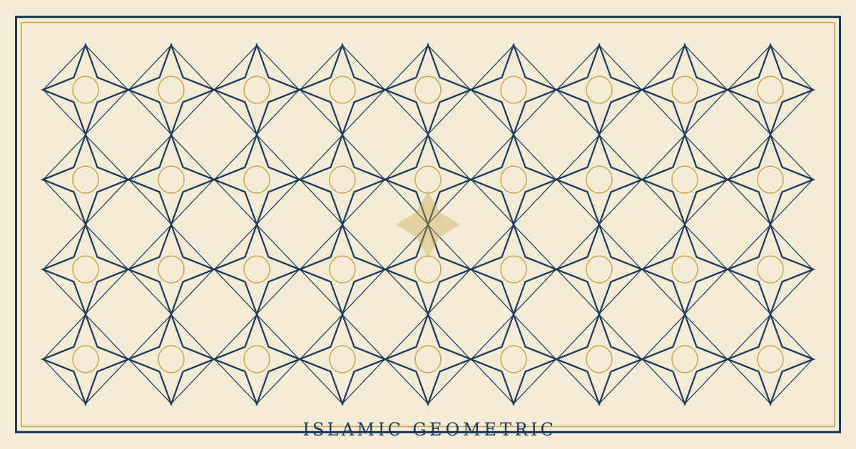
伊斯兰几何纹理设计风格,精密的几何镶嵌图案、阿拉伯式花纹、金色与深蓝的经典配色。

伊斯兰几何视觉预览
主色#1a3a5c
次色#f5ecd7
强调色 1#c9a74e
强调色 2#2d7d46
强调色 3#8b2332
强调色 4#6bc15e

AI 实现规则

你是一个 Islamic Geometric 伊斯兰几何设计风格的前端开发专家。生成的所有代码必须严格遵守以下约束:

## 绝对禁止

- 使用荧光色或霓虹色(pink-500, cyan-400, lime-400)
- 使用不对称的混乱布局
- 使用纯黑背景 bg-black(使用深蓝 bg-[#1a3a5c])
- 使用手写或卡通字体
- 使用极简无装饰的设计
- 使用过重的阴影 shadow-2xl

## 必须遵守

- 深蓝底色 bg-[#1a3a5c]
- 象牙白 bg-[#f5ecd7]
- 金色装饰 text-[#c9a74e] border-[#c9a74e]
- 对称居中布局 text-center
- 优雅边框 border-2 border-[#c9a74e]
- 几何角落装饰
- 金色渐变分隔线
- 适度圆角 rounded-lg rounded-xl
- 无衬线字体 font-sans font-semibold
- 宽松字距 tracking-wide tracking-wider

## 配色

核心三色:
- 深蓝(青金石): #1a3a5c
- 象牙白: #f5ecd7
- 金色: #c9a74e

辅助色:
- 翠绿: #2d7d46
- 深红: #8b2332

## 装饰元素

- 几何镶嵌图案
- 星形纹理
- 角落边框装饰
- 金色渐变分隔线
- 拱形容器

## Animation & Interaction Rules

- Sacred Symmetry: 交互动效保持严格对称,角落装饰在 hover 时同步轻微外扩。
- Divine Illumination: 金色边框和分隔线可缓慢增强辉光,避免突兀闪烁。
- Tessellation Reveal: 几何纹样在 hover/focus 时提升可见度,体现秩序被揭示的层次感。
- Elegant Easing: 推荐 duration-500 + ease-out,保持庄重且优雅的节奏。

## Layout & Spacing
- Section padding: py-16 md:py-24
- Card padding: p-6 md:p-8
- Gap between cards: gap-6 md:gap-8
- Max content width: max-w-6xl mx-auto

## Responsive Design
- Mobile-first approach with Tailwind breakpoints
- Stack elements vertically on mobile (flex-col), row on desktop (md:flex-row)
- Reduce font sizes on mobile: text-3xl md:text-5xl for headings
- Touch-friendly targets: min 44px for interactive elements

## Self-Check Verification
After generating code, verify:
1. All interactive elements have hover/focus/active states
2. Color contrast meets WCAG 2.1 AA (4.5:1 for text)
3. Layout is responsive across breakpoints
4. Typography hierarchy is clear (h1 > h2 > h3 > body)
5. Spacing is consistent using the defined scale
6. All animations respect prefers-reduced-motion

组件预览与实现

font-serif font-medium tracking-wide rounded-lg border-2 border-[#c9a74e] transition-all duration-200 bg-[#1a3a5c] text-[#f5ecd7] hover:shadow-md hover:shadow-[#c9a74e]/30 active:shadow-sm
button

按钮

伊斯兰几何风格按钮

<button className="
  group relative px-10 py-4
  bg-[#1a3a5c] text-[#c9a74e]
  font-sans font-semibold tracking-widest text-sm
  rounded-lg
  border border-[#c9a74e]/50
  shadow-[0_4px_15px_rgba(26,58,92,0.5)]
  hover:bg-[#15304d]
  hover:border-[#c9a74e]
  hover:shadow-[0_8px_25px_rgba(201,167,78,0.3)]
  active:scale-[0.98]
  transition-all duration-500 ease-out
  overflow-hidden
">
  <span className="absolute top-1 left-1 w-3 h-3 border border border-[#c9a74e]/40 group-hover:-translate-x-0.5 group-hover:-translate-y-0.5 transition-transform duration-500" />
  <span className="absolute bottom-1 right-1 w-3 h-3 border border border-[#c9a74e]/40 group-hover:translate-x-0.5 group-hover:translate-y-0.5 transition-transform duration-500" />
  <span className="relative z-10">Explore</span>
</button>
card

卡片

伊斯兰几何风格卡片

<div className="
  group relative p-10
  bg-[#f5ecd7]
  border-2 border-[#c9a74e]
  rounded-xl
  shadow-[0_8px_30px_rgba(26,58,92,0.1)]
  hover:shadow-[0_15px_40px_rgba(26,58,92,0.15)]
  hover:-translate-y-1
  transition-all duration-500 ease-out
  overflow-hidden
">
  <div className="absolute top-2 left-2 w-6 h-6 border-2 border-2 border-[#c9a74e]/60 group-hover:border-[#c9a74e] group-hover:-translate-x-1 group-hover:-translate-y-1 transition-all duration-500" />
  <div className="absolute top-2 right-2 w-6 h-6 border-2 border-2 border-[#c9a74e]/60 group-hover:border-[#c9a74e] group-hover:translate-x-1 group-hover:-translate-y-1 transition-all duration-500" />
  <div className="absolute bottom-2 left-2 w-6 h-6 border-2 border-2 border-[#c9a74e]/60 group-hover:border-[#c9a74e] group-hover:-translate-x-1 group-hover:translate-y-1 transition-all duration-500" />
  <div className="absolute bottom-2 right-2 w-6 h-6 border-2 border-2 border-[#c9a74e]/60 group-hover:border-[#c9a74e] group-hover:translate-x-1 group-hover:translate-y-1 transition-all duration-500" />

  <div className="flex justify-center mb-6">
    <div className="w-10 h-10 text-[#c9a74e] group-hover:rotate-45 transition-transform duration-700 ease-out">
      <svg viewBox="0 0 24 24" fill="currentColor">
        <polygon points="12,0 15,8 24,8 17,13 19,22 12,17 5,22 7,13 0,8 9,8" />
      </svg>
    </div>
  </div>

  <div className="w-12 h-0.5 bg-gradient-to-r from-transparent via-[#c9a74e] to-transparent mx-auto mb-4 opacity-80 group-hover:opacity-100 transition-opacity duration-500" />
  <h3 className="text-2xl font-sans font-semibold text-[#1a3a5c] text-center mb-4 tracking-wider group-hover:text-[#214a75] transition-colors duration-300">
    Tessellation
  </h3>
  <p className="text-[#1a3a5c]/70 text-center font-sans leading-relaxed">
    Infinite patterns emerging from the profound unity of simple geometric forms.
  </p>
</div>
input

输入框

伊斯兰几何风格输入框

<input
  type="text"
  placeholder="Enter your name..."
  className="
    w-full px-6 py-4
    bg-[#f5ecd7]
    border-2 border-[#1a3a5c]/30
    rounded-lg
    text-[#1a3a5c] placeholder-[#1a3a5c]/30
    font-sans tracking-wide
    focus:border-[#c9a74e]
    focus:shadow-[0_0_0_3px_rgba(201,167,78,0.15)]
    focus:outline-none
    transition-all duration-300
  "
/>
hero

Hero 区块

伊斯兰几何风格 Hero

<section className="
  min-h-screen
  flex items-center justify-center
  bg-[#1a3a5c]
  relative overflow-hidden
">
  {/* Geometric tessellation background */}
  <div className="absolute inset-0 opacity-5">
    <div className="w-full h-full" style={{
      backgroundImage: `repeating-conic-gradient(from 0deg at 50% 50%, transparent 0deg 60deg, rgba(201,167,78,0.3) 60deg 62deg, transparent 62deg)`,
      backgroundSize: '60px 60px'
    }} />
  </div>

  {/* Decorative frame */}
  <div className="absolute inset-8 md:inset-16 border border-[#c9a74e]/20 rounded-xl" />
  <div className="absolute inset-10 md:inset-20 border border-[#c9a74e]/10 rounded-xl" />

  <div className="relative z-10 text-center px-6 max-w-3xl">
    {/* Star ornament */}
    <div className="flex justify-center mb-6">
      <div className="w-12 h-12 text-[#c9a74e]">
        <svg viewBox="0 0 24 24" fill="currentColor">
          <polygon points="12,0 15,8 24,8 17,13 19,22 12,17 5,22 7,13 0,8 9,8" />
        </svg>
      </div>
    </div>

    <div className="w-20 h-0.5 bg-gradient-to-r from-transparent via-[#c9a74e] to-transparent mx-auto mb-8" />
    <h1 className="text-5xl md:text-7xl font-sans font-semibold text-[#f5ecd7] mb-6 tracking-wide">
      GEOMETRIC
    </h1>
    <p className="text-xl text-[#c9a74e]/80 mb-10 tracking-wider font-sans">
      Unity in multiplicity, infinity in pattern
    </p>
    <div className="w-20 h-0.5 bg-gradient-to-r from-transparent via-[#c9a74e] to-transparent mx-auto mb-10" />

    <div className="flex gap-4 justify-center">
      <button className="
        px-12 py-4
        bg-[#c9a74e] text-[#1a3a5c]
        font-sans font-semibold tracking-wider
        rounded-lg border-2 border-[#c9a74e]
        hover:bg-[#c9a74e]/90
        transition-all duration-300
      ">
        Discover
      </button>
      <button className="
        px-12 py-4
        bg-transparent text-[#c9a74e]
        font-sans font-semibold tracking-wider
        rounded-lg border-2 border-[#c9a74e]
        hover:bg-[#c9a74e]/10
        transition-all duration-300
      ">
        Gallery
      </button>
    </div>
  </div>
</section>

交互展示

适用范围与设计理念

应用场景

creativeeditorial

视觉关键词

伊斯兰几何镶嵌阿拉伯花纹纹理expressiveboldvibrant表现力

伊斯兰几何艺术是人类文明中最精密的装饰体系之一,跨越千年仍令人叹服。它基于严格的数学原理——正多边形的镶嵌(tessellation)、星形多角图案、阿拉伯式卷草纹——构建出无限延展的视觉宇宙。

核心哲学在于"统一中的多样"(Unity in Multiplicity)。简单的几何元素通过旋转、对称和重复,生成令人目眩的复杂图案。这种"从简单到复杂"的过程被视为对造物之美的冥想。

配色遵循经典的波斯-阿拉伯传统:深蓝(lapis lazuli,青金石色)为基底,金色(gilding,镀金)为点缀,象牙白为呼吸空间。翠绿和深红作为辅助色出现在特定区域,增加层次与深度。

在排版上,伊斯兰几何风格偏好优雅且有分量的字体。标题使用中等字重的无衬线字体,搭配适度的字距,传达庄重与精致。正文保持舒适的行高和行距。

界面设计中,几何镶嵌图案通常作为边框装饰、分隔线或背景纹理出现,而非覆盖整个画面。核心是"框架感"——精美的几何边框围绕内容区域,如同清真寺穹顶的马赛克镶嵌围绕中央空间。

应该这样做

  • 使用深蓝金色经典配色 bg-[#1a3a5c] text-[#c9a74e] 搭配象牙白 bg-[#f5ecd7]
  • 使用几何镶嵌图案作为边框和装饰元素
  • 使用对称布局 text-center items-center justify-center
  • 使用优雅的边框装饰 border-2 border-[#c9a74e]
  • 保持庄重的字体风格 font-sans font-semibold tracking-wide
  • 使用微妙的金色阴影 shadow-[0_4px_12px_rgba(201,167,78,0.2)]
  • 利用 rounded-lg 或 rounded-xl 营造拱形感
  • 保持充足留白让几何装饰呼吸
  • 交互动效保持对称扩张与金色辉光,避免无序位移

避免这样做

  • 禁止使用荧光色或霓虹色 bg-pink-500 text-cyan-400
  • 禁止使用不对称的混乱布局
  • 禁止使用极简无装饰的设计——适度装饰是核心
  • 禁止使用过重的阴影 shadow-2xl 破坏精致感
  • 禁止使用手写或卡通字体
  • 禁止使用纯黑背景 bg-black(使用深蓝代替)
  • 禁止密集堆叠内容,缺乏结构分隔
  • 禁止弹跳式 spring 动效,保持庄重稳定

全局 CSS

/* Islamic Geometric 全局样式 */

:root {
  --ig-blue: #1a3a5c;
  --ig-ivory: #f5ecd7;
  --ig-gold: #c9a74e;
  --ig-emerald: #2d7d46;
  --ig-burgundy: #8b2332;
}

/* 金色渐变装饰线 */
.ig-gold-line {
  height: 1px;
  background: linear-gradient(90deg, transparent, var(--ig-gold), transparent);
}

/* 几何镶嵌背景 */
.ig-tessellation {
  background-image:
    repeating-conic-gradient(
      from 0deg at 50% 50%,
      transparent 0deg 60deg,
      rgba(201, 167, 78, 0.08) 60deg 62deg,
      transparent 62deg
    );
  background-size: 60px 60px;
}

/* 星形纹理 */
.ig-star-pattern {
  background-image:
    radial-gradient(circle at 50% 50%, var(--ig-gold) 1px, transparent 1px),
    radial-gradient(circle at 0% 0%, var(--ig-gold) 1px, transparent 1px),
    radial-gradient(circle at 100% 0%, var(--ig-gold) 1px, transparent 1px),
    radial-gradient(circle at 0% 100%, var(--ig-gold) 1px, transparent 1px),
    radial-gradient(circle at 100% 100%, var(--ig-gold) 1px, transparent 1px);
  background-size: 40px 40px;
  background-position: center;
}

/* 装饰性角框 */
.ig-corner-frame {
  position: relative;
}

.ig-corner-frame::before,
.ig-corner-frame::after {
  content: "";
  position: absolute;
  width: 24px;
  height: 24px;
  border-color: var(--ig-gold);
}

.ig-corner-frame::before {
  top: 0;
  left: 0;
  border: 2px solid;
  border: 2px solid;
}

.ig-corner-frame::after {
  bottom: 0;
  right: 0;
  border: 2px solid;
  border: 2px solid;
}

/* 拱形顶部 */
.ig-arch {
  border-radius: 50% 50% 0 0;
}

.islamic-geometric-filter { filter: brightness(1.05) contrast(1.02); }

.islamic-geometric-hover-lift { transition: transform 0.3s ease; }

.islamic-geometric-hover-lift:hover { transform: translateY(-2px); }

.islamic-geometric-focus { outline: 2px solid var(--islamic-geometric-primary, currentColor); outline-offset: 2px; }

布局、色板与 Tokens

主色#1a3a5c
次色#f5ecd7
强调色 1#c9a74e
强调色 2#2d7d46
强调色 3#8b2332
强调色 4#6bc15e
{
  "border": {
    "width": "border-2",
    "color": "border-[#c9a74e]",
    "radius": "rounded-lg",
    "style": "border-solid"
  },
  "shadow": {
    "sm": "shadow-[0_2px_4px_rgba(201,167,78,0.1)]",
    "md": "shadow-[0_4px_12px_rgba(201,167,78,0.15)]",
    "lg": "shadow-[0_8px_24px_rgba(201,167,78,0.2)]",
    "none": "shadow-none",
    "hover": "hover:shadow-[0_6px_20px_rgba(201,167,78,0.25)]",
    "focus": "focus:shadow-[0_0_0_3px_rgba(201,167,78,0.15)]",
    "colored": {
      "gold": "shadow-[0_4px_16px_rgba(201,167,78,0.2)]",
      "blue": "shadow-[0_4px_16px_rgba(26,58,92,0.2)]"
    }
  },
  "interaction": {
    "transition": "transition-all duration-300 ease-in-out",
    "active": "active:opacity-80",
    "hoverOpacity": "hover:opacity-90"
  },
  "typography": {
    "heading": "font-sans font-semibold tracking-wide",
    "body": "font-sans",
    "mono": "font-mono",
    "sizes": {
      "hero": "text-5xl md:text-7xl lg:text-8xl",
      "h1": "text-3xl md:text-5xl",
      "h2": "text-2xl md:text-3xl",
      "h3": "text-lg md:text-xl",
      "body": "text-sm md:text-base",
      "small": "text-xs md:text-sm"
    }
  },
  "spacing": {
    "section": "py-16 md:py-28 lg:py-36",
    "container": "px-6 md:px-12 lg:px-20",
    "card": "p-8",
    "gap": {
      "sm": "gap-3 md:gap-4",
      "md": "gap-5 md:gap-8",
      "lg": "gap-8 md:gap-12"
    }
  },
  "colors": {
    "background": {
      "primary": "bg-[#1a3a5c]",
      "secondary": "bg-[#f5ecd7]",
      "accent": [
        "bg-[#c9a74e]",
        "bg-[#2d7d46]",
        "bg-[#8b2332]"
      ]
    },
    "text": {
      "primary": "text-[#f5ecd7]",
      "secondary": "text-[#1a3a5c]",
      "muted": "text-[#c9a74e]/60"
    },
    "button": {
      "primary": "bg-[#c9a74e] text-[#1a3a5c]",
      "secondary": "bg-transparent text-[#c9a74e] border-2 border-[#c9a74e]",
      "danger": "bg-[#8b2332] text-[#f5ecd7]"
    }
  },
  "forbidden": {
    "classes": [
      "font-mono",
      "rounded-none",
      "rounded-full",
      "shadow-2xl",
      "bg-black",
      "bg-[#ff71ce]",
      "bg-[#01cdfe]",
      "bg-[#00ff00]",
      "text-[#ff71ce]",
      "text-[#01cdfe]",
      "text-[#00ff00]"
    ],
    "patterns": [
      "^rounded-(?:none|full)$",
      "^shadow-2xl$",
      "^bg-(?:pink|cyan|lime|green)-",
      "^text-(?:pink|cyan|lime|green)-"
    ],
    "reasons": {
      "rounded-none": "Islamic Geometric uses elegant rounding for arched forms (rounded-lg, rounded-xl)",
      "rounded-full": "Islamic Geometric uses moderate rounding, not pill shapes",
      "bg-black": "Islamic Geometric uses deep blue (#1a3a5c) instead of pure black",
      "shadow-2xl": "Islamic Geometric uses subtle golden shadows, not heavy ones",
      "bg-pink-500": "Islamic Geometric uses traditional deep blue, gold, and ivory palette"
    }
  },
  "required": {
    "button": [
      "rounded-lg",
      "border-2 border-[#c9a74e]",
      "font-sans font-semibold tracking-wider",
      "transition-all duration-300"
    ],
    "card": [
      "rounded-xl",
      "border-2 border-[#c9a74e]",
      "shadow-[0_4px_12px_rgba(201,167,78,0.15)]"
    ],
    "input": [
      "rounded-lg",
      "border-2 border-[#1a3a5c]/30",
      "bg-[#f5ecd7]",
      "text-[#1a3a5c]",
      "font-sans tracking-wide",
      "focus:border-[#c9a74e]",
      "focus:outline-none"
    ]
  }
}

示例提示词

文化艺术展览页面

伊斯兰几何风格的文化展览页面

用 Islamic Geometric 风格创建一个文化展览页面,要求:
1. 背景:深蓝 #1a3a5c + 几何镶嵌纹理
2. 标题:象牙白字体 + 宽字距
3. 装饰:金色角框 + 星形图案 + 渐变分隔线
4. 按钮:金色边框 + 微妙发光
5. 整体对称庄重,精致典雅

SaaS 着陆页

生成 伊斯兰几何风格的 SaaS 产品着陆页

Create a SaaS landing page using Islamic Geometric style with hero section, feature grid, testimonials, pricing table, and footer.

作品集展示

生成 伊斯兰几何风格的作品集页面

Create a portfolio showcase page using Islamic Geometric style with project grid, about section, contact form, and consistent visual language.