按钮
Linear 风格的渐变按钮
<button className="px-4 py-2 bg-gradient-to-r from-[#5e6ad2] to-[#8b5cf6] text-white text-sm font-medium rounded-lg hover:opacity-90 active:opacity-80 transition-opacity duration-150">
  Create Issue
</button>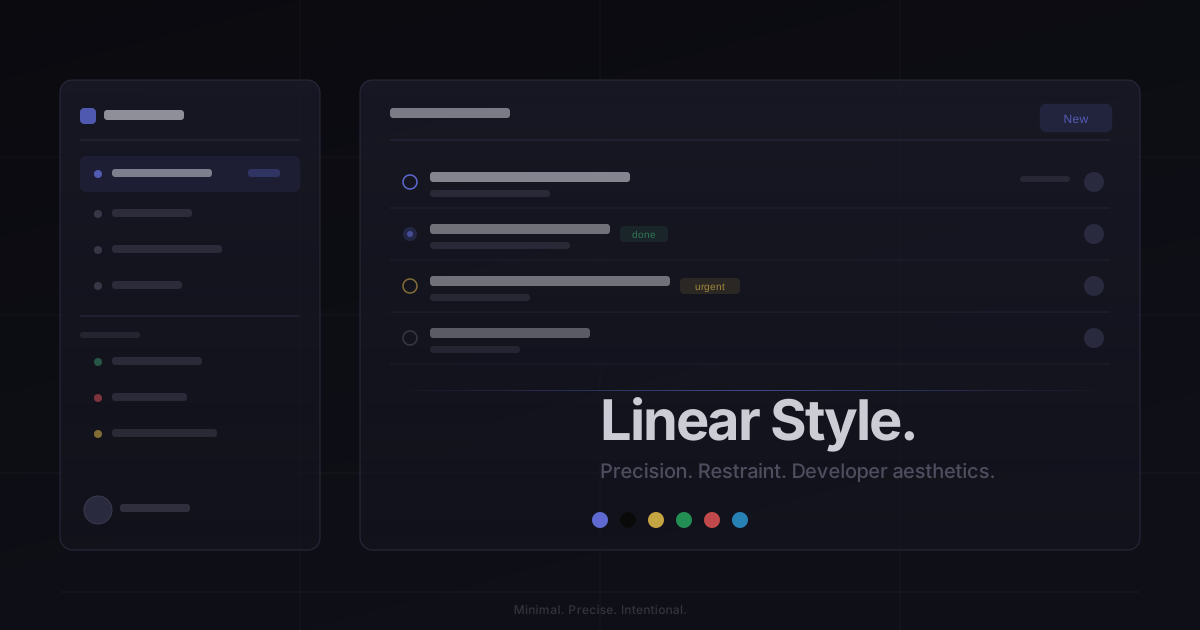
#5e6ad2#0a0a0b#f2c94c#27ae60#eb5757#2d9cdbYou are a Linear Style design expert. This style emulates the design language of the Linear project management tool — precise, restrained, and developer-focused.
## Absolute Rules
- Background: #0a0a0b or bg-zinc-950 — always dark
- Text: text-white for primary, text-zinc-400 for secondary, text-zinc-500/600 for tertiary
- Borders: border border-white/10 — always 1px, always semi-transparent
- Brand color: #5e6ad2 (indigo-purple) — used sparingly for CTAs and accents
- Font: Inter only, tracking-tight, text-sm as default body size
- Border-radius: rounded-lg max, rounded-md for small elements
## Forbidden
- White or light backgrounds
- Large border-radius (rounded-2xl+)
- Colored shadows
- Multiple fonts
- High-saturation colors (except brand purple)
- Decorative elements (gradients as decoration, blobs, patterns)
## Interaction Pattern
- Use opacity for hover states: hover:opacity-90 or hover:bg-white/[0.06]
- Transitions must be fast: duration-150
- No scale transforms on hover
- Focus: focus:border-[#5e6ad2]/50
## Typography Scale
- Hero: text-4xl font-semibold tracking-tight
- Section: text-2xl font-semibold tracking-tight
- Body: text-sm text-zinc-400
- Label: text-xs text-zinc-500 font-medium uppercase tracking-widerfont-medium text-sm rounded-lg transition-opacity duration-150 bg-gradient-to-r from-[#5e6ad2] to-[#8b5cf6] text-white hover:opacity-90 active:opacity-80Linear 风格的渐变按钮
<button className="px-4 py-2 bg-gradient-to-r from-[#5e6ad2] to-[#8b5cf6] text-white text-sm font-medium rounded-lg hover:opacity-90 active:opacity-80 transition-opacity duration-150">
Create Issue
</button>Linear 风格的暗色卡片
<div className="rounded-lg border border-white/10 bg-white/[0.03] p-5 hover:bg-white/[0.06] transition-colors duration-150">
  <div className="flex items-center gap-3 mb-3">
    <div className="w-4 h-4 rounded-full border-2 border-[#5e6ad2]" />
    <span className="text-sm text-white font-medium">STY-142</span>
    <span className="ml-auto text-xs text-zinc-500">2h ago</span>
  </div>
  <h4 className="text-white text-sm mb-1.5">Add dark mode support for dashboard</h4>
  <p className="text-zinc-500 text-xs leading-relaxed">Implement theme switching with system preference detection and manual override.</p>
  <div className="mt-3 flex items-center gap-2">
    <span className="px-2 py-0.5 text-[10px] font-medium text-[#5e6ad2] bg-[#5e6ad2]/10 rounded">Feature</span>
    <span className="px-2 py-0.5 text-[10px] font-medium text-[#f2c94c] bg-[#f2c94c]/10 rounded">In Progress</span>
  </div>
</div>Linear 风格的暗色输入框
<div className="space-y-1.5">
  <label className="block text-zinc-400 text-xs font-medium">Issue title</label>
  <input
    type="text"
    className="w-full px-3 py-2 bg-white/[0.03] border border-white/10 rounded-lg text-white text-sm placeholder:text-zinc-600 focus:outline-none focus:border-[#5e6ad2]/50 focus:bg-white/[0.05] transition-all duration-150"
    placeholder="Enter a title..."
  />
</div>Linear Style 源自备受开发者推崇的项目管理工具 Linear。其设计理念是"每一个像素都有目的"。
核心理念:
- 深色优先:几乎纯黑的背景(#0a0a0b),让内容成为唯一焦点
- 精确排版:Inter 字体,letter-spacing 微调,恰到好处的行高
- 克制渐变:紫色渐变仅用于主要 CTA 和品牌元素
- 微妙边框:1px 的半透明白色边框划分层级
- 无多余装饰:没有阴影、没有圆角过大的元素、没有花哨的效果
设计原则:
- 视觉一致性:所有组件必须遵循统一的视觉语言,从色彩到字体到间距保持谐调
- 层次分明:通过颜色深浅、字号大小、留白空间建立清晰的信息层级
- 交互反馈:每个可交互元素都必须有明确的 hover、active、focus 状态反馈
- 响应式适配:设计必须在移动端、平板、桌面端上保持一致的体验
- 无障碍性:确保色彩对比度符合 WCAG 2.1 AA 标准,所有交互元素可键盘访问
/* Linear Style Global Styles */
@layer base {
  body {
    @apply bg-[#0a0a0b] text-white antialiased;
    font-family: 'Inter', -apple-system, system-ui, sans-serif;
    -webkit-font-smoothing: antialiased;
    letter-spacing: -0.01em;
  }
}

@layer utilities {
  .linear-border {
    border: 1px solid rgba(255, 255, 255, 0.1);
  }

  .linear-surface {
    background: rgba(255, 255, 255, 0.03);
  }

  .linear-surface-hover {
    background: rgba(255, 255, 255, 0.06);
  }

  .linear-gradient {
    background: linear-gradient(to right, #5e6ad2, #8b5cf6);
  }
}
/* Linear Style Design Tokens */
:root {
  --linear-style-primary: #5e6ad2;
  --linear-style-secondary: #0a0a0b;
  --linear-style-accent: #f2c94c;
  --linear-style-glow: rgba(94, 106, 210, 0.3);
}

@keyframes linear-style-fade-in {
  from { opacity: 0; transform: translateY(8px); }
  to { opacity: 1; transform: translateY(0); }
}

@keyframes linear-style-pulse {
  0%, 100% { opacity: 1; }
  50% { opacity: 0.7; }
}

.linear-style-card {
  position: relative;
  overflow: hidden;
}

.linear-style-card::before {
  content: "";
  position: absolute;
  inset: 0;
  opacity: 0;
  transition: opacity 0.3s ease;
  background: linear-gradient(135deg, rgba(94, 106, 210, 0.05), transparent);
  pointer-events: none;
}

.linear-style-card:hover::before {
  opacity: 1;
}

.linear-style-frosted {
  backdrop-filter: blur(12px) saturate(180%);
  -webkit-backdrop-filter: blur(12px) saturate(180%);
  background: rgba(94, 106, 210, 0.08);
}

.linear-style-accent-corner {
  clip-path: polygon(0 0, 100% 0, 100% calc(100% - 2rem), calc(100% - 2rem) 100%, 0 100%);
}

.linear-style-animate-in {
  animation: linear-style-fade-in 0.5s ease-out both;
}#5e6ad2#0a0a0b#f2c94c#27ae60#eb5757#2d9cdb{
"border": {
"width": "border",
"color": "border-white/10",
"radius": "rounded-lg",
"style": "border-solid"
},
"shadow": {
"sm": "shadow-none",
"md": "shadow-none",
"lg": "shadow-none",
"none": "shadow-none",
"hover": "shadow-none",
"focus": "shadow-none",
"colored": {}
},
"interaction": {
"transition": "transition-all duration-150",
"active": "active:opacity-80",
"hoverTranslate": ""
},
"typography": {
"heading": "font-sans font-semibold tracking-tight",
"body": "font-sans text-sm",
"mono": "font-mono",
"sizes": {
"hero": "text-4xl font-semibold tracking-tight",
"h1": "text-2xl font-semibold tracking-tight",
"h2": "text-xl font-semibold tracking-tight",
"h3": "text-base font-medium tracking-tight",
"body": "text-sm",
"small": "text-xs"
}
},
"spacing": {
"section": "py-12 md:py-20",
"container": "px-4 md:px-8",
"card": "p-5",
"gap": {
"sm": "gap-1.5",
"md": "gap-3",
"lg": "gap-5"
}
},
"colors": {
"background": {
"primary": "bg-[#0a0a0b]",
"secondary": "bg-white/[0.03]",
"accent": [
"bg-[#5e6ad2]"
]
},
"text": {
"primary": "text-white",
"secondary": "text-zinc-400",
"muted": "text-zinc-500"
},
"button": {
"primary": "bg-gradient-to-r from-[#5e6ad2] to-[#8b5cf6] text-white",
"secondary": "bg-white/[0.03] text-white border border-white/10",
"danger": "bg-[#eb5757] text-white"
}
},
"forbidden": {
"classes": [
"bg-white",
"bg-gray-50",
"bg-gray-100",
"bg-slate-50",
"rounded-2xl",
"rounded-3xl",
"rounded-full",
"shadow-sm",
"shadow-md",
"shadow-lg",
"shadow-xl",
"shadow-purple-500/20",
"shadow-indigo-500/20",
"font-serif",
"font-mono",
"text-pink-400",
"text-green-400",
"text-orange-400"
],
"patterns": [
"^bg-(?:white|gray-(?:50|100)|slate-50)$",
"^rounded-(?:2xl|3xl|full)$",
"^shadow-(?:sm|md|lg|xl|2xl)$",
"^shadow-.*\\/\\d+$",
"^font-(?:serif|mono)$"
],
"reasons": {
"bg-white": "Linear Style uses dark backgrounds only (#0a0a0b)",
"rounded-2xl": "Linear Style uses rounded-lg max for restrained aesthetics",
"shadow-sm": "Linear Style avoids shadows entirely; uses borders for hierarchy",
"font-serif": "Linear Style uses Inter (sans-serif) exclusively",
"font-mono": "Linear Style uses Inter (sans-serif) exclusively for UI text"
}
},
"required": {
"button": [
"rounded-lg",
"font-medium",
"text-sm",
"transition-opacity duration-150"
],
"card": [
"rounded-lg",
"border border-white/10",
"bg-white/[0.03]"
],
"input": [
"rounded-lg",
"border border-white/10",
"bg-white/[0.03]",
"text-white text-sm",
"focus:outline-none"
]
}
}Linear 风格的项目看板,包含 issue 列表和状态管理
Create a project management dashboard in Linear style. Include a sidebar with workspace navigation, a main area with issue list (showing status icons, issue IDs, titles, labels, and assignees), and a top bar with filters. Use #0a0a0b background, border-white/10 borders, and #5e6ad2 for the primary action button.生成 Linear 风格风格的 SaaS 产品着陆页
Create a SaaS landing page using Linear Style style with hero section, feature grid, testimonials, pricing table, and footer.生成 Linear 风格风格的作品集页面
Create a portfolio showcase page using Linear Style style with project grid, about section, contact form, and consistent visual language.