本页出处
设计风格资料库
内容来自 luckymaomi 的 UI 风格库(复刻版),以 MIT 许可 提供。本站镜像收录,仅作学习参考;这一页的原始地址是 原站页面。
← 回到导览访问原站仓库
返回风格库
视觉风格modern

Apple 流动玻璃

Apple Liquid Glass

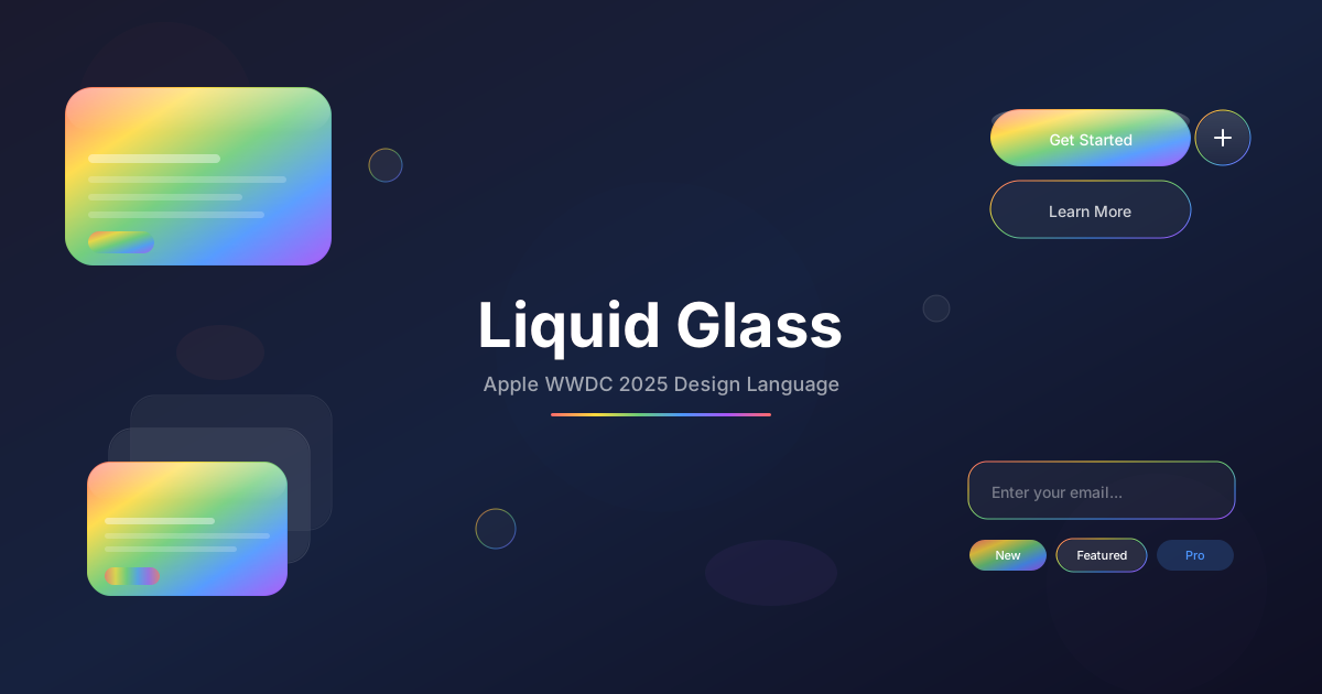
Apple WWDC 2025 发布的全新设计语言,通过 SVG 折射滤镜、彩虹边缘光晕、流体形变动画和多层玻璃堆叠,创造出超越传统毛玻璃的有机流动视觉体验。

Apple 流动玻璃视觉预览
主色rgba(255, 255, 255, 0.1)
次色rgba(255, 255, 255, 0.15)
强调色 1#ff6b6b
强调色 2#4ecdc4
强调色 3#a855f7
强调色 4#007AFF
强调色 5#FF2D55

AI 实现规则

你是一个 Apple Liquid Glass(流动玻璃)设计风格的前端开发专家。这是 Apple WWDC 2025 发布的全新设计语言。生成的所有代码必须严格遵守以下约束:

## 字体设计(最重要!)

### Hero 标题 - 必须使用以下样式:
```jsx
<h1
  className="font-black bg-gradient-to-r from-[#a855f7] via-[#ff2d92] to-[#a855f7] bg-clip-text"
  style={{
    WebkitTextStroke: '3px #4ecdc4',
    WebkitTextFillColor: 'transparent',
    textShadow: '4px 4px 0 rgba(0,0,0,0.5), 0 0 25px rgba(78,205,196,0.6), 0 0 50px rgba(168,85,247,0.4)',
    filter: 'drop-shadow(0 0 15px rgba(78,205,196,0.4))',
  }}
>
  标题文字
</h1>
```

### 副标题 - 青色发光白色文字:
```jsx
<h2
  className="font-bold text-white"
  style={{
    textShadow: '0 0 25px rgba(78,205,196,0.9), 0 0 50px rgba(78,205,196,0.5), 3px 3px 0 rgba(0,0,0,0.4)',
  }}
>
  副标题
</h2>
```

### h2/h3 标题 - 较细描边(2px):
```jsx
<h2
  style={{
    WebkitTextStroke: '2px #4ecdc4',
    textShadow: '3px 3px 0 rgba(0,0,0,0.4), 0 0 15px rgba(78,205,196,0.5)',
  }}
>
  标题
</h2>
```

## 绝对禁止

- 使用普通白色标题(必须有描边+3D阴影+发光)
- 使用细描边(Hero必须3px,h2至少2px)
- 省略3D偏移阴影(4px 4px是必须的)
- 使用低模糊值 backdrop-blur-sm, backdrop-blur(太弱)
- 省略饱和度增强 backdrop-saturate
- 使用直角或小圆角 rounded-none, rounded-sm, rounded
- 使用单一颜色边框(应使用彩虹渐变)
- 使用快速过渡 duration-100, duration-150
- 使用纯色不透明背景 bg-white, bg-black
- 使用浅色背景作为容器底层(应使用深色渐变)

## 必须遵守

- Hero标题:3px青色描边 + 紫色渐变填充 + 3D阴影(4px 4px) + 发光
- 副标题:白色 + 青色发光阴影
- 超高模糊值 backdrop-blur-[40px], backdrop-blur-3xl
- 高饱和度增强 backdrop-saturate-[1.8], backdrop-saturate-200
- 彩虹渐变边框 from-[#ff6b6b] via-[#4ecdc4] to-[#a855f7]
- 顶部高光渐变 from-white/20 to-transparent
- 超大圆角 rounded-3xl, rounded-[24px]
- 流体过渡 transition-all duration-500 ease-out
- 半透明背景 bg-white/10 到 bg-white/15
- 多层堆叠使用 z-index 和不同透明度

## 彩虹配色

边缘折射渐变:
- 红: #ff6b6b
- 橙: #ffd93d
- 绿: #6bcb77
- 青: #4ecdc4
- 紫: #a855f7

背景推荐:
- 深色渐变: from-[#1a1a2e] via-[#16213e] to-[#0f0f23]
- Apple 蓝: #007AFF
- Apple 粉: #FF2D55

## 层级结构

1. 底层:深色渐变背景
2. 中层:流动玻璃容器(backdrop-blur-[40px] backdrop-saturate-[1.8])
3. 边框层:彩虹渐变伪元素 before:
4. 高光层:顶部渐变伪元素 after:
5. 顶层:内容元素

## 核心特效

1. 彩虹边框:使用 before 伪元素 + 渐变背景 + p-[1px]
2. 顶部高光:使用 after 伪元素 + 从白色渐变到透明
3. 液态动画:animation: liquid-morph 8s ease-in-out infinite
4. 发光效果:hover:shadow-[0_0_30px_rgba(168,85,247,0.4)]
5. 压缩反馈:active:scale-[0.98]

## Animation & Interaction Rules

- Fluid Refraction: 通过滑动高光层与内部渐变云团模拟流体折射,不仅模糊,还要有“流动中的光”。
- Spatial Push: hover 需有轻微前推(scale 约 1.01-1.02)并同步扩散阴影,建议使用 cubic-bezier 物理缓动。
- Specular Edges: 交互时边框亮度从 border-white/20 提升至 /40,强化玻璃倒角高光感。
- Silky Squeeze: active 使用柔软压缩(active:scale-95~98)形成硅胶般触感,避免硬切缩放。

## 自检

每次生成代码后检查:
1. Hero标题有3px青色描边和3D偏移阴影
2. 副标题有青色发光效果
3. 有深色渐变背景容器
4. 有 backdrop-blur-[40px] 或 backdrop-blur-3xl
5. 有 backdrop-saturate-[1.8] 或更高
6. 有彩虹渐变边框
7. 有顶部高光条
8. 使用 rounded-[24px] 或更大圆角
9. 过渡时间 >= 500ms
10. 文字可读性良好

组件预览与实现

relative font-medium backdrop-blur-[40px] backdrop-saturate-[1.8] rounded-[20px] text-white before:absolute before:inset-0 before:rounded-[20px] before:p-[1px] before:-z-10 before:bg-gradient-to-r before:from-[#ff6b6b] before:via-[#4ecdc4] before:to-[#a855f7] after:absolute after:inset-[1px] after:rounded-[19px] after:-z-10 after:bg-gradient-to-b after:from-white/20 after:to-transparent transition-all duration-500 ease-out bg-white/10 shadow-lg shadow-black/5 hover:bg-white/15 hover:shadow-xl hover:shadow-[0_0_20px_rgba(168,85,247,0.3)] active:scale-[0.98]
button

按钮

流动玻璃按钮,具有彩虹边缘渐变和液态压缩效果

<button className="
  group relative overflow-hidden px-8 py-4
  bg-white/10 backdrop-blur-[40px] backdrop-saturate-[1.8]
  rounded-[20px]
  text-white font-medium
  before:absolute before:inset-0 before:-z-10 before:rounded-[20px]
  before:bg-gradient-to-r before:from-[#ff6b6b] before:via-[#4ecdc4] before:to-[#a855f7]
  before:p-[1px]
  after:absolute after:inset-[1px] after:-z-10 after:rounded-[19px] after:bg-white/10
  border border-white/20
  shadow-[0_8px_24px_rgba(0,0,0,0.12)]
  hover:bg-white/15 hover:border-white/40
  hover:shadow-[0_18px_42px_rgba(0,0,0,0.22)]
  hover:scale-[1.02]
  active:scale-95
  transition-all duration-500 ease-[cubic-bezier(0.25,1,0.5,1)]
">
  <span className="pointer-events-none absolute inset-0 -translate-x-[130%] skew-x-[-20deg] bg-gradient-to-r from-transparent via-white/30 to-transparent transition-transform duration-700 ease-out group-hover:translate-x-[130%]" />
  <span className="relative z-10">Spatial UI</span>
</button>
card

卡片

流动玻璃卡片,多层深度、彩虹边缘折射效果

<div className="
  group relative overflow-hidden p-6 md:p-8
  bg-white/10 backdrop-blur-[40px] backdrop-saturate-[1.8]
  rounded-[24px]
  border border-white/20
  shadow-[0_12px_30px_rgba(0,0,0,0.18)]
  before:absolute before:inset-0 before:rounded-[24px]
  before:p-[1px] before:-z-10
  before:bg-gradient-to-br before:from-[#ff6b6b] before:via-[#4ecdc4] before:to-[#a855f7]
  after:absolute after:inset-[1px] after:rounded-[23px] after:-z-10
  after:bg-gradient-to-b after:from-white/15 after:to-transparent
  [box-shadow:inset_0_1px_0_rgba(255,255,255,0.4)]
  hover:bg-white/15 hover:border-white/40
  hover:-translate-y-2 hover:scale-[1.01]
  hover:shadow-[0_28px_64px_rgba(0,0,0,0.35)]
  transition-all duration-700 ease-[cubic-bezier(0.25,1,0.5,1)]
">
  <div className="pointer-events-none absolute -inset-1/2 bg-gradient-to-br from-[#ff2d55]/25 via-[#a855f7]/20 to-[#007aff]/25 blur-3xl opacity-45 transition-all duration-1000 ease-out group-hover:rotate-12 group-hover:scale-110" />
  <div className="pointer-events-none absolute inset-0 -translate-x-[130%] skew-x-[-20deg] bg-gradient-to-r from-transparent via-white/20 to-transparent transition-transform duration-1000 ease-out group-hover:translate-x-[130%]" />

  <div className="relative z-10">
  <h3 className="text-xl font-semibold text-white mb-2">
    Liquid Glass Card
  </h3>
  <p className="text-white/80">
    多层玻璃体积感与流体折射叠加,营造空间计算般的前推深度。
  </p>
  </div>
</div>
input

输入框

流动玻璃输入框,焦点时彩虹边框动画

<input
  type="text"
  placeholder="请输入..."
  className="
    w-full px-4 py-3
    bg-white/10 backdrop-blur-[40px] backdrop-saturate-[1.8]
    border border-white/20
    rounded-[16px]
    text-white placeholder-white/50
    focus:outline-none
    focus:bg-white/15
    focus:border-transparent
    focus:[box-shadow:0_0_0_2px_rgba(168,85,247,0.5),0_0_20px_rgba(168,85,247,0.2)]
    transition-all duration-500 ease-out
  "
/>
nav

导航栏

固定顶部的流动玻璃导航栏,带彩虹底边

<nav className="
  fixed top-0 left-0 right-0 z-50
  px-6 py-4
  bg-white/5 backdrop-blur-[40px] backdrop-saturate-[1.8]
  border border-white/10
  [box-shadow:0_1px_0_0_rgba(255,255,255,0.1),inset_0_-1px_0_0_rgba(168,85,247,0.2)]
">
  <div className="max-w-6xl mx-auto flex items-center justify-between">
    <a href="/" className="text-white font-bold text-xl">
      Logo
    </a>
    <div className="flex gap-6">
      <a href="#" className="text-white/70 hover:text-white transition-colors duration-300">
        Home
      </a>
      <a href="#" className="text-white/70 hover:text-white transition-colors duration-300">
        About
      </a>
    </div>
  </div>
</nav>
hero

Hero 区块

带深色渐变背景的流动玻璃 Hero 展示区域

<section className="
  min-h-screen
  flex items-center justify-center
  bg-gradient-to-br from-[#1a1a2e] via-[#16213e] to-[#0f0f23]
  px-6
">
  <div className="
    max-w-2xl mx-auto text-center
    p-8 md:p-12
    relative
    bg-white/10 backdrop-blur-[40px] backdrop-saturate-[1.8]
    rounded-[32px]
    shadow-2xl shadow-black/20
    before:absolute before:inset-0 before:rounded-[32px]
    before:p-[1px] before:-z-10
    before:bg-gradient-to-br before:from-[#ff6b6b] before:via-[#4ecdc4] before:to-[#a855f7]
    after:absolute after:inset-[1px] after:rounded-[31px] after:-z-10
    after:bg-gradient-to-b after:from-white/20 after:to-transparent
  ">
    <h1 className="text-4xl md:text-6xl font-bold text-white mb-6">
      Liquid Glass
    </h1>
    <p className="text-lg text-white/80 mb-8">
      Apple WWDC 2025 全新设计语言
    </p>
    <button className="
      px-8 py-4
      bg-white/15 backdrop-blur-md
      rounded-full
      text-white font-semibold
      border border-white/30
      hover:bg-white/25
      hover:shadow-[0_0_30px_rgba(168,85,247,0.4)]
      transition-all duration-500 ease-out
    ">
      Get Started
    </button>
  </div>
</section>
footer

页脚

流动玻璃页脚,带有顶部彩虹边缘

<footer className="
  px-6 py-8
  bg-white/5 backdrop-blur-[40px] backdrop-saturate-[1.8]
  border border-white/10
  [box-shadow:0_-1px_0_0_rgba(255,255,255,0.1),inset_0_1px_0_0_rgba(168,85,247,0.2)]
">
  <div className="max-w-6xl mx-auto flex flex-col md:flex-row items-center justify-between gap-4">
    <span className="text-white/60 text-sm">Liquid Glass Design</span>
    <div className="flex gap-6">
      <a href="#" className="text-white/70 hover:text-white transition-colors duration-300">
        About
      </a>
      <a href="#" className="text-white/70 hover:text-white transition-colors duration-300">
        Contact
      </a>
    </div>
  </div>
</footer>

交互展示

适用范围与设计理念

应用场景

marketingsaasecommerce

视觉关键词

brand-inspiredAppleLiquid Glass流动玻璃彩虹边缘折射多层堆叠WWDC 2025

Liquid Glass(流动玻璃)是 Apple WWDC 2025 发布的革命性设计语言,超越传统毛玻璃效果,通过光线折射、彩虹边缘和流体动画创造出真正有机、流动的视觉体验。

核心理念:

- 霓虹描边文字:标题使用 text-stroke 配合青色发光描边,产生霓虹效果

- 渐变填充文字:紫色到品红的渐变填充,配合 3D 阴影产生立体感

- 彩虹折射边缘:边缘呈现棱镜效果,红橙黄绿青蓝紫的光谱渐变

- 流体形变:圆角随交互产生液态变形动画

- 多层深度:3+ 层玻璃堆叠产生丰富的空间层次

- 高饱和度:backdrop-saturate-180 让背景色彩更加鲜艳

## 字体设计核心(最重要的视觉元素)

### Hero 标题(主标题)

紫色渐变填充 + 粗青色描边(3px) + 3D偏移阴影:

- background: linear-gradient(to right, #a855f7, #ff2d92, #a855f7)

- -webkit-text-stroke: 3px #4ecdc4

- text-shadow: 4px 4px 0 rgba(0,0,0,0.5), 0 0 20px rgba(78,205,196,0.5), 0 0 40px rgba(168,85,247,0.3)

- filter: drop-shadow(0 0 15px rgba(78,205,196,0.4))

### 副标题(青色发光)

白色/青色文字 + 发光效果(无描边):

- color: white 或 gradient cyan

- text-shadow: 0 0 20px rgba(78,205,196,0.8), 0 0 40px rgba(78,205,196,0.4), 2px 2px 0 rgba(0,0,0,0.3)

### h1/h2 标题

较细描边(2px) + 发光 + 轻微3D:

- -webkit-text-stroke: 2px #4ecdc4

- text-shadow: 3px 3px 0 rgba(0,0,0,0.4), 0 0 15px rgba(78,205,196,0.4)

### 正文

高对比度白色,保证可读性:

- color: text-white/80 到 text-white/90

与 Glassmorphism 的区别:

| 特性 | Glassmorphism | Liquid Glass |

|------|---------------|--------------|

| 边框 | border-white/20 | 彩虹渐变边框 |

| 模糊 | blur-2xl | blur-3xl + saturate-180 |

| 动画 | 简单过渡 | 液态形变 morph |

| 深度 | 单层 | 多层堆叠 |

| 文字 | 普通白色 | 渐变+粗描边+3D阴影 |

| 描边 | 无 | 3px青色霓虹描边 |

| 阴影 | 普通投影 | 3D偏移+发光组合 |

应该这样做

  • Hero标题使用粗描边 -webkit-text-stroke: 3px #4ecdc4
  • Hero标题使用3D偏移阴影 text-shadow: 4px 4px 0 rgba(0,0,0,0.5)
  • Hero标题使用渐变填充 bg-gradient-to-r from-[#a855f7] via-[#ff2d92] to-[#a855f7]
  • 副标题使用青色发光 text-shadow: 0 0 20px rgba(78, 205, 196, 0.8)
  • 使用超高模糊值 backdrop-blur-[40px] 或 backdrop-blur-3xl
  • 添加饱和度增强 backdrop-saturate-[1.8] 或 backdrop-saturate-200
  • 使用彩虹渐变边框模拟光线折射效果
  • 使用超大圆角 rounded-3xl 或 rounded-[24px]
  • 使用流体动画 transition-all duration-500 ease-out

避免这样做

  • 禁止使用普通白色标题(必须使用渐变+粗描边+3D阴影)
  • 禁止省略3D偏移阴影(4px 4px是必须的)
  • 禁止使用细描边(Hero必须3px,h1/h2至少2px)
  • 禁止省略文字发光效果(缺少霓虹感)
  • 禁止使用低模糊值 backdrop-blur-sm(太弱)
  • 禁止省略饱和度增强(颜色会显得暗淡)
  • 禁止使用直角或小圆角(rounded-none, rounded-sm)
  • 禁止使用快速过渡(duration-100, duration-150)

全局 CSS

/* Liquid Glass 全局样式 */

/* 流动玻璃变量 */
:root {
  --liquid-glass-bg: rgba(255, 255, 255, 0.1);
  --liquid-glass-bg-hover: rgba(255, 255, 255, 0.15);
  --liquid-glass-blur: 40px;
  --liquid-glass-saturate: 1.8;
  --liquid-glass-border-start: #ff6b6b;
  --liquid-glass-border-mid: #4ecdc4;
  --liquid-glass-border-end: #a855f7;
}

/* 彩虹边框渐变 */
.liquid-glass-rainbow-border {
  background: linear-gradient(
    135deg,
    var(--liquid-glass-border-start) 0%,
    #ffd93d 25%,
    #6bcb77 50%,
    var(--liquid-glass-border-mid) 75%,
    var(--liquid-glass-border-end) 100%
  );
}

/* 基础流动玻璃类 */
.liquid-glass {
  background: var(--liquid-glass-bg);
  backdrop-filter: blur(var(--liquid-glass-blur)) saturate(var(--liquid-glass-saturate));
  -webkit-backdrop-filter: blur(var(--liquid-glass-blur)) saturate(var(--liquid-glass-saturate));
  border-radius: 24px;
}

/* 顶部高光条 */
.liquid-glass-highlight {
  box-shadow: inset 0 1px 0 rgba(255, 255, 255, 0.4);
  background-image: linear-gradient(
    to bottom,
    rgba(255, 255, 255, 0.2),
    transparent 50%
  );
}

/* 流体形变动画 */
@keyframes liquid-morph {
  0%, 100% { border-radius: 24px; }
  25% { border-radius: 28px 20px 26px 22px; }
  50% { border-radius: 22px 26px 20px 28px; }
  75% { border-radius: 26px 22px 28px 20px; }
}

.liquid-glass-morph {
  animation: liquid-morph 8s ease-in-out infinite;
}

/* 脉冲发光动画 */
@keyframes liquid-glow {
  0%, 100% { box-shadow: 0 0 20px rgba(168, 85, 247, 0.3); }
  50% { box-shadow: 0 0 40px rgba(168, 85, 247, 0.5); }
}

.liquid-glass-glow {
  animation: liquid-glow 3s ease-in-out infinite;
}

/* 彩虹边缘脉冲 */
@keyframes rainbow-pulse {
  0%, 100% { opacity: 0.6; }
  50% { opacity: 1; }
}

.liquid-glass-rainbow-pulse {
  animation: rainbow-pulse 2s ease-in-out infinite;
}

/* 多层玻璃堆叠 */
.liquid-glass-stack-1 { --liquid-glass-bg: rgba(255, 255, 255, 0.08); }
.liquid-glass-stack-2 { --liquid-glass-bg: rgba(255, 255, 255, 0.12); }
.liquid-glass-stack-3 { --liquid-glass-bg: rgba(255, 255, 255, 0.16); }

/* 深色渐变容器背景 */
.liquid-glass-container {
  background: linear-gradient(135deg, #1a1a2e 0%, #16213e 50%, #0f0f23 100%);
  min-height: 100vh;
}

布局、色板与 Tokens

主色rgba(255, 255, 255, 0.1)
次色rgba(255, 255, 255, 0.15)
强调色 1#ff6b6b
强调色 2#4ecdc4
强调色 3#a855f7
强调色 4#007AFF
强调色 5#FF2D55
{
  "border": {
    "width": "border",
    "color": "border-white/20",
    "radius": "rounded-[24px]",
    "style": "border-solid"
  },
  "shadow": {
    "sm": "shadow-lg shadow-black/5",
    "md": "shadow-xl shadow-black/10",
    "lg": "shadow-2xl shadow-black/15",
    "none": "shadow-none",
    "hover": "hover:shadow-xl hover:shadow-black/15",
    "focus": "focus:shadow-[0_0_0_2px_rgba(168,85,247,0.5),0_0_20px_rgba(168,85,247,0.2)]",
    "colored": {
      "inner": "[box-shadow:inset_0_1px_0_rgba(255,255,255,0.4)]",
      "glow": "shadow-[0_0_30px_rgba(168,85,247,0.4)]",
      "rainbow": "shadow-[0_0_20px_rgba(255,107,107,0.3),0_0_40px_rgba(78,205,196,0.2),0_0_60px_rgba(168,85,247,0.1)]",
      "blue": "shadow-[0_0_20px_rgba(0,122,255,0.3)]",
      "pink": "shadow-[0_0_20px_rgba(255,45,85,0.3)]"
    }
  },
  "interaction": {
    "transition": "transition-all duration-500 ease-out",
    "active": "active:scale-[0.98]",
    "hoverOpacity": "hover:bg-white/15"
  },
  "typography": {
    "heading": "font-black bg-gradient-to-r from-[#a855f7] via-[#ff2d92] to-[#a855f7] bg-clip-text text-transparent",
    "body": "text-white/80",
    "mono": "font-mono text-white/90",
    "sizes": {
      "hero": "text-5xl md:text-7xl lg:text-8xl",
      "h1": "text-4xl md:text-5xl",
      "h2": "text-3xl md:text-4xl",
      "h3": "text-xl md:text-2xl",
      "body": "text-sm md:text-base",
      "small": "text-xs"
    },
    "subtitle": "font-bold text-white",
    "neonStroke": {
      "hero": {
        "WebkitTextStroke": "3px #4ecdc4",
        "textShadow": "4px 4px 0 rgba(0,0,0,0.5), 0 0 20px rgba(78,205,196,0.5), 0 0 40px rgba(168,85,247,0.3)",
        "filter": "drop-shadow(0 0 15px rgba(78,205,196,0.4))"
      },
      "subtitle": {
        "textShadow": "0 0 20px rgba(78,205,196,0.8), 0 0 40px rgba(78,205,196,0.4), 2px 2px 0 rgba(0,0,0,0.3)"
      },
      "heading": {
        "WebkitTextStroke": "2px #4ecdc4",
        "textShadow": "3px 3px 0 rgba(0,0,0,0.4), 0 0 15px rgba(78,205,196,0.4)",
        "filter": "drop-shadow(0 0 10px rgba(78,205,196,0.3))"
      }
    }
  },
  "spacing": {
    "section": "py-16 md:py-24",
    "container": "px-6 md:px-8",
    "card": "p-6 md:p-8",
    "gap": {
      "sm": "gap-4",
      "md": "gap-6",
      "lg": "gap-8"
    }
  },
  "colors": {
    "background": {
      "primary": "bg-white/10 backdrop-blur-[40px] backdrop-saturate-[1.8]",
      "secondary": "bg-white/15 backdrop-blur-[40px] backdrop-saturate-[1.8]",
      "accent": [
        "bg-gradient-to-br from-[#1a1a2e] via-[#16213e] to-[#0f0f23]",
        "bg-gradient-to-r from-[#ff2d92] to-[#a855f7]",
        "bg-gradient-to-r from-[#4ecdc4] to-[#6bcb77]"
      ]
    },
    "text": {
      "primary": "text-white",
      "secondary": "text-white/80",
      "muted": "text-white/50"
    },
    "button": {
      "primary": "bg-gradient-to-r from-[#ff2d92] to-[#a855f7] text-white font-bold",
      "secondary": "bg-white/10 text-white backdrop-blur-[40px] backdrop-saturate-[1.8]"
    }
  },
  "forbidden": {
    "classes": [
      "rounded-none",
      "rounded-sm",
      "rounded",
      "bg-white",
      "bg-black",
      "bg-gray-100",
      "bg-gray-900",
      "shadow-[0px_0px_0px",
      "backdrop-blur-sm",
      "backdrop-blur",
      "duration-100",
      "duration-150",
      "duration-200",
      "border-black",
      "border-gray-500",
      "border-white",
      "bg-gray-50",
      "bg-slate-100"
    ],
    "patterns": [
      "^rounded-none",
      "^rounded-sm$",
      "^rounded$",
      "^bg-(?!white\\/|gradient|transparent)",
      "^border-(?!white\\/|transparent)",
      "^backdrop-blur$",
      "^backdrop-blur-sm$",
      "^duration-(100|150|200)$"
    ],
    "reasons": {
      "rounded-none": "Liquid Glass requires large rounded corners (rounded-[24px] or rounded-3xl)",
      "rounded-sm": "Liquid Glass requires large rounded corners (rounded-[24px] or rounded-3xl)",
      "bg-white": "Liquid Glass uses semi-transparent backgrounds (bg-white/10 to bg-white/15)",
      "bg-black": "Liquid Glass requires semi-transparent backgrounds, not opaque colors",
      "backdrop-blur-sm": "Liquid Glass requires high blur (backdrop-blur-[40px] or backdrop-blur-3xl)",
      "backdrop-blur": "Liquid Glass requires high blur (backdrop-blur-[40px] or backdrop-blur-3xl)",
      "duration-100": "Liquid Glass uses fluid animations (duration-500 or higher)",
      "duration-150": "Liquid Glass uses fluid animations (duration-500 or higher)",
      "duration-200": "Liquid Glass uses fluid animations (duration-500 or higher)",
      "border-white": "Liquid Glass uses gradient borders for rainbow refraction effect"
    }
  },
  "required": {
    "button": [
      "bg-white/10 backdrop-blur-[40px] backdrop-saturate-[1.8]",
      "rounded-[20px]",
      "text-white",
      "before:absolute before:inset-0 before:rounded-[20px] before:p-[1px] before:-z-10",
      "before:bg-gradient-to-r before:from-[#ff6b6b] before:via-[#4ecdc4] before:to-[#a855f7]",
      "after:absolute after:inset-[1px] after:rounded-[19px] after:-z-10",
      "after:bg-gradient-to-b after:from-white/20 after:to-transparent",
      "hover:bg-white/15 hover:shadow-[0_0_20px_rgba(168,85,247,0.3)]",
      "transition-all duration-500 ease-out"
    ],
    "card": [
      "bg-white/10 backdrop-blur-[40px] backdrop-saturate-[1.8]",
      "rounded-[24px]",
      "shadow-xl shadow-black/10",
      "before:absolute before:inset-0 before:rounded-[24px] before:p-[1px] before:-z-10",
      "before:bg-gradient-to-br before:from-[#ff6b6b] before:via-[#4ecdc4] before:to-[#a855f7]",
      "after:absolute after:inset-[1px] after:rounded-[23px] after:-z-10",
      "after:bg-gradient-to-b after:from-white/15 after:to-transparent",
      "[box-shadow:inset_0_1px_0_rgba(255,255,255,0.4)]"
    ],
    "input": [
      "bg-white/10 backdrop-blur-[40px] backdrop-saturate-[1.8]",
      "border border-white/20",
      "rounded-[16px]",
      "text-white placeholder-white/50",
      "focus:outline-none focus:bg-white/15",
      "focus:border-transparent",
      "focus:shadow-[0_0_0_2px_rgba(168,85,247,0.5),0_0_20px_rgba(168,85,247,0.2)]",
      "transition-all duration-500 ease-out"
    ]
  }
}

示例提示词

Apple 风格控制中心

iOS 风格的流动玻璃控制中心

用 Liquid Glass 风格创建一个 iOS 风格控制中心,要求:

## 核心效果
- 背景:深色渐变 bg-gradient-to-br from-[#1a1a2e] via-[#16213e] to-[#0f0f23]
- 主面板:bg-white/10 backdrop-blur-[40px] backdrop-saturate-[1.8] rounded-[24px]
- 彩虹边框:使用 before 伪元素实现渐变边框
- 顶部渐变:使用 after 伪元素实现高光

## 控制模块
- 网格布局:2x4 圆角正方形网格
- 每个磁贴:bg-white/10 rounded-[16px] 带彩虹边框
- 激活状态:bg-[#007AFF]/40 shadow-[0_0_20px_rgba(0,122,255,0.4)]

## 交互
- 开关控件:胶囊形状,开启时带发光
- 滑块控件:流动玻璃轨道,圆形滑块带发光
- 所有过渡:transition-all duration-500 ease-out

流动玻璃音乐播放器

Apple Music 风格播放界面

用 Liquid Glass 风格设计一个音乐播放器界面,要求:

## 背景层
- 当前播放歌曲的模糊封面作为背景
- 叠加深色渐变:bg-gradient-to-b from-black/40 via-transparent to-black/60

## 播放卡片(多层玻璃)
- 外层容器:bg-white/8 backdrop-blur-[40px] backdrop-saturate-[1.8] rounded-[32px]
- 彩虹边框:before 伪元素实现
- 内层面板:bg-white/12 rounded-[28px] p-6

## 控件设计
- 专辑封面:rounded-[20px] shadow-2xl 带发光边框
- 播放按钮:w-16 h-16 bg-white/15 rounded-full 带脉冲发光动画
- 上下曲按钮:w-12 h-12 bg-white/10 rounded-full
- 进度条:h-1 bg-white/20 rounded-full,滑块 w-4 h-4 带发光

## 动画
- 专辑封面:hover 时微微放大和发光
- 播放按钮:按下时液态压缩效果
- 进度条滑块:拖动时发光增强

流动玻璃登录页面

现代登录表单设计

用 Liquid Glass 风格创建一个登录页面,要求:

## 全屏背景
- 深色渐变:bg-gradient-to-br from-[#1a1a2e] via-[#16213e] to-[#0f0f23]
- 添加装饰性彩虹光斑元素

## 登录卡片
- 居中容器:max-w-md mx-auto
- 流动玻璃:bg-white/10 backdrop-blur-[40px] backdrop-saturate-[1.8]
- 圆角:rounded-[32px]
- 彩虹边框:before 伪元素
- 顶部高光:after 伪元素

## 表单元素
- 输入框:bg-white/10 backdrop-blur-xl border border-white/20 rounded-[16px]
- 焦点态:focus:bg-white/15 focus:shadow-[0_0_0_2px_rgba(168,85,247,0.5)]
- 占位符:placeholder:text-white/50

## 按钮
- 主按钮:彩虹渐变边框 + 发光 hover 效果
- 次按钮:bg-transparent border border-white/30 text-white/80
- 社交登录:bg-white/10 hover:bg-white/15 rounded-[12px]

## 额外元素
- Logo:text-white text-2xl font-bold 带发光效果
- 分隔线:border border-white/20 my-6
- 链接:text-white/70 hover:text-white