本页出处
设计风格资料库
内容来自 luckymaomi 的 UI 风格库(复刻版),以 MIT 许可 提供。本站镜像收录,仅作学习参考;这一页的原始地址是 原站页面。
← 回到导览访问原站仓库
返回风格库
视觉风格expressive

现代渐变风

Modern Gradient

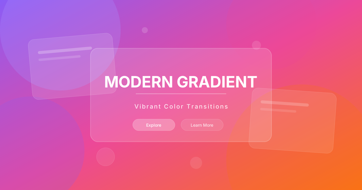
充满活力的现代渐变风格,多彩渐变背景、玻璃质感卡片、动态光影效果。适合创业公司、数字产品、活动页面。

现代渐变风视觉预览
主色#8b5cf6
次色#1e1b4b
强调色 1#06b6d4
强调色 2#ec4899
强调色 3#f59e0b
强调色 4#8587ff

AI 实现规则

STYLE: Modern Gradient
TYPE: Vibrant, energetic gradient design

MUST USE:
- Gradient backgrounds: bg-gradient-to-r from-violet-500 to-fuchsia-500
- Glass morphism cards: backdrop-blur-xl bg-white/10 border-white/20
- Dark base background: bg-slate-950 or bg-[#1e1b4b]
- Gradient text: bg-gradient-to-r bg-clip-text text-transparent
- Colored shadows: shadow-violet-500/25
- Large rounded corners: rounded-2xl, rounded-3xl
- Glow orbs for decoration: blur-3xl opacity-30

MUST AVOID:
- Solid color backgrounds (main areas)
- Monotone gray schemes
- Sharp corners (rounded-none)
- Old-style gradients (vertical button gradients)
- Visual clutter from too many gradients
- Dark text on dark gradients

COLOR COMBOS:
- Violet to Fuchsia: from-violet-500 to-fuchsia-500
- Cyan to Blue: from-cyan-500 to-blue-500
- Pink to Orange: from-pink-500 to-orange-500
- Multi-color: from-violet-500 via-fuchsia-500 to-cyan-500

TYPOGRAPHY:
- Headings: White or gradient text
- Body: text-white/70 or text-white/80
- Font weight: font-medium to font-semibold

## Animation & Interaction Rules

- Gradient Flow: 渐变交互应包含色带位移(如 bg-[length:200%_auto] + hover:bg-right),避免静态变亮/变暗。
- Neon Dispersion: hover 时彩色阴影扩散半径显著增加,强化未来感光晕。
- Zero-Gravity Float: 卡片与按钮可轻微上浮并微缩放,建议 duration-500 + ease-out。
- Luminous Borders: 半透明边框在 hover 时提亮到品牌色透明度,形成被内部光线点亮的边缘。

组件预览与实现

font-medium rounded-2xl transition-all duration-300 bg-gradient-to-r from-violet-500 to-fuchsia-500 text-white shadow-lg shadow-violet-500/25 hover:shadow-xl hover:shadow-violet-500/30 hover:from-violet-600 hover:to-fuchsia-600 active:scale-[0.98]
button

按钮

Modern Gradient 风格的渐变按钮

// Primary Gradient Button
<button className="px-8 py-4 bg-gradient-to-r from-violet-500 via-fuchsia-500 to-violet-500 bg-[length:200%_auto] text-white rounded-2xl font-bold tracking-wide shadow-[0_8px_20px_rgba(167,139,250,0.3)] hover:bg-right hover:shadow-[0_15px_30px_rgba(217,70,239,0.4)] hover:-translate-y-1 hover:scale-[1.02] active:scale-95 transition-all duration-500 ease-out">
  Get Started
</button>

// Outline Gradient Button
<button className="px-6 py-3 rounded-2xl font-medium relative group hover:-translate-y-1 hover:scale-[1.02] transition-all duration-500 ease-out">
  <span className="absolute inset-0 bg-gradient-to-r from-violet-500 to-fuchsia-500 rounded-2xl" />
  <span className="absolute inset-[2px] bg-slate-950 rounded-[14px] group-hover:bg-slate-900 transition-colors duration-500" />
  <span className="relative bg-gradient-to-r from-violet-400 to-fuchsia-400 bg-clip-text text-transparent">
    Learn More
  </span>
</button>

// Glass Button
<button className="px-6 py-3 backdrop-blur-xl bg-white/10 border border-white/20 text-white rounded-2xl font-medium hover:bg-white/20 hover:border-violet-400/50 hover:shadow-[0_12px_30px_rgba(139,92,246,0.28)] hover:-translate-y-1 transition-all duration-500 ease-out">
  Explore
</button>
card

卡片

Modern Gradient 风格的玻璃卡片

<div className="group backdrop-blur-xl bg-white/10 border border-white/20 rounded-3xl p-8 hover:bg-white/15 hover:border-violet-400/50 hover:shadow-[0_20px_50px_rgba(167,139,250,0.18)] hover:-translate-y-2 hover:scale-[1.02] transition-all duration-500 ease-out cursor-pointer">
  <div className="w-14 h-14 bg-gradient-to-br from-violet-500 to-fuchsia-500 rounded-2xl flex items-center justify-center mb-6 group-hover:scale-110 group-hover:rotate-12 transition-transform duration-500 ease-out">
    <Icon className="w-7 h-7 text-white" />
  </div>
  <h3 className="text-xl font-semibold text-white mb-3">Feature Title</h3>
  <p className="text-white/70 leading-relaxed group-hover:text-white/85 transition-colors duration-500">
    Stunning visual effects with modern gradient aesthetics and fluid color flow.
  </p>
</div>
input

输入框

Modern Gradient 风格的输入框

<div className="space-y-2">
  <label className="block text-sm font-medium text-white/70">Email Address</label>
  <input
    type="email"
    className="w-full px-5 py-3.5 backdrop-blur-xl bg-white/10 border border-white/20 rounded-2xl text-white placeholder:text-white/40 focus:outline-none focus:border-violet-500/50 focus:ring-2 focus:ring-violet-500/20 transition-all duration-300"
    placeholder="you@example.com"
  />
</div>

交互展示

适用范围与设计理念

应用场景

marketingecommercesaas

视觉关键词

渐变现代活力创业数字动态科技感expressiveboldvibrant

Modern Gradient 风格通过丰富的渐变色彩和光影效果创造视觉冲击力和活力感。

核心理念:

- 视觉活力:渐变色彩带来动感和能量

- 深度层次:通过渐变和透明度创造深度

- 现代科技:传达创新和前沿的品牌形象

- 情感共鸣:色彩激发积极的情感反应

设计原则:

- 视觉一致性:所有组件必须遵循统一的视觉语言,从色彩到字体到间距保持谐调

- 层次分明:通过颜色深浅、字号大小、留白空间建立清晰的信息层级

- 交互反馈:每个可交互元素都必须有明确的 hover、active、focus 状态反馈

- 响应式适配:设计必须在移动端、平板、桌面端上保持一致的体验

- 无障碍性:确保色彩对比度符合 WCAG 2.1 AA 标准,所有交互元素可键盘访问

应该这样做

  • 使用 bg-gradient-to-r from-violet-500 via-purple-500 to-fuchsia-500 等渐变
  • 卡片使用 backdrop-blur-xl bg-white/10 的玻璃效果
  • 按钮使用渐变 + hover 时渐变位移效果
  • 深色背景 bg-slate-950 或 bg-[#1e1b4b]
  • 文字使用 bg-gradient-to-r bg-clip-text text-transparent 渐变效果
  • 使用 rounded-2xl 或 rounded-3xl 圆角
  • 添加光晕效果 blur-3xl opacity-30 作为装饰

避免这样做

  • 禁止使用纯色背景(主要区域)
  • 禁止使用单调的灰色调
  • 禁止使用尖锐边角 rounded-none
  • 禁止使用老式渐变(如垂直渐变的按钮)
  • 禁止过度使用渐变导致视觉混乱
  • 禁止在深色渐变上使用深色文字

全局 CSS

/* Modern Gradient Global Styles */
@layer base {
  body {
    @apply bg-slate-950 text-white antialiased;
  }
}

/* Gradient text utility */
.gradient-text {
  @apply bg-gradient-to-r from-violet-400 via-fuchsia-400 to-pink-400 bg-clip-text text-transparent;
}

/* Glow orb decoration */
.glow-orb {
  @apply absolute blur-3xl opacity-30 pointer-events-none;
}

/* Animated gradient background */
@keyframes gradient-shift {
  0%, 100% { background-position: 0% 50%; }
  50% { background-position: 100% 50%; }
}

.animated-gradient {
  background-size: 200% 200%;
  animation: gradient-shift 8s ease infinite;
}
/* Modern Gradient Design Tokens */
:root {
  --modern-gradient-primary: #8b5cf6;
  --modern-gradient-secondary: #1e1b4b;
  --modern-gradient-accent: #06b6d4;
  --modern-gradient-glow: rgba(139, 92, 246, 0.3);
}

.modern-gradient-card {
  position: relative;
  overflow: hidden;
}

.modern-gradient-card::before {
  content: "";
  position: absolute;
  inset: 0;
  opacity: 0;
  transition: opacity 0.3s ease;
  background: linear-gradient(135deg, rgba(139, 92, 246, 0.05), transparent);
  pointer-events: none;
}

.modern-gradient-card:hover::before {
  opacity: 1;
}

.modern-gradient-frosted {
  backdrop-filter: blur(12px) saturate(180%);
  -webkit-backdrop-filter: blur(12px) saturate(180%);
  background: rgba(139, 92, 246, 0.08);
}

.modern-gradient-accent-corner {
  clip-path: polygon(0 0, 100% 0, 100% calc(100% - 2rem), calc(100% - 2rem) 100%, 0 100%);
}

.modern-gradient-animate-in {
  animation: modern-gradient-fade-in 0.5s ease-out both;
}

布局、色板与 Tokens

主色#8b5cf6
次色#1e1b4b
强调色 1#06b6d4
强调色 2#ec4899
强调色 3#f59e0b
强调色 4#8587ff
{
  "border": {
    "width": "border",
    "color": "border-white/20",
    "radius": "rounded-2xl",
    "style": "border-solid"
  },
  "shadow": {
    "sm": "shadow-lg shadow-violet-500/20",
    "md": "shadow-xl shadow-violet-500/25",
    "lg": "shadow-2xl shadow-violet-500/30",
    "none": "shadow-none",
    "hover": "shadow-2xl shadow-violet-500/40",
    "focus": "ring-2 ring-violet-500/50",
    "colored": {
      "violet": "shadow-xl shadow-violet-500/30",
      "fuchsia": "shadow-xl shadow-fuchsia-500/30",
      "cyan": "shadow-xl shadow-cyan-500/30"
    }
  },
  "interaction": {
    "transition": "transition-all duration-300",
    "active": "active:scale-95",
    "hoverScale": "hover:scale-[1.02]",
    "hoverOpacity": "hover:opacity-90"
  },
  "typography": {
    "heading": "font-bold",
    "body": "font-normal",
    "mono": "font-mono",
    "sizes": {
      "hero": "text-4xl md:text-6xl lg:text-7xl",
      "h1": "text-3xl md:text-5xl",
      "h2": "text-2xl md:text-4xl",
      "h3": "text-xl md:text-2xl",
      "body": "text-sm md:text-base",
      "small": "text-xs"
    }
  },
  "spacing": {
    "section": "py-20 md:py-32",
    "container": "px-4 md:px-8",
    "card": "p-6 md:p-8",
    "gap": {
      "sm": "gap-4",
      "md": "gap-6 md:gap-8",
      "lg": "gap-8 md:gap-16"
    }
  },
  "colors": {
    "background": {
      "primary": "bg-slate-950",
      "secondary": "bg-slate-900",
      "accent": [
        "bg-gradient-to-r from-violet-500 to-fuchsia-500",
        "bg-gradient-to-r from-cyan-500 to-blue-500"
      ]
    },
    "text": {
      "primary": "text-white",
      "secondary": "text-white/80",
      "muted": "text-white/60"
    },
    "button": {
      "primary": "bg-gradient-to-r from-violet-600 to-fuchsia-600 text-white",
      "secondary": "backdrop-blur-xl bg-white/10 border border-white/20 text-white",
      "danger": "bg-gradient-to-r from-red-600 to-orange-600 text-white"
    }
  },
  "forbidden": {
    "classes": [
      "bg-white",
      "bg-gray-50",
      "bg-slate-50",
      "shadow-sm",
      "shadow-md",
      "text-gray-900",
      "text-black",
      "rounded-none"
    ],
    "patterns": [
      "^bg-white$",
      "^bg-gray-[1-4]00",
      "^bg-slate-[1-4]00",
      "^text-gray-[89]00",
      "^text-black"
    ],
    "reasons": {
      "bg-white": "Modern Gradient uses dark backgrounds for contrast",
      "shadow-sm": "Use colored shadows: shadow-xl shadow-violet-500/30",
      "text-black": "Use text-white or text-white/80 on dark backgrounds"
    }
  },
  "required": {
    "button": [
      "px-6 py-3",
      "rounded-2xl",
      "font-medium",
      "transition-all duration-300"
    ],
    "card": [
      "backdrop-blur-xl",
      "bg-white/10",
      "border border-white/20",
      "rounded-3xl"
    ],
    "input": [
      "px-5 py-3.5",
      "backdrop-blur-xl",
      "bg-white/10",
      "border border-white/20",
      "rounded-2xl",
      "text-white",
      "placeholder:text-white/40",
      "focus:border-violet-500/50",
      "focus:ring-2 focus:ring-violet-500/20"
    ]
  }
}

示例提示词

创业着陆页

生成现代创业公司着陆页

Create a startup landing using Modern Gradient style:
- Full-width hero with animated gradient background
- Floating glass cards with features
- Gradient CTAs with shadow glow
- Stats section with gradient numbers
- Testimonials in glass cards
- Dark footer with gradient accents
- Add decorative glow orbs

SaaS 着陆页

生成 现代渐变风风格的 SaaS 产品着陆页

Create a SaaS landing page using Modern Gradient style with hero section, feature grid, testimonials, pricing table, and footer.

作品集展示

生成 现代渐变风风格的作品集页面

Create a portfolio showcase page using Modern Gradient style with project grid, about section, contact form, and consistent visual language.