本页出处
设计风格资料库
内容来自 luckymaomi 的 UI 风格库(复刻版),以 MIT 许可 提供。本站镜像收录,仅作学习参考;这一页的原始地址是 原站页面。
← 回到导览访问原站仓库
返回风格库
视觉风格minimal

Notion 风格

Notion Style

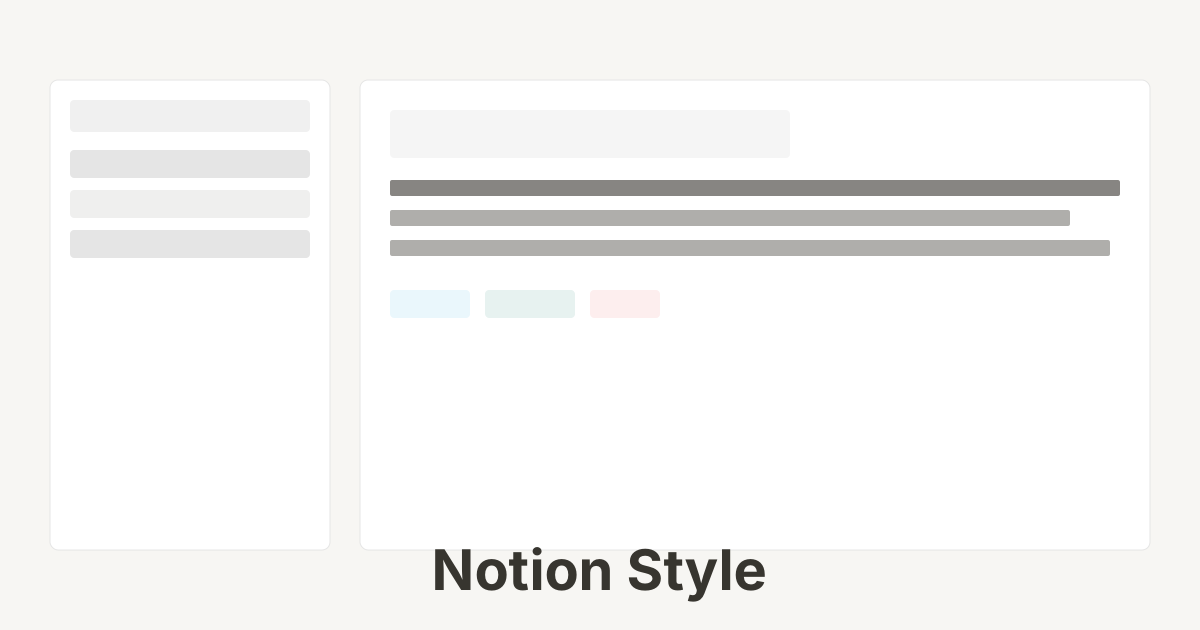
极简清爽的文档工具风格,强调内容可读性和功能性,使用微妙的边框、柔和的悬停效果和清晰的文字层级。

Notion 风格视觉预览
主色#37352f
次色#ffffff
强调色 1#2eaadc
强调色 2#eb5757
强调色 3#0f7b6c
强调色 4#a083ff

AI 实现规则

你是一个 Notion Style 设计风格的前端开发专家。生成的所有代码必须严格遵守以下约束:

## 绝对禁止

- 使用大圆角 rounded-2xl, rounded-3xl, rounded-full
- 使用渐变背景 bg-gradient-*
- 使用重阴影 shadow-xl, shadow-2xl
- 使用过于鲜艳的颜色
- 过度装饰和动画

## 必须遵守

- 使用 Notion 米色背景 bg-[#f7f6f3]
- 微妙边框 border border-gray-200
- 小圆角 rounded-md 或 rounded-lg
- 轻柔悬停 hover:bg-gray-100
- 清晰的文字层级

## 配色

主色调:
- 文字: text-[#37352f] (Notion 深灰)
- 背景: bg-white, bg-[#f7f6f3]
- 边框: border-gray-200

强调色:
- 蓝色: text-[#2eaadc], bg-blue-50
- 红色: text-[#eb5757], bg-red-50
- 绿色: text-[#0f7b6c], bg-green-50
- 黄色: text-[#dfab01], bg-yellow-50

## 交互

- 悬停: hover:bg-[#efedea](Block Highlighting,极低信噪比)
- 选中: bg-[#e3e1db](Micro-click,仅加深背景)
- 聚焦: focus:ring-2 focus:ring-blue-500/30

## Animation & Interaction Rules

- Ultimate Restraint: 严格禁止任何 translate 或 scale 动画,文档工具要求绝对的视觉稳定性。
- Block Highlighting: hover 背景从 #f7f6f3 变为 #efedea(约 5% 亮度变化),transition-colors duration-150,信噪比刻意保持极低。
- Drag Handle Illusion: 卡片/列表项使用 group 类,左侧 ⋮⋮ 拖拽手柄 opacity-0 group-hover:opacity-100 transition-opacity duration-150,这是 Notion 标志性 UX 模式。
- Micro-click: active 状态仅加深背景至 #e3e1db,无其他任何视觉变化,体现效率工具的克制感。

## 自检

每次生成代码后检查:
1. 没有使用渐变
2. 圆角适中(rounded-md 或 rounded-lg)
3. 阴影轻柔(shadow-sm 或 shadow-md)
4. 整体感觉简洁清爽

组件预览与实现

font-medium text-sm rounded-md transition-colors duration-150 bg-[#2383e2] text-white hover:bg-gray-100 active:bg-gray-200
button

按钮

Notion 风格按钮,极度克制的 Block Highlighting + Micro-click 反馈

<button className="
  px-3 py-1.5
  bg-transparent
  rounded
  text-sm font-medium text-[#37352f]
  hover:bg-[#efedea]
  active:bg-[#e3e1db]
  transition-colors duration-150
  flex items-center gap-2
">
  <svg className="w-4 h-4 text-gray-500" fill="none" stroke="currentColor" viewBox="0 0 24 24">
    <path strokeLinecap="round" strokeLinejoin="round" strokeWidth={1.5} d="M12 4v16m8-8H4" />
  </svg>
  New page
</button>
card

卡片

Notion 风格卡片,Drag Handle Illusion + Block Highlighting,零位移零缩放

<div className="
  group p-3 -ml-3
  rounded-md
  hover:bg-[#efedea]
  transition-colors duration-150
  cursor-pointer flex gap-2
">
  {/* Drag handle — revealed on hover (Drag Handle Illusion) */}
  <div className="flex-none pt-0.5 opacity-0 group-hover:opacity-100 transition-opacity duration-150 select-none">
    <span className="text-gray-400 text-sm cursor-grab">⋮⋮</span>
  </div>
  <div>
    <h3 className="text-lg font-semibold text-[#37352f] mb-1 group-hover:underline decoration-gray-300 underline-offset-4">
      Page Title
    </h3>
    <p className="text-gray-500 text-sm">
      A simple description of the content
    </p>
  </div>
</div>
input

输入框

Notion 风格输入框

<input
  type="text"
  placeholder="Type something..."
  className="
    w-full px-3 py-2
    bg-white
    border border-gray-200
    rounded-md
    text-gray-900 placeholder-gray-400
    focus:outline-none focus:ring-2 focus:ring-blue-500 focus:border-transparent
    transition-all
  "
/>
nav

侧边栏

Notion 风格侧边导航

<aside className="
  w-60 h-screen
  bg-[#f7f6f3]
  border border-gray-200
  p-3
">
  <div className="mb-4">
    <button className="w-full px-2 py-1.5 text-left text-sm text-gray-600 hover:bg-gray-200 rounded-md transition-colors">
      Search
    </button>
  </div>
  <div className="space-y-1">
    <a href="#" className="block px-2 py-1.5 text-sm text-gray-700 hover:bg-gray-200 rounded-md transition-colors">
      Getting Started
    </a>
    <a href="#" className="block px-2 py-1.5 text-sm text-gray-700 bg-gray-200 rounded-md">
      Quick Note
    </a>
    <a href="#" className="block px-2 py-1.5 text-sm text-gray-700 hover:bg-gray-200 rounded-md transition-colors">
      Personal Home
    </a>
  </div>
</aside>
hero

页面标题

Notion 风格页面标题区域

<div className="max-w-3xl mx-auto px-6 py-12">
  <div className="mb-6">
    <div className="inline-flex h-16 w-16 items-center justify-center rounded-2xl bg-gray-100 border border-gray-200">
      <div className="h-8 w-8 rounded-lg bg-white border border-gray-300 shadow-sm" />
    </div>
  </div>
  <h1 className="text-4xl font-bold text-gray-900 mb-4">
    Welcome to Notion Style
  </h1>
  <p className="text-lg text-gray-500">
    A clean and minimal design system for documentation and note-taking applications.
  </p>
</div>

交互展示

适用范围与设计理念

应用场景

docsadminblog

视觉关键词

Notion文档极简清爽工具协作笔记minimalcleansimple

Notion Style 是一种源于 Notion 应用的极简设计风格,强调内容的可读性和功能的直观性。通过微妙的视觉元素和清晰的层级结构,让用户专注于内容本身。

核心理念:

- 内容优先:设计服务于内容,不喧宾夺主

- 功能清晰:每个元素都有明确的功能目的

- 微妙交互:悬停和点击反馈轻柔自然

- 层级分明:通过字体大小和颜色区分信息层级

设计原则:

- 视觉一致性:所有组件必须遵循统一的视觉语言,从色彩到字体到间距保持谐调

- 层次分明:通过颜色深浅、字号大小、留白空间建立清晰的信息层级

- 交互反馈:每个可交互元素都必须有明确的 hover、active、focus 状态反馈

- 响应式适配:设计必须在移动端、平板、桌面端上保持一致的体验

- 无障碍性:确保色彩对比度符合 WCAG 2.1 AA 标准,所有交互元素可键盘访问

应该这样做

  • 使用 Notion 标志性的米色背景 #f7f6f3
  • 使用微妙的边框 border-gray-200
  • 悬停效果使用浅灰背景 hover:bg-gray-100
  • 保持清晰的文字层级
  • 使用系统字体栈确保可读性
  • 图标使用简洁的线性风格
  • 卡片使用 group 类,hover 时左侧拖拽手柄 ⋮⋮ 从 opacity-0 变为 opacity-100(Drag Handle Illusion,Notion 标志性 UX 模式)
  • 悬停背景仅从 #f7f6f3 变为 #efedea(Block Highlighting,极低信噪比反馈)
  • active 状态仅加深背景色至 #e3e1db,禁止任何位移或缩放(Micro-click,文档工具的克制触感)
  • 所有过渡 duration-150,保持效率工具的即时响应感
  • 按钮使用透明底色 bg-transparent,hover:bg-[#efedea] active:bg-[#e3e1db](Ultimate Restraint,无浮起无缩放)

避免这样做

  • 禁止使用大圆角 rounded-2xl 或更大
  • 禁止使用渐变背景
  • 禁止使用重阴影
  • 禁止使用过于鲜艳的颜色
  • 禁止过度装饰
  • 禁止任何 translate 或 scale 动画(破坏文档工具的阅读稳定性)
  • 禁止 hover 时出现边框变化或阴影跳变(信噪比过高,干扰用户专注内容)
  • 禁止按钮使用 hover:-translate-y-* 上浮效果(Notion 是平铺文档,无漂浮感)

全局 CSS

/* Notion Style 全局样式 */

:root {
  --notion-text: #37352f;
  --notion-text-gray: #9b9a97;
  --notion-bg: #ffffff;
  --notion-bg-gray: #f7f6f3;
  --notion-blue: #2eaadc;
  --notion-red: #eb5757;
  --notion-green: #0f7b6c;
  --notion-yellow: #dfab01;
  --notion-border: rgba(55, 53, 47, 0.09);
}

/* 基础文字样式 */
body {
  font-family: ui-sans-serif, -apple-system, BlinkMacSystemFont, "Segoe UI", Helvetica, "Apple Color Emoji", Arial, sans-serif;
  color: var(--notion-text);
  line-height: 1.5;
}

/* Notion 风格链接 */
.notion-link {
  color: var(--notion-text);
  text-decoration: underline;
  text-decoration-color: rgba(55, 53, 47, 0.4);
  text-underline-offset: 2px;
}

.notion-link:hover {
  text-decoration-color: var(--notion-text);
}

/* Notion 风格代码块 */
.notion-code {
  font-family: SFMono-Regular, Menlo, Consolas, "PT Mono", "Liberation Mono", Courier, monospace;
  font-size: 85%;
  background: rgba(135, 131, 120, 0.15);
  border-radius: 3px;
  padding: 0.2em 0.4em;
}

/* Notion 风格分割线 */
.notion-divider {
  border: none;
  border: 1px solid var(--notion-border);
  margin: 1rem 0;
}
@keyframes notion-style-fade-in {
  from { opacity: 0; transform: translateY(8px); }
  to { opacity: 1; transform: translateY(0); }
}

@keyframes notion-style-pulse {
  0%, 100% { opacity: 1; }
  50% { opacity: 0.7; }
}

.notion-style-card {
  position: relative;
  overflow: hidden;
}

.notion-style-card::before {
  content: "";
  position: absolute;
  inset: 0;
  opacity: 0;
  transition: opacity 0.3s ease;
  background: linear-gradient(135deg, rgba(55, 53, 47, 0.05), transparent);
  pointer-events: none;
}

.notion-style-card:hover::before {
  opacity: 1;
}

.notion-style-gradient {
  background: linear-gradient(135deg, #37352f, #2eaadc);
}

.notion-style-gradient-text {
  background: linear-gradient(135deg, #37352f, #2eaadc);
  -webkit-background-clip: text;
  -webkit-text-fill-color: transparent;
  background-clip: text;
}

.notion-style-frosted {
  backdrop-filter: blur(12px) saturate(180%);
  -webkit-backdrop-filter: blur(12px) saturate(180%);
  background: rgba(55, 53, 47, 0.08);
}

.notion-style-accent-corner {
  clip-path: polygon(0 0, 100% 0, 100% calc(100% - 2rem), calc(100% - 2rem) 100%, 0 100%);
}

.notion-style-animate-in {
  animation: notion-style-fade-in 0.5s ease-out both;
}

布局、色板与 Tokens

主色#37352f
次色#ffffff
强调色 1#2eaadc
强调色 2#eb5757
强调色 3#0f7b6c
强调色 4#a083ff
{
  "border": {
    "width": "border",
    "color": "border-gray-200",
    "radius": "rounded-md",
    "style": "border-solid"
  },
  "shadow": {
    "sm": "shadow-sm",
    "md": "shadow-md",
    "lg": "shadow-lg",
    "none": "shadow-none",
    "hover": "hover:shadow-md",
    "focus": "focus:shadow-sm",
    "colored": {}
  },
  "interaction": {
    "transition": "transition-colors duration-150",
    "active": "active:scale-95",
    "hoverOpacity": "hover:bg-gray-100"
  },
  "typography": {
    "heading": "font-semibold text-gray-900",
    "body": "text-gray-700",
    "mono": "font-mono text-gray-600 text-sm",
    "sizes": {
      "hero": "text-4xl md:text-5xl",
      "h1": "text-3xl md:text-4xl",
      "h2": "text-2xl md:text-3xl",
      "h3": "text-xl md:text-2xl",
      "body": "text-base",
      "small": "text-sm"
    }
  },
  "spacing": {
    "section": "py-12 md:py-16",
    "container": "px-4 md:px-6",
    "card": "p-4 md:p-6",
    "gap": {
      "sm": "gap-2",
      "md": "gap-4",
      "lg": "gap-6"
    }
  },
  "colors": {
    "background": {
      "primary": "bg-white",
      "secondary": "bg-[#f7f6f3]",
      "accent": [
        "bg-blue-50",
        "bg-red-50",
        "bg-green-50",
        "bg-yellow-50"
      ]
    },
    "text": {
      "primary": "text-[#37352f]",
      "secondary": "text-gray-600",
      "muted": "text-gray-400"
    },
    "button": {
      "primary": "bg-[#2eaadc] text-white",
      "secondary": "bg-gray-100 text-gray-700"
    }
  },
  "forbidden": {
    "classes": [
      "rounded-2xl",
      "rounded-3xl",
      "rounded-full",
      "shadow-2xl",
      "bg-gradient-to-r",
      "bg-gradient-to-br"
    ],
    "patterns": [
      "^rounded-(?:2xl|3xl|full)",
      "^shadow-(?:2xl|inner)",
      "^bg-gradient"
    ],
    "reasons": {
      "rounded-2xl": "Notion style uses subtle rounded corners (rounded-md or rounded-lg)",
      "rounded-full": "Notion style avoids pill-shaped elements except for avatars",
      "shadow-2xl": "Notion style uses minimal, subtle shadows",
      "bg-gradient-to-r": "Notion style uses flat, solid colors without gradients"
    }
  },
  "required": {
    "button": [
      "px-3 py-1.5",
      "rounded-md",
      "text-sm font-medium",
      "hover:bg-gray-100",
      "transition-colors duration-150"
    ],
    "card": [
      "bg-white",
      "border border-gray-200",
      "rounded-lg",
      "shadow-sm"
    ],
    "input": [
      "bg-white",
      "border border-gray-200",
      "rounded-md",
      "text-gray-900 placeholder-gray-400",
      "focus:outline-none focus:ring-2 focus:ring-blue-500 focus:border-transparent",
      "transition-all"
    ]
  }
}

示例提示词

文档页面

Notion 风格文档布局

用 Notion Style 创建一个文档页面,要求:
1. 左侧:固定侧边栏,米色背景,页面列表
2. 右侧:主内容区,白色背景
3. 标题:大号字体,可编辑感
4. 内容块:段落、列表、代码块
5. 悬停效果:微妙的背景色变化

任务看板

Notion 风格看板视图

用 Notion Style 设计一个任务看板,要求:
1. 多列布局:To Do, In Progress, Done
2. 任务卡片:白色背景,微妙边框,小圆角
3. 拖拽指示:悬停时显示抓取光标
4. 添加按钮:简洁的 + 图标
5. 标签:彩色小标签(蓝、红、绿、黄)

作品集展示

生成 Notion 风格风格的作品集页面

Create a portfolio showcase page using Notion Style style with project grid, about section, contact form, and consistent visual language.