本页出处
设计风格资料库
内容来自 luckymaomi 的 UI 风格库(复刻版),以 MIT 许可 提供。本站镜像收录,仅作学习参考;这一页的原始地址是 原站页面。
← 回到导览访问原站仓库
返回风格库
视觉风格expressive

欧普艺术

Op Art

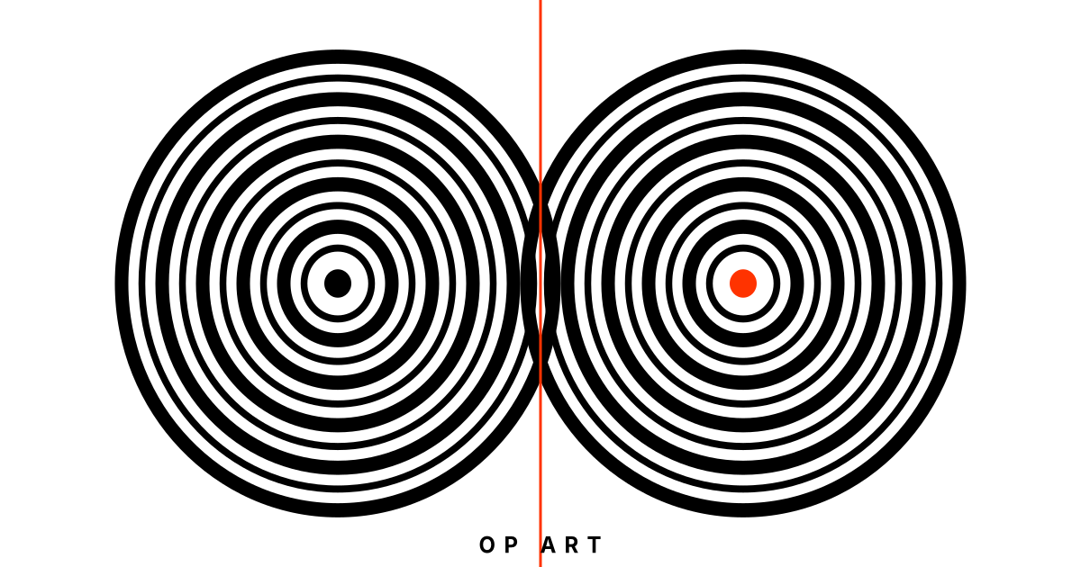
光学艺术运动风格,利用几何图案制造视觉幻象和运动感。黑白对比为核心,辅以振动色彩对。

欧普艺术视觉预览
主色#000000
次色#ffffff
强调色 1#ff3300
强调色 2#0066ff
强调色 3#ffcc00
强调色 4#5e6d00

AI 实现规则

你是一个 Op Art 欧普艺术设计风格的前端开发专家。生成的所有代码必须严格遵守以下约束:

## 绝对禁止

- 使用圆角 rounded-lg rounded-xl rounded-full
- 使用柔和阴影 shadow-sm shadow-md shadow-lg
- 使用渐变 bg-gradient-to-*
- 使用衬线字体 font-serif
- 使用半透明和模糊效果 opacity-50 backdrop-blur
- 大面积密集光学图案(会造成视觉疲劳)

## 必须遵守

- 纯黑 bg-black text-black border-black
- 纯白 bg-white text-white
- 尖锐几何 rounded-none
- 无衬线字体 font-sans font-medium
- 宽字距 tracking-wider tracking-[0.3em]
- 大写排版 uppercase
- 大面积留白平衡视觉强度
- 光学图案作为局部装饰而非全覆盖

## 配色

黑白为主(90%面积):
- 纯黑: #000000
- 纯白: #ffffff

振动色彩对(10%点缀):
- 红: #ff3300
- 蓝: #0066ff
- 黄: #ffcc00

## 装饰元素

- 同心圆图案
- 棋盘格
- 条纹图案
- 莫尔条纹
- 几何线条

## Animation & Interaction Rules

- Illusion Generation: 卡片使用 group 类,内部同心圆装饰 group-hover:animate-[spin_4s_linear_infinite],静止几何变为动态错觉,禁止在非 hover 状态旋转(避免视觉污染)。
- Harsh Strobe: hover 时整体黑白反转 hover:bg-black hover:text-white transition-colors duration-150,必须是硬切,禁止平滑渐变。
- Warp & Distort: 标题在 group-hover 时施加 skew 扭曲 group-hover:-skew-x-12 transition-transform duration-150,制造空间错觉。
- Brutal Action: active 状态瞬间切换警示红 active:bg-[#ff3300] active:border-[#ff3300],无过渡,模拟刺目光爆。

组件预览与实现

font-sans font-extrabold uppercase tracking-wider rounded-none border-4 border-[#000000] transition-all duration-100 bg-[#000000] text-[#ffffff] hover:invert active:scale-95
button

按钮

欧普艺术风格按钮,Harsh Strobe 黑白硬切 + Brutal Action 警示红闪爆

<button className="
  group relative px-12 py-4
  bg-black text-white
  font-sans font-black uppercase tracking-[0.4em] text-sm
  rounded-none
  border-4 border-black
  hover:bg-white hover:text-black
  active:bg-[#ff3300] active:text-white active:border-[#ff3300]
  transition-colors duration-100
  overflow-hidden
">
  <div className="absolute inset-0 bg-[repeating-linear-gradient(45deg,transparent,transparent_4px,black_4px,black_8px)] opacity-0 group-hover:opacity-10 transition-none" />
  <span className="relative z-10">Perceive</span>
</button>
card

卡片

欧普艺术风格卡片,Illusion Generation 同心圆旋转 + Harsh Strobe 黑白反转 + Warp & Distort 标题扭曲

<div className="
  group relative p-10
  bg-white
  border-4 border-black
  rounded-none overflow-hidden
  hover:bg-black hover:text-white
  transition-colors duration-150
  cursor-crosshair
">
  {/* Concentric rings — spin on hover (Illusion Generation) */}
  <div className="absolute top-0 right-0 w-32 h-32 overflow-hidden opacity-30 group-hover:opacity-100 transition-opacity duration-150">
    <div className="w-64 h-64 -translate-x-16 -translate-y-16 group-hover:animate-[spin_4s_linear_infinite]">
      {[...Array(8)].map((_, i) => (
        <div
          key={i}
          className="absolute inset-0 border-[3px] border-black rounded-full group-hover:border-white"
          style={{ margin: `${i * 10}px` }}
        />
      ))}
    </div>
  </div>

  <div className="relative z-10">
    <div className="w-12 h-2 bg-[#ff3300] mb-6 group-hover:bg-white transition-colors duration-150" />
    <h3 className="text-xl font-sans font-black text-black tracking-wider mb-3 uppercase group-hover:text-white group-hover:-skew-x-12 transition-all duration-150">
      Optical
    </h3>
    <p className="text-black/60 font-sans leading-relaxed text-sm group-hover:text-white/70 group-hover:tracking-wider transition-all duration-300">
      The eye deceives. Geometry reveals truth hidden in plain sight.
    </p>
  </div>
</div>
input

输入框

欧普艺术风格输入框

<input
  type="text"
  placeholder="TYPE HERE..."
  className="
    w-full px-5 py-3
    bg-white
    border-2 border-black
    rounded-none
    text-black placeholder-black/30
    font-sans font-medium tracking-wider text-sm uppercase
    focus:border-[#ff3300]
    focus:shadow-[4px_4px_0_#000000]
    focus:outline-none
    transition-all duration-200
  "
/>
hero

Hero 区块

欧普艺术风格 Hero

<section className="
  min-h-screen
  flex items-center justify-center
  bg-white
  relative overflow-hidden
">
  {/* Concentric circles background */}
  <div className="absolute inset-0 flex items-center justify-center opacity-10">
    {[...Array(20)].map((_, i) => (
      <div
        key={i}
        className="absolute border-2 border-black rounded-full"
        style={{
          width: `${(i + 1) * 80}px`,
          height: `${(i + 1) * 80}px`,
        }}
      />
    ))}
  </div>

  {/* Stripe pattern left */}
  <div className="absolute left-0 top-0 w-1/4 h-full flex">
    {[...Array(12)].map((_, i) => (
      <div
        key={i}
        className={`flex-1 ${i % 2 === 0 ? "bg-black" : "bg-white"}`}
      />
    ))}
  </div>

  <div className="relative z-10 text-center px-6 max-w-3xl">
    <h1 className="text-6xl md:text-8xl font-sans font-bold text-black mb-6 tracking-tight uppercase">
      OP ART
    </h1>
    <div className="flex justify-center gap-2 mb-6">
      <span className="w-4 h-4 bg-[#ff3300] inline-block" />
      <span className="w-4 h-4 bg-[#0066ff] inline-block" />
      <span className="w-4 h-4 bg-[#ffcc00] inline-block" />
    </div>
    <p className="text-lg text-black/50 mb-10 tracking-[0.2em] uppercase font-sans font-medium">
      Where perception becomes the medium
    </p>
    <div className="flex gap-4 justify-center">
      <button className="
        px-12 py-4
        bg-black text-white
        font-sans font-medium uppercase tracking-[0.3em]
        rounded-none border-2 border-black
        hover:bg-white hover:text-black
        transition-colors duration-200
      ">
        Enter
      </button>
      <button className="
        px-12 py-4
        bg-white text-black
        font-sans font-medium uppercase tracking-[0.3em]
        rounded-none border-2 border-black
        hover:bg-black hover:text-white
        transition-colors duration-200
      ">
        Study
      </button>
    </div>
  </div>
</section>

交互展示

适用范围与设计理念

应用场景

creativeeditorial

视觉关键词

high-contrast光学幻觉视觉运动感几何黑白振动expressiveboldvibrant

Op Art(光学艺术)兴起于1960年代,以Bridget Riley和Victor Vasarely为代表。它利用精密的几何图案在二维平面上制造运动、振动和深度的视觉幻象,挑战观者的感知系统。

Op Art的核心在于"视觉张力":当黑与白以特定频率和角度交替排列时,人眼会产生运动错觉。同心圆、棋盘格、莫尔条纹、渐变线条——这些看似简单的元素经过精密计算后,能让静止的画面"活"起来。

配色上,Op Art以纯黑与纯白的极端对比为基础。当需要色彩时,选择"振动色彩对"——红与蓝、黄与紫——这些互补色并置时会在视网膜上产生振荡效应,让观者感到不安定的能量。

在界面设计中,Op Art风格需要克制使用。大面积的光学图案容易造成视觉疲劳,因此通常作为局部装饰或背景纹理出现,搭配大面积留白和清晰的信息层次。

排版追求极简与几何感:无衬线字体、均匀字重、严格网格对齐。文字本身不应与光学图案竞争注意力,而是作为图案海洋中的"安全岛"——清晰、稳定、可读。

应该这样做

  • 使用纯黑白高对比 bg-black text-white bg-white text-black
  • 使用几何图案元素——同心圆、条纹、棋盘格作为装饰
  • 使用振动色彩对作为点缀 text-[#ff3300] bg-[#0066ff] text-[#ffcc00]
  • 使用极简无衬线字体 font-sans font-medium
  • 使用严格网格对齐 grid grid-cols-* items-center justify-center
  • 保持大面积留白平衡光学图案的视觉强度
  • 使用 border-2 border-black 强调几何线条
  • 使用 rounded-none 保持锐利的几何边缘
  • 卡片使用 group 类,hover 时内部同心圆装饰触发旋转:group-hover:animate-[spin_4s_linear_infinite](Illusion Generation,静止几何变为动态错觉)
  • hover 时内容区整体黑白反转:hover:bg-black hover:text-white transition-colors duration-150(Harsh Strobe,极端对撞)
  • 标题在 group-hover 时施加透视扭曲:group-hover:-skew-x-12 transition-transform duration-150(Warp & Distort,空间错觉)
  • active 状态瞬间切换为警示红:active:bg-[#ff3300] active:border-[#ff3300](Brutal Action,刺目光爆)

避免这样做

  • 禁止在大面积使用密集光学图案导致视觉疲劳
  • 禁止使用柔和渐变 bg-gradient-to-r 削弱对比度
  • 禁止使用柔和阴影 shadow-sm shadow-md 破坏平面感
  • 禁止使用圆角 rounded-lg rounded-xl rounded-full
  • 禁止使用衬线字体 font-serif
  • 禁止使用超过两种强调色,保持黑白为主体
  • 禁止使用半透明或模糊效果 opacity-50 backdrop-blur
  • 禁止 hover 时使用平滑渐变过渡(必须是黑白硬切,duration-100 或 duration-150)
  • 禁止光学图案在 hover 时保持静止(旋转或动效是制造错觉的来源,静止则丧失 Op Art 精髓)
  • 禁止 active 状态使用平滑过渡颜色(警示红应为瞬间闪现,非渐变)

全局 CSS

/* Op Art 全局样式 */

:root {
  --op-black: #000000;
  --op-white: #ffffff;
  --op-red: #ff3300;
  --op-blue: #0066ff;
  --op-yellow: #ffcc00;
}

/* 同心圆图案 */
.op-concentric {
  background-image: repeating-radial-gradient(
    circle at center,
    transparent 0px,
    transparent 8px,
    var(--op-black) 8px,
    var(--op-black) 10px
  );
}

/* 棋盘格 */
.op-checkerboard {
  background-image:
    linear-gradient(45deg, var(--op-black) 25%, transparent 25%),
    linear-gradient(-45deg, var(--op-black) 25%, transparent 25%),
    linear-gradient(45deg, transparent 75%, var(--op-black) 75%),
    linear-gradient(-45deg, transparent 75%, var(--op-black) 75%);
  background-size: 20px 20px;
  background-position: 0 0, 0 10px, 10px -10px, -10px 0px;
}

/* 条纹图案 */
.op-stripes {
  background-image: repeating-linear-gradient(
    0deg,
    var(--op-black) 0px,
    var(--op-black) 4px,
    var(--op-white) 4px,
    var(--op-white) 8px
  );
}

/* 莫尔条纹效果 */
.op-moire {
  background-image:
    repeating-linear-gradient(0deg, transparent, transparent 2px, rgba(0,0,0,0.1) 2px, rgba(0,0,0,0.1) 4px),
    repeating-linear-gradient(90deg, transparent, transparent 2px, rgba(0,0,0,0.1) 2px, rgba(0,0,0,0.1) 4px);
}

/* 振动色彩边框 */
.op-vibrant-border {
  border: 3px solid var(--op-red);
  outline: 3px solid var(--op-blue);
  outline-offset: 3px;
}
@keyframes op-art-fade-in {
  from { opacity: 0; transform: translateY(8px); }
  to { opacity: 1; transform: translateY(0); }
}

@keyframes op-art-pulse {
  0%, 100% { opacity: 1; }
  50% { opacity: 0.7; }
}

.op-art-card {
  position: relative;
  overflow: hidden;
}

.op-art-card::before {
  content: "";
  position: absolute;
  inset: 0;
  opacity: 0;
  transition: opacity 0.3s ease;
  background: linear-gradient(135deg, rgba(0, 0, 0, 0.05), transparent);
  pointer-events: none;
}

.op-art-card:hover::before {
  opacity: 1;
}

.op-art-frosted {
  backdrop-filter: blur(12px) saturate(180%);
  -webkit-backdrop-filter: blur(12px) saturate(180%);
  background: rgba(0, 0, 0, 0.08);
}

.op-art-accent-corner {
  clip-path: polygon(0 0, 100% 0, 100% calc(100% - 2rem), calc(100% - 2rem) 100%, 0 100%);
}

.op-art-animate-in {
  animation: op-art-fade-in 0.5s ease-out both;
}

布局、色板与 Tokens

主色#000000
次色#ffffff
强调色 1#ff3300
强调色 2#0066ff
强调色 3#ffcc00
强调色 4#5e6d00
{
  "border": {
    "width": "border-2",
    "color": "border-black",
    "radius": "rounded-none",
    "style": "border-solid"
  },
  "shadow": {
    "sm": "shadow-none",
    "md": "shadow-[4px_4px_0_#000000]",
    "lg": "shadow-[6px_6px_0_#000000]",
    "none": "shadow-none",
    "hover": "hover:shadow-[4px_4px_0_#000000]",
    "focus": "focus:shadow-[4px_4px_0_#000000]",
    "colored": {
      "red": "shadow-[4px_4px_0_#ff3300]",
      "blue": "shadow-[4px_4px_0_#0066ff]"
    }
  },
  "interaction": {
    "transition": "transition-colors duration-200",
    "active": "active:translate-x-[2px] active:translate-y-[2px]",
    "hoverOpacity": "hover:opacity-100"
  },
  "typography": {
    "heading": "font-sans font-bold uppercase tracking-[0.3em]",
    "body": "font-sans font-medium",
    "mono": "font-mono",
    "sizes": {
      "hero": "text-6xl md:text-8xl lg:text-9xl",
      "h1": "text-4xl md:text-6xl",
      "h2": "text-2xl md:text-4xl",
      "h3": "text-xl md:text-2xl",
      "body": "text-sm md:text-base",
      "small": "text-xs md:text-sm"
    }
  },
  "spacing": {
    "section": "py-16 md:py-28 lg:py-36",
    "container": "px-6 md:px-12 lg:px-20",
    "card": "p-8",
    "gap": {
      "sm": "gap-2 md:gap-4",
      "md": "gap-4 md:gap-8",
      "lg": "gap-8 md:gap-12"
    }
  },
  "colors": {
    "background": {
      "primary": "bg-white",
      "secondary": "bg-black",
      "accent": [
        "bg-[#ff3300]",
        "bg-[#0066ff]",
        "bg-[#ffcc00]"
      ]
    },
    "text": {
      "primary": "text-black",
      "secondary": "text-white",
      "muted": "text-black/50"
    },
    "button": {
      "primary": "bg-black text-white",
      "secondary": "bg-white text-black border-2 border-black",
      "danger": "bg-[#ff3300] text-white"
    }
  },
  "forbidden": {
    "classes": [
      "font-serif",
      "rounded-sm",
      "rounded",
      "rounded-md",
      "rounded-lg",
      "rounded-xl",
      "rounded-2xl",
      "rounded-full",
      "shadow-sm",
      "shadow",
      "shadow-md",
      "shadow-lg",
      "shadow-xl",
      "bg-gradient-to-r",
      "bg-gradient-to-l",
      "bg-gradient-to-b",
      "bg-gradient-to-t",
      "backdrop-blur",
      "backdrop-blur-sm",
      "backdrop-blur-md",
      "backdrop-blur-lg",
      "italic"
    ],
    "patterns": [
      "^font-serif$",
      "^rounded-(?!none)",
      "^shadow-(?:sm|md|lg|xl|2xl)$",
      "^bg-gradient-",
      "^backdrop-blur",
      "^opacity-(?:[1-4]\\d|50)$"
    ],
    "reasons": {
      "font-serif": "Op Art uses clean geometric sans-serif typography (font-sans)",
      "rounded-lg": "Op Art demands sharp geometric edges for optical precision (rounded-none)",
      "shadow-md": "Op Art is flat and graphic; soft shadows break the 2D illusion",
      "bg-gradient-to-r": "Op Art uses hard-edge flat colors for maximum contrast",
      "backdrop-blur": "Op Art avoids blur effects that soften the precise geometric patterns"
    }
  },
  "required": {
    "button": [
      "rounded-none",
      "border-2 border-black",
      "font-sans font-medium uppercase tracking-[0.3em]",
      "transition-colors duration-200"
    ],
    "card": [
      "rounded-none",
      "border-2 border-black",
      "bg-white"
    ],
    "input": [
      "rounded-none",
      "border-2 border-black",
      "bg-white",
      "text-black",
      "font-sans font-medium uppercase tracking-wider",
      "focus:border-[#ff3300]",
      "focus:outline-none"
    ]
  }
}

示例提示词

视觉艺术展览页面

光学艺术风格的展览展示页面

用 Op Art 风格创建一个艺术展览页面,要求:
1. 背景:纯白 + 局部黑白光学图案装饰
2. 标题:黑色无衬线大写 + 宽字距
3. 装饰:同心圆 + 条纹 + 棋盘格(克制使用)
4. 按钮:黑白反转悬停效果
5. 整体干净锐利,视觉张力集中在局部

SaaS 着陆页

生成 欧普艺术风格的 SaaS 产品着陆页

Create a SaaS landing page using Op Art style with hero section, feature grid, testimonials, pricing table, and footer.

作品集展示

生成 欧普艺术风格的作品集页面

Create a portfolio showcase page using Op Art style with project grid, about section, contact form, and consistent visual language.