本页出处
设计风格资料库
内容来自 luckymaomi 的 UI 风格库(复刻版),以 MIT 许可 提供。本站镜像收录,仅作学习参考;这一页的原始地址是 原站页面。
← 回到导览访问原站仓库
返回风格库
视觉风格retro

像素动漫风

Pixel Anime

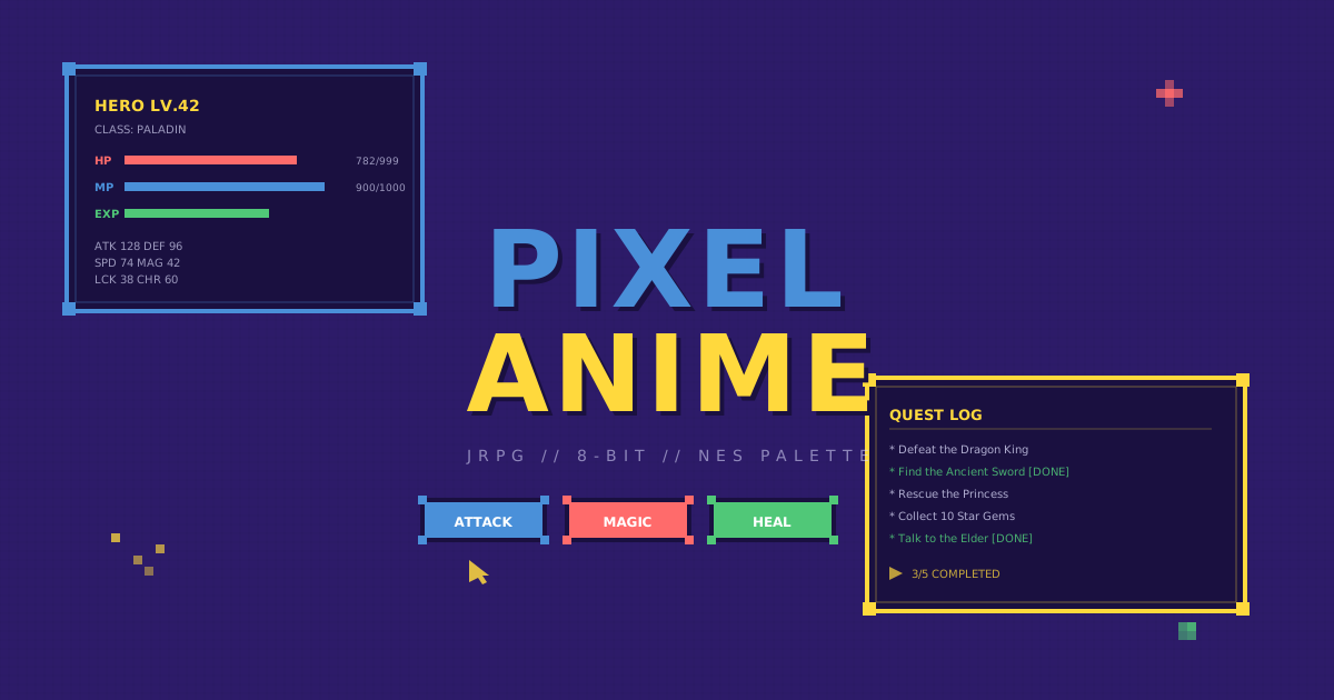
将经典JRPG游戏UI与像素动漫美学融合,以RPG对话框、状态条、像素边框和NES色板打造怀旧8-bit游戏界面风格。

像素动漫风视觉预览
主色#4a90d9
次色#2d1b69
强调色 1#ff6b6b
强调色 2#ffd93d
强调色 3#50c878
强调色 4#a98d16

AI 实现规则

You are a Pixel Anime design style frontend development expert. All generated code must strictly follow these constraints:

## Absolutely Forbidden

- Smooth gradients (linear-gradient, radial-gradient for decoration)
- Rounded corners (rounded-lg, rounded-xl, rounded-full)
- Blur effects (blur, backdrop-blur)
- Serif fonts
- Soft shadows (shadow-sm, shadow-md, shadow-lg, shadow-xl)

## Must Follow

- Dark purple background: bg-[#2d1b69] as primary, bg-[#1a1040] as secondary
- RPG dialogue box frames with 2-4px borders and corner block decorations
- HP/MP/EXP status bar UI elements with flat color fills
- Hard offset pixel shadows: shadow-[4px_4px_0px_#1a1040]
- Monospace font: font-mono for ALL text
- Bold 2px borders: border-2 border-[#1a1040]
- Flat colors only, no gradients
- Step-based hover: hover:translate-x-[2px] hover:translate-y-[2px]
- Linear easing: ease-linear, duration-75

## Color Palette (NES-inspired)

Primary:
- Pixel Blue: #4a90d9
- Dark Purple: #2d1b69
- Deep Dark: #1a1040
- Pixel Red: #ff6b6b
- Pixel Gold: #ffd93d
- Pixel Green: #50c878
- Light Text: #e0e0ff

## Unique Elements

- RPG dialogue box frame with corner block decorations
- HP/MP/EXP status bar progress indicators
- Pixel-grid background pattern (8px grid)
- Blinking pixel arrow cursor/continue indicators
- Step-based pixel-aligned hover translations

## Animation & Interaction Rules

- Framerate Drop: All transitions must use `duration-75 ease-linear` to simulate 15fps GBA/NDS-era animation. Never use `ease-in-out` or smooth bezier curves — pixel animations are abrupt state changes.
- Blocky Aura: Hover glow must use multi-directional hard-edge colored shadows with zero blur: `hover:shadow-[4px_4px_0_#ffd93d,-2px_-2px_0_#ffd93d]`. No `blur()` or `drop-shadow()` ever.
- Anime Action: Button active state applies squash-and-stretch: `active:scale-x-110 active:scale-y-90` — Japanese animation physics on press, not a translate drop.
- Corner Blink: Card corner pixel squares must use `group-hover:animate-pulse` to simulate idle game UI animation. Never animate in non-hover state — blink only when the player's cursor is over the card.

组件预览与实现

relative font-mono font-bold uppercase tracking-wider border-2 border-[#1a1040] shadow-[4px_4px_0px_#1a1040] transition-all duration-150 ease-linear bg-[#4a90d9] text-white hover:translate-x-[2px] hover:translate-y-[2px] hover:shadow-[2px_2px_0px_#1a1040] active:translate-x-[4px] active:translate-y-[4px] active:shadow-none
button

RPG Menu Button

Pixel anime button with Blocky Aura multi-shadow hover + Anime Action squash-and-stretch on press

<button className="
  px-6 py-3
  bg-[#4a90d9] text-white
  font-mono font-bold uppercase tracking-widest
  border-2 border-[#1a1040]
  shadow-[4px_4px_0_#1a1040]
  hover:bg-[#5aa0e9]
  hover:shadow-[4px_4px_0_#ffd93d,-2px_-2px_0_#ffd93d]
  hover:-translate-y-1
  active:scale-x-110 active:scale-y-90
  active:translate-x-[4px] active:translate-y-[4px]
  active:shadow-none
  transition-all duration-75 ease-linear
">
  ATTACK
</button>
card

RPG Dialogue Box

Card with Corner Blink pixel squares on group-hover + Blocky Aura shadow shift

<div className="group relative p-6 bg-[#1a1040] border-2 border-[#4a90d9] shadow-[6px_6px_0_#1a1040] hover:shadow-[8px_8px_0_#4a90d9] hover:-translate-y-1 hover:-translate-x-1 transition-all duration-75 ease-linear cursor-pointer">
  {/* Corner pixels — blink on hover (Corner Blink) */}
  <div className="absolute -top-[6px] -left-[6px] w-[12px] h-[12px] bg-[#4a90d9] border-2 border-[#1a1040] group-hover:bg-[#ffd93d] group-hover:animate-pulse transition-colors duration-75" />
  <div className="absolute -top-[6px] -right-[6px] w-[12px] h-[12px] bg-[#4a90d9] border-2 border-[#1a1040] group-hover:bg-[#ffd93d] group-hover:animate-pulse transition-colors duration-75" />
  <div className="absolute -bottom-[6px] -left-[6px] w-[12px] h-[12px] bg-[#4a90d9] border-2 border-[#1a1040] group-hover:bg-[#ffd93d] group-hover:animate-pulse transition-colors duration-75" />
  <div className="absolute -bottom-[6px] -right-[6px] w-[12px] h-[12px] bg-[#4a90d9] border-2 border-[#1a1040] group-hover:bg-[#ffd93d] group-hover:animate-pulse transition-colors duration-75" />
  <div className="relative">
    <h3 className="text-2xl font-mono font-bold text-[#ffd93d] uppercase mb-2 group-hover:text-white transition-colors duration-75">
      QUEST LOG
    </h3>
    <p className="text-[#e0e0ff]/70 font-mono text-sm group-hover:text-[#ffd93d] transition-colors duration-75">
      &gt; A new adventure awaits! Press A to continue...
    </p>
  </div>
</div>
input

Pixel Input

Input with pixel border, blinking cursor effect, and monospace text

<input
  type="text"
  placeholder="ENTER NAME..."
  className="
    w-full px-4 py-3
    bg-[#1a1040]
    border-2 border-[#4a90d9]
    text-[#e0e0ff] placeholder-[#e0e0ff]/40
    font-mono
    focus:border-[#ffd93d]
    focus:shadow-[2px_2px_0px_#4a90d9]
    focus:outline-none
    transition-all duration-150 ease-linear
    caret-[#ffd93d]
  "
/>
hero

RPG Title Screen

Title screen hero with pixel grid background, RPG window frame, and selection arrow

<section className="
  min-h-screen relative overflow-hidden
  flex items-center justify-center
  bg-[#2d1b69]
">
  <div className="absolute inset-0" style={{
    backgroundImage: "linear-gradient(rgba(26,16,64,0.15) 1px, transparent 1px), linear-gradient(90deg, rgba(26,16,64,0.15) 1px, transparent 1px)",
    backgroundSize: "8px 8px"
  }} />
  <div className="relative z-10 text-center px-6">
    <h1 className="text-5xl md:text-7xl font-mono font-bold text-[#4a90d9] uppercase tracking-wider mb-2">
      PIXEL
    </h1>
    <h2 className="text-4xl md:text-6xl font-mono font-bold text-[#ffd93d] uppercase tracking-wider mb-6">
      ANIME
    </h2>
    <p className="text-lg text-[#e0e0ff]/60 font-mono mb-8">
      JRPG // 8-BIT // NES PALETTE
    </p>
    <button className="px-10 py-4 bg-[#ff6b6b] text-white font-mono font-bold uppercase tracking-wider border-2 border-[#1a1040] shadow-[4px_4px_0px_#1a1040] hover:translate-x-[2px] hover:translate-y-[2px] hover:shadow-[2px_2px_0px_#1a1040] transition-all duration-150 ease-linear">
      PRESS START
    </button>
  </div>
</section>

交互展示

适用范围与设计理念

应用场景

creative

视觉关键词

retro像素动漫JRPG8-bitRPG对话框像素NES色板retrovintagenostalgic复古

Pixel Anime merges classic JRPG game UI with pixel-art anime aesthetics. Every element feels like it belongs in a 16-bit RPG menu screen.

Core principles:

- RPG Dialogue Boxes: Window frames with chunky borders and corner block decorations, referencing Final Fantasy and Dragon Quest menu systems

- Health/Status Bars: HP, MP, and EXP progress bars with pixel-precise flat fills and bordered containers

- Pixel Borders: All borders are 2px+ solid with hard edges, using image-rendering: pixelated where applicable

- NES/SNES Palette: Limited color palette of bold primary colors (blue, red, gold, green) on deep purple backgrounds

- Step-based Interactions: Hover states use translate-x/y in pixel-aligned steps, not smooth transforms

- Blinking Cursor: Selection arrows and continue prompts use blinking pixel arrows

应该这样做

  • Use RPG dialogue box frames with 4px borders and corner block decorations
  • Include HP/MP/EXP status bar UI elements with flat fills
  • Apply hard offset shadows (4px_4px_0px) for pixel depth
  • Use monospace font exclusively for all text
  • Keep interactions step-based (translate-x/y in 2px increments)
  • Use NES-palette colors: blue #4a90d9, red #ff6b6b, gold #ffd93d, green #50c878
  • Add pixel corner block decorations on major containers
  • Framerate Drop: use `duration-75 ease-linear` for all transitions to simulate 15fps GBA/NDS-era animation cadence
  • Blocky Aura: hover glow must be hard-edge multi-directional colored shadows with zero blur: `hover:shadow-[4px_4px_0_#ffd93d,-2px_-2px_0_#ffd93d]`
  • Anime Action: button active state applies squash-and-stretch `active:scale-x-110 active:scale-y-90` — classic Japanese animation physics on press
  • Corner Blink: card corner pixel squares use `group-hover:animate-pulse` to simulate game UI idle standby animation; never animate in non-hover state

避免这样做

  • Never use smooth gradients (linear-gradient, radial-gradient)
  • Never use rounded corners (rounded-lg/xl/full)
  • Never use blur effects (blur, backdrop-blur)
  • Never use serif fonts
  • Never use soft shadows (shadow-sm/md/lg/xl)
  • Never use `ease-in-out` or `ease` curves — only `ease-linear` or `transition-none` (pixel animations are abrupt, not organic)
  • Never use blurred glow shadows for the Blocky Aura effect — zero blur is mandatory for 8-bit authenticity
  • Never trigger Corner Blink animation outside of `group-hover` state — idle blinking on load creates visual noise

全局 CSS

/* Pixel Anime Global Styles */

:root {
  --pa-blue: #4a90d9;
  --pa-dark: #2d1b69;
  --pa-deep: #1a1040;
  --pa-red: #ff6b6b;
  --pa-gold: #ffd93d;
  --pa-green: #50c878;
  --pa-text: #e0e0ff;
}

/* RPG dialogue box frame with corner blocks */
.pa-dialog-frame {
  position: relative;
  border: 2px solid var(--pa-blue);
  background: var(--pa-deep);
}
.pa-dialog-frame::before,
.pa-dialog-frame::after {
  content: "";
  position: absolute;
  width: 8px;
  height: 8px;
  background: var(--pa-blue);
}
.pa-dialog-frame::before { top: -4px; left: -4px; }
.pa-dialog-frame::after { top: -4px; right: -4px; }

/* Pixel grid overlay */
.pa-pixel-grid::after {
  content: "";
  position: absolute;
  inset: 0;
  background-image:
    linear-gradient(rgba(26, 16, 64, 0.12) 1px, transparent 1px),
    linear-gradient(90deg, rgba(26, 16, 64, 0.12) 1px, transparent 1px);
  background-size: 8px 8px;
  pointer-events: none;
  image-rendering: pixelated;
}

/* HP/MP/EXP status bar */
.pa-status-bar {
  height: 8px;
  border: 2px solid var(--pa-deep);
  background: var(--pa-deep);
}
.pa-status-bar-fill {
  height: 100%;
  image-rendering: pixelated;
}

/* Pixel hard shadow */
.pa-shadow {
  box-shadow: 4px 4px 0px var(--pa-deep);
}

/* Blinking cursor animation */
@keyframes pa-blink {
  0%, 50% { opacity: 1; }
  51%, 100% { opacity: 0; }
}
.pa-blink {
  animation: pa-blink 1s infinite;
}

布局、色板与 Tokens

主色#4a90d9
次色#2d1b69
强调色 1#ff6b6b
强调色 2#ffd93d
强调色 3#50c878
强调色 4#a98d16
{
  "border": {
    "width": "border-2",
    "color": "border-[#1a1040]",
    "radius": "rounded-none",
    "style": "border-solid"
  },
  "shadow": {
    "sm": "shadow-[2px_2px_0px_#1a1040]",
    "md": "shadow-[4px_4px_0px_#1a1040]",
    "lg": "shadow-[6px_6px_0px_#1a1040]",
    "none": "shadow-none",
    "hover": "hover:shadow-[6px_6px_0px_#1a1040]",
    "focus": "focus:shadow-[2px_2px_0px_#4a90d9]",
    "colored": {
      "blue": "shadow-[4px_4px_0px_#4a90d9]",
      "red": "shadow-[4px_4px_0px_#ff6b6b]",
      "gold": "shadow-[4px_4px_0px_#ffd93d]"
    }
  },
  "interaction": {
    "transition": "transition-all duration-150 ease-linear",
    "active": "active:translate-x-[4px] active:translate-y-[4px] active:shadow-none",
    "hoverTranslate": "hover:translate-x-[2px] hover:translate-y-[2px]"
  },
  "typography": {
    "heading": "font-mono font-bold uppercase tracking-wider",
    "body": "font-mono text-[#e0e0ff]/80",
    "mono": "font-mono",
    "sizes": {
      "hero": "text-4xl md:text-6xl lg:text-7xl",
      "h1": "text-3xl md:text-5xl",
      "h2": "text-2xl md:text-3xl",
      "h3": "text-lg md:text-xl",
      "body": "text-xs md:text-sm",
      "small": "text-[10px] md:text-xs"
    }
  },
  "spacing": {
    "section": "py-12 md:py-20 lg:py-28",
    "container": "px-4 md:px-8 lg:px-12",
    "card": "p-4 md:p-6",
    "gap": {
      "sm": "gap-3 md:gap-4",
      "md": "gap-4 md:gap-6",
      "lg": "gap-6 md:gap-8"
    }
  },
  "colors": {
    "background": {
      "primary": "bg-[#2d1b69]",
      "secondary": "bg-[#1a1040]",
      "accent": [
        "bg-[#4a90d9]",
        "bg-[#ff6b6b]",
        "bg-[#ffd93d]",
        "bg-[#50c878]"
      ]
    },
    "text": {
      "primary": "text-[#e0e0ff]",
      "secondary": "text-[#ffd93d]",
      "muted": "text-[#e0e0ff]/50"
    },
    "button": {
      "primary": "bg-[#4a90d9] text-white shadow-[4px_4px_0px_#1a1040]",
      "secondary": "bg-[#ff6b6b] text-white shadow-[4px_4px_0px_#1a1040]",
      "danger": "bg-[#ff6b6b] text-white"
    }
  },
  "forbidden": {
    "classes": [
      "rounded-lg",
      "rounded-xl",
      "rounded-2xl",
      "rounded-full",
      "bg-gradient-to-r",
      "bg-gradient-to-b",
      "bg-gradient-to-br",
      "shadow-sm",
      "shadow-md",
      "shadow-lg",
      "shadow-xl",
      "backdrop-blur",
      "backdrop-blur-sm",
      "backdrop-blur-md",
      "font-serif"
    ],
    "patterns": [
      "^rounded-(?:lg|xl|2xl|full)$",
      "^bg-gradient-",
      "^shadow-(?:sm|md|lg|xl)$",
      "^backdrop-blur",
      "^font-serif$"
    ],
    "reasons": {
      "rounded-lg": "Pixel Anime uses sharp corners only -- pixels cannot be round",
      "bg-gradient-to-r": "Pixel Anime uses flat solid colors, no smooth gradients allowed",
      "shadow-md": "Pixel Anime uses hard offset pixel shadows only, never soft shadows",
      "backdrop-blur": "Pixel Anime avoids all blur effects to maintain crisp pixel aesthetic"
    }
  },
  "required": {
    "button": [
      "font-mono font-bold uppercase",
      "border-2 border-[#1a1040]",
      "shadow-[4px_4px_0px_#1a1040]",
      "transition-all duration-150 ease-linear"
    ],
    "card": [
      "bg-[#2d1b69]",
      "border-2 border-[#1a1040]",
      "shadow-[4px_4px_0px_#1a1040]"
    ],
    "input": [
      "bg-[#1a1040]",
      "border-2 border-[#4a90d9]",
      "font-mono",
      "focus:outline-none"
    ]
  }
}

示例提示词

JRPG角色面板

经典RPG风格的角色状态面板

Use Pixel Anime style to create a JRPG character panel:
1. Background: dark purple with visible pixel grid overlay
2. RPG dialogue box frames with corner block decorations
3. HP/MP/EXP status bars with flat color fills
4. Character stats in monospace font, NES color palette
5. Pixel shadows and step-based button interactions

SaaS 着陆页

生成 像素动漫风风格的 SaaS 产品着陆页

Create a SaaS landing page using Pixel Anime style with hero section, feature grid, testimonials, pricing table, and footer.

作品集展示

生成 像素动漫风风格的作品集页面

Create a portfolio showcase page using Pixel Anime style with project grid, about section, contact form, and consistent visual language.