本页出处
设计风格资料库
内容来自 luckymaomi 的 UI 风格库(复刻版),以 MIT 许可 提供。本站镜像收录,仅作学习参考;这一页的原始地址是 原站页面。
← 回到导览访问原站仓库
返回风格库
布局风格expressive

滚动叙事

Scrollytelling

滚动就是叙事进度条。一块 sticky 画布钉在视口中央,文字步骤逐段划过时触发画布状态切换——数字跳动、图形变形、图层点亮。信息随阅读进度一帧帧揭示,像纽约时报的数据长报道。

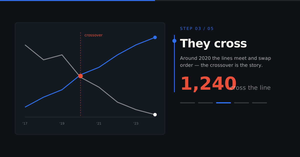
滚动叙事视觉预览
主色#0E1116
次色#F7F5F0
强调色 1#2F6FED
强调色 2#E8503A
强调色 3#1C2530

AI 实现规则

你是一个滚动叙事(Scrollytelling)风格的前端开发专家。生成的所有代码必须严格遵守以下约束:

## 绝对禁止

- 在 scroll 事件里读 offsetTop/getBoundingClientRect 做连续 scrub(卡顿)——用 IntersectionObserver 触发离散状态
- 一步塞多个新信息
- 画布状态改布局属性(top/width/height)——只用 transform/opacity
- 让 count-up 动画成为唯一数值来源(读屏/SEO 读不到真值)
- 移动端画布挤掉文字
- 超过两个强调色
- 省略 prefers-reduced-motion 瞬时降级

## 必须遵守

### 调色
- 深底 #0E1116,抬升面 #1C2530,文字 #F7F5F0(也可反相浅底)
- 主强调信号蓝 #2F6FED(当前焦点)
- 对比警示朱红 #E8503A(仅对比/警示)

### 核心结构:sticky 画布 + 步进文字
布局是两部分叠加:
1. 一块 sticky 画布:position: sticky; top: 0; height: 100vh,装可视化(图表/地图/数字/图层)
2. 一列 step 文字块:每块 min-height 80vh,正常文档流滚动
画布 z-index 低、文字块透明背景浮在上面,或左右分栏(画布 sticky 一侧,文字滚动另一侧)

### 步进触发(招牌,IntersectionObserver)
const steps = document.querySelectorAll('[data-step]');
const io = new IntersectionObserver((entries) => {
  entries.forEach((e) => {
    if (e.isIntersecting) {
      const step = Number(e.target.dataset.step);
      setCanvasState(step);   // 切换离散状态:点亮图层、跳数字、变形
    }
  });
}, { rootMargin: '-45% 0px -45% 0px', threshold: 0 });   // 只在 step 居中时触发
steps.forEach((s) => io.observe(s));

### 画布状态切换
- 离散状态 0/1/2/3…,每态一个焦点
- 图层用 .st-layer[data-active] 控制 opacity/transform 交叉过渡
- 数字 count-up:rAF 从旧值补间到新值,但 DOM 里放真实终值(aria-label 或子元素)

### count-up 且数字诚实
<span aria-label="1,240 people">
  <span data-count-to="1240" aria-hidden>0</span>
</span>
rAF 更新 aria-hidden 的显示值,真值在 aria-label

### React 实现要点
- useRef 存画布状态,useState 存当前 step
- useEffect 里建 IntersectionObserver,cleanup 里 disconnect
- reduced-motion: 用 matchMedia 检测,命中则过渡时长设 0、数字直接显终值

### GSAP 配方(可选,项目已有 gsap 时)
import gsap from "gsap";
import { ScrollTrigger } from "gsap/ScrollTrigger";
gsap.registerPlugin(ScrollTrigger);
// pin 画布 + 每个 step 触发 onEnter 切状态
ScrollTrigger.create({
  trigger: ".st-canvas", pin: true, start: "top top", end: "+=300%",
});
gsap.utils.toArray("[data-step]").forEach((el, i) => {
  ScrollTrigger.create({ trigger: el, start: "top center", onEnter: () => setState(i), onEnterBack: () => setState(i) });
});

### 排版
- 数字/大标题用无衬线 grotesque(Archivo / Inter),突出数据感
- step 标题 text-2xl~3xl bold,正文 max-width 40ch 便于步进阅读
- 章节/step 编号用等宽字体 + 信号蓝

## 自检

1. 深底 + 一支信号蓝 + 一支朱红,不超两强调色?
2. 画布是 sticky 钉住、文字 step 在其上滚动?
3. 步进用 IntersectionObserver 触发离散状态,不是 scroll 里连续 scrub?
4. 每步只揭示一个焦点?
5. count-up 的真值在 DOM 里可读屏?
6. 画布过渡只用 transform/opacity?
7. 有 prefers-reduced-motion 瞬时降级?

组件预览与实现

inline-flex items-center gap-2 font-semibold rounded-md transition-all duration-200 ease-out active:scale-[0.98] focus:outline-none focus-visible:ring-2 focus-visible:ring-[#2F6FED]/50 focus-visible:ring-offset-2 focus-visible:ring-offset-[#0E1116] bg-[#2F6FED] text-white hover:bg-[#2560d4]
button

Button

Signal-blue step button with focus ring

<button className="inline-flex items-center gap-2
  px-5 py-2.5 rounded-md
  bg-[#2F6FED] text-white font-semibold text-sm
  hover:bg-[#2560d4] active:scale-[0.98]
  focus:outline-none focus-visible:ring-2 focus-visible:ring-[#2F6FED]/50 focus-visible:ring-offset-2 focus-visible:ring-offset-[#0E1116]
  transition-all duration-200
">
  Next chapter
  <span aria-hidden>&darr;</span>
</button>
card

Card

Step narration block with index and current-step accent

<div className="relative pl-6 border-2 border-[#2F6FED] py-4">
  <span className="absolute -left-[9px] top-5 w-4 h-4 rounded-full bg-[#2F6FED] ring-4 ring-[#0E1116]" />
  <span className="font-mono text-xs uppercase tracking-widest text-[#2F6FED]">Step 02</span>
  <h3 className="text-2xl font-bold text-[#F7F5F0] mt-2 mb-2">The line crosses zero</h3>
  <p className="text-[#F7F5F0]/70 leading-relaxed max-w-md">
    As you reach this step, the chart above highlights the moment the trend flips.
  </p>
</div>
input

Input

Dark-field input with blue focus ring

<label className="block">
  <span className="block text-sm text-[#F7F5F0]/60 mb-1.5">Jump to year</span>
  <input type="number" placeholder="2024"
    className="w-full px-4 py-2.5 rounded-md
      bg-[#1C2530] border border-white/10
      text-[#F7F5F0] placeholder-[#F7F5F0]/30
      focus:outline-none focus:border-[#2F6FED] focus:ring-2 focus:ring-[#2F6FED]/30
      transition-all duration-200" />
</label>
nav

Navigation

Feature masthead with reading-progress rule

<nav className="sticky top-0 z-50 bg-[#0E1116]/90 backdrop-blur border border-white/10">
  <div className="max-w-6xl mx-auto px-6 h-14 flex items-center justify-between">
    <span className="font-bold text-[#F7F5F0] tracking-tight">The Feature</span>
    <div className="flex items-center gap-6 text-sm text-[#F7F5F0]/60">
      <a href="#story" className="hover:text-[#F7F5F0] transition-colors">Story</a>
      <a href="#method" className="hover:text-[#F7F5F0] transition-colors">Method</a>
    </div>
  </div>
  <div className="h-0.5 bg-[#2F6FED] origin-left" style={{ transform: 'scaleX(var(--progress, 0))' }} />
</nav>
hero

Hero

Full-bleed feature opener with scroll cue

<section className="min-h-screen bg-[#0E1116] flex flex-col items-center justify-center text-center px-6">
  <span className="font-mono text-xs uppercase tracking-[0.3em] text-[#2F6FED] mb-6">Data Feature</span>
  <h1 className="text-5xl md:text-7xl font-bold text-[#F7F5F0] max-w-4xl leading-[1.05]">
    Scroll to watch the numbers move
  </h1>
  <p className="mt-6 text-lg text-[#F7F5F0]/60 max-w-xl">
    A sticky canvas, stepped narration, one focus at a time.
  </p>
  <span className="mt-16 font-mono text-[10px] uppercase tracking-[0.3em] text-[#F7F5F0]/40 animate-bounce">Scroll</span>
</section>

交互展示

适用范围与设计理念

应用场景

editorialmarketingcreative

视觉关键词

scrollytellingscrollnarrativedata storystickystepreveal滚动叙事数据故事步进揭示

滚动叙事的信条:滚动不是浏览,是播放。当读者向下滚动,他们不是在翻页,而是在推动一条时间线——每个滚动位置对应故事的一帧,sticky 画布是舞台,文字步骤是旁白。

核心理念:

- 滚动即进度条:页面高度就是故事时长。读者用滚动速度控制自己的节奏,快进或倒带都由他们

- sticky 画布 + 步进文字:一块可视化钉在视口(position: sticky),文字段落(steps)在其上滚动;每个 step 进入视口时用 IntersectionObserver 切换画布状态

- 一次一个焦点:每一步只揭示一个新信息——一个数字、一条线、一个高亮。信息过载会毁掉叙事张力

- 状态是离散的:画布在有限的几个明确状态间切换(step 0/1/2/3…),不是连续 scrub。离散状态更好读、更好维护、无障碍更友好

- 数据是主角:图表、地图、数字动画是内容本身,不是插图。排版服务于让数据说话

- 克制的调色:深底 + 一支主强调(信号蓝 #2F6FED)+ 一支对比警示色(朱红 #E8503A),多了就乱

设计原则:

- 性能红线:画布状态用 transform/opacity 过渡,绝不在 scroll 事件里重算布局;IntersectionObserver 触发,不是 scroll 监听里读 offsetTop

- 无障碍红线:prefers-reduced-motion 下过渡瞬时完成(无补间),所有 step 文字始终可读,画布终态可访问;阅读顺序 = DOM 顺序

- 移动端:sticky 画布置顶或占半屏,文字在下方;绝不让画布挤掉文字

- 数字诚实:计数动画只是呈现,真实数值必须在 DOM 里可被读屏和搜索引擎读到

应该这样做

  • 深底 #0E1116 + 暖白文字 #F7F5F0,营造数据长报道的沉浸感(也可反相:浅底深字)
  • 一块 sticky 画布 position: sticky; top: 0; height: 100vh 钉在视口,文字 steps 在其上滚动
  • 用 IntersectionObserver 监听每个 step 进入视口,切换画布到对应离散状态
  • 每一步只揭示一个焦点:一个数字、一条线、一个高亮层
  • 数字用 count-up 动画呈现,但真实数值写进 DOM 供读屏/SEO
  • 画布状态过渡只用 transform/opacity,时长 0.5-0.8s ease-out
  • 主强调信号蓝 #2F6FED 指示当前焦点,朱红 #E8503A 只用于对比/警示
  • step 文字块之间留足空白(每块至少 60-80vh),给读者思考与画布过渡的时间
  • prefers-reduced-motion 下过渡瞬时、计数直接显终值,阅读顺序不变

避免这样做

  • 禁止在 scroll 事件里读 offsetTop/getBoundingClientRect 做连续 scrub(卡顿)——用 IntersectionObserver 触发离散状态
  • 禁止一步塞多个新信息(叙事张力崩塌)
  • 禁止画布状态改布局属性(top/width/height)——只用 transform/opacity
  • 禁止让计数动画成为唯一数值来源(读屏/SEO 读不到)
  • 禁止移动端画布挤掉文字
  • 禁止超过两个强调色
  • 禁止省略 prefers-reduced-motion 瞬时降级

全局 CSS

/* Scrollytelling Global Styles */

:root {
  --st-base: #0E1116;
  --st-surface: #1C2530;
  --st-paper: #F7F5F0;
  --st-signal: #2F6FED;
  --st-alert: #E8503A;
  --st-ease: cubic-bezier(0.22, 1, 0.36, 1);
}

/* The pinned stage */
.st-sticky {
  position: sticky;
  top: 0;
  height: 100vh;
  display: flex;
  align-items: center;
  justify-content: center;
}

/* Step narration blocks — give each room to breathe */
.st-step {
  min-height: 80vh;
  display: flex;
  align-items: center;
}

/* Canvas layers cross-fade / slide between discrete states (transform+opacity only) */
.st-layer {
  transition: opacity 0.6s var(--st-ease), transform 0.6s var(--st-ease);
  will-change: opacity, transform;
}
.st-layer[data-active="false"] { opacity: 0; }
.st-layer[data-active="true"] { opacity: 1; }

@media (prefers-reduced-motion: reduce) {
  .st-layer { transition: none; }
}

布局、色板与 Tokens

主色#0E1116
次色#F7F5F0
强调色 1#2F6FED
强调色 2#E8503A
强调色 3#1C2530
{
  "border": {
    "width": "border",
    "color": "border-white/10",
    "radius": "rounded-md",
    "style": "border-solid"
  },
  "shadow": {
    "sm": "shadow-[0_1px_2px_rgba(0,0,0,0.4)]",
    "md": "shadow-[0_4px_16px_rgba(0,0,0,0.5)]",
    "lg": "shadow-[0_16px_48px_rgba(0,0,0,0.6)]",
    "none": "shadow-none",
    "hover": "hover:shadow-[0_8px_28px_rgba(47,111,237,0.25)]",
    "focus": "focus-visible:ring-2 focus-visible:ring-[#2F6FED]/50 focus-visible:ring-offset-2 focus-visible:ring-offset-[#0E1116]",
    "colored": {}
  },
  "interaction": {
    "transition": "transition-all duration-200 ease-out",
    "active": "active:scale-[0.98]",
    "hoverOpacity": "hover:bg-[#2560d4]"
  },
  "typography": {
    "heading": "font-bold text-[#F7F5F0] tracking-tight",
    "body": "text-[#F7F5F0]/70 leading-relaxed",
    "mono": "font-mono text-[#2F6FED] uppercase tracking-widest",
    "sizes": {
      "hero": "text-5xl md:text-7xl",
      "h1": "text-4xl md:text-5xl",
      "h2": "text-3xl md:text-4xl",
      "h3": "text-xl md:text-2xl",
      "body": "text-base md:text-lg",
      "small": "text-sm"
    }
  },
  "spacing": {
    "section": "py-20 md:py-28",
    "container": "px-6 md:px-8",
    "card": "py-4 pl-6",
    "gap": {
      "sm": "gap-4",
      "md": "gap-8",
      "lg": "gap-12"
    }
  },
  "colors": {
    "background": {
      "primary": "bg-[#0E1116]",
      "secondary": "bg-[#1C2530]",
      "accent": [
        "bg-[#2F6FED]"
      ]
    },
    "text": {
      "primary": "text-[#F7F5F0]",
      "secondary": "text-[#F7F5F0]/70",
      "muted": "text-[#F7F5F0]/45"
    },
    "button": {
      "primary": "bg-[#2F6FED] text-white",
      "secondary": "bg-[#1C2530] text-[#F7F5F0] border border-white/10"
    }
  },
  "forbidden": {
    "classes": [
      "bg-white",
      "bg-gray-100",
      "bg-gradient-to-r",
      "from-indigo-600",
      "via-purple-600",
      "to-pink-500",
      "rounded-full",
      "duration-1000"
    ],
    "patterns": [
      "^bg-gradient-",
      "^bg-white$",
      "^from-(indigo|purple|pink|fuchsia)-"
    ],
    "reasons": {
      "bg-white": "Scrollytelling uses a dark data-feature base #0E1116 (or a controlled paper variant)",
      "bg-gradient-to-r": "The stage is flat; focus comes from signal-blue highlights, not gradients",
      "from-indigo-600": "No AI-cliche gradients; one signal blue and one vermilion accent only",
      "rounded-full": "Chart/data UI reads better with restrained rounded-md, not pills",
      "duration-1000": "Step transitions stay 0.5-0.8s so the narrative keeps pace"
    }
  },
  "required": {
    "button": [
      "bg-[#2F6FED] text-white font-semibold",
      "rounded-md",
      "hover:bg-[#2560d4] active:scale-[0.98]",
      "focus:outline-none focus-visible:ring-2 focus-visible:ring-[#2F6FED]/50",
      "transition-all duration-200"
    ],
    "card": [
      "border-2 border-[#2F6FED]",
      "pl-6 py-4",
      "bg-transparent"
    ],
    "input": [
      "bg-[#1C2530] border border-white/10",
      "rounded-md",
      "text-[#F7F5F0] placeholder-[#F7F5F0]/30",
      "focus:outline-none focus:border-[#2F6FED] focus:ring-2 focus:ring-[#2F6FED]/30",
      "transition-all duration-200"
    ]
  }
}

示例提示词

数据故事长报道

滚动驱动的数据新闻长报道

Create a scrollytelling data feature with:
1. Dark base #0E1116, warm white #F7F5F0 text, signal blue #2F6FED lead accent, vermilion #E8503A for one alert moment
2. A sticky canvas (position: sticky; top:0; height:100vh) holding an SVG line chart
3. 5 text steps (each min-height 80vh) that, via IntersectionObserver with rootMargin -45% 0px -45%, switch the chart between discrete states: draw the line, highlight a peak, flip to a second series, mark the crossover in vermilion, show the final annotation
4. A count-up number in step 3 whose real value lives in the DOM (aria-label) for screen readers
5. A top reading-progress bar driven by scroll
6. All canvas transitions transform/opacity only, 0.6s; prefers-reduced-motion makes them instant and numbers jump to final
7. Mobile: canvas pinned to top half, steps below

产品原理滚动讲解

分步揭示产品原理的滚动页

Create a scrollytelling how-it-works page with:
1. Dark #0E1116 stage, #F7F5F0 type, signal blue #2F6FED focus accent
2. A sticky product diagram (SVG layers) pinned center-viewport
3. 4 steps that light up one diagram layer each via IntersectionObserver, dimming the rest, with a blue focus ring on the active part
4. Each step: a monospace "STEP 0N", a bold title, and body copy capped at 40ch
5. Discrete state switching (data-active on .st-layer), transform/opacity transitions at 0.6s ease-out
6. reduced-motion: instant layer swaps, no tween
7. Honest: any figures animated with count-up also present the real value in text