本页出处
设计风格资料库
内容来自 luckymaomi 的 UI 风格库(复刻版),以 MIT 许可 提供。本站镜像收录,仅作学习参考;这一页的原始地址是 原站页面。
← 回到导览访问原站仓库
返回风格库
视觉风格modern

视觉小说风

Visual Novel

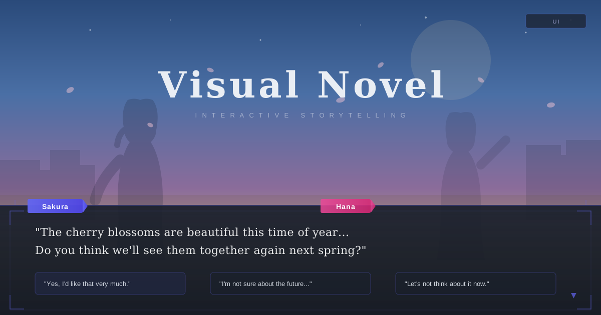
借鉴ADV视觉小说游戏UI的设计风格,半透明对话框面板、角色铭牌徽章、装饰性边角框线、分支选项按钮和存档界面,打造沉浸式交互故事体验。

视觉小说风视觉预览
主色#4a5568
次色#f7fafc
强调色 1#6366f1
强调色 2#ec4899
强调色 3#10b981
强调色 4#d948bb

AI 实现规则

You are a Visual Novel design style frontend development expert. All generated code must strictly follow these constraints:

## Absolutely Forbidden

- Heavy brutalist borders (border-4+)
- Neon glow or RGB split shadow effects
- Pixel art style elements
- Harsh, highly saturated neon colors
- Monospace fonts for main content
- Pure black backgrounds
- Sharp edges without rounding (rounded-none)
- Terminal-style uppercase with tracking-widest

## Must Follow

- Dark dialog panels: bg-[#1a202c]/85 with backdrop-blur-md
- Light info panels: bg-white/70 with backdrop-blur-md
- Serif font for all narrative/dialog text (font-serif)
- Sans-serif font for UI elements (font-sans font-medium)
- Rounded corners: rounded-lg on all panels and buttons
- Soft shadows: shadow-sm, shadow-md
- Independent ornate corner glyphs on dialog panels
- Character nameplate badges: colored inline-block with rounded-sm

## Color Palette

Primary:
- Slate: #4a5568 (text, borders)
- Light BG: #f7fafc (page background)
- Dark Panel: #1a202c (dialog backgrounds at /85 or /90 opacity)
- Indigo: #6366f1 (primary accent, nameplates, borders)
- Pink: #ec4899 (secondary accent, alternate nameplates)
- Emerald: #10b981 (tertiary accent, alternate nameplates)

## Unique Elements

- ADV-format dialogue panel: dark semi-transparent panel fixed to bottom with ornate corner decorations and character nameplate
- Character nameplate badges: small colored rectangle positioned overlapping the card border (absolute -top-3 left-6)
- Ornate corner decorations: independent full-border square glyphs at panel corners
- Choice button grid: full-width frosted glass buttons with ChevronRight icon and left-aligned text
- Scene background: sky gradient with character silhouettes (rounded-t-full ellipse shapes)
- Save screen panel: dark panel with ornate corners, form inputs, and dual action buttons

## Animation & Interaction Rules
- Dialogue Focus: 模拟游戏中的"选择支"。悬停选项按钮时,通过加深背景模糊(`backdrop-blur`)并叠加一层非常微弱的白色或主题色渐变(如 `hover:bg-white/10`),营造出选项被聚光灯照亮的沉浸感。
- Cursor Prompt: 悬停时,在文本的左侧利用隐藏元素浮现一个小小的指示符(如 ▶ 或 ✦),并带有轻微的位移动画(`opacity-0 -translate-x-2 group-hover:opacity-100 group-hover:translate-x-0`),高度还原视觉小说的 UI 特征。
- Sprite Breathing: 过渡动画必须极其平滑(`duration-300 ease-in-out`)。卡片悬停时,可以有极其微小且缓慢的上浮(`hover:-translate-y-0.5`),模拟游戏角色立绘(Sprite)呼吸的动作。
- Story Text: 点击(`:active`)时,选项框可以稍微横向移动(`active:translate-x-2`)以示确认,而不是传统的下沉。

组件预览与实现

font-sans font-medium rounded-lg transition-all duration-300 ease-in-out bg-[#6366f1] text-white shadow-sm border border-[#6366f1]/20 hover:bg-[#6366f1]/10 hover:border-[#6366f1]/40 hover:shadow-[0_0_15px_#6366f115] active:scale-[0.98]
button

按钮

视觉小说选项按钮,毛玻璃分支选择

<button className="group relative w-full px-8 py-4 bg-[#1a202c]/60 backdrop-blur-md text-[#e2e8f0] font-sans text-lg text-left rounded-lg border border-[#6366f1]/30 hover:bg-[#6366f1]/20 hover:border-[#6366f1]/60 hover:text-white hover:-translate-y-0.5 active:translate-x-2 transition-all duration-300 ease-out overflow-hidden">
  {/* 选中高光扫过 */}
  <div className="absolute inset-0 bg-gradient-to-r from-transparent via-white/5 to-transparent -translate-x-full group-hover:translate-x-full transition-transform duration-700 ease-out" />
  <div className="flex items-center gap-3 relative z-10">
    <span className="opacity-0 -translate-x-2 group-hover:opacity-100 group-hover:translate-x-0 text-[#6366f1] transition-all duration-300">
      ▶
    </span>
    <span>"I should go to the rooftop and watch the sunset."</span>
  </div>
</button>
card

卡片

ADV对话面板,带铭牌和装饰边角

<div className="relative mt-6">
  {/* 角色名牌 */}
  <div className="absolute -top-4 left-6 px-6 py-1.5 bg-gradient-to-r from-[#6366f1] to-[#4f46e5] rounded-t-md rounded-br-md shadow-[0_4px_10px_rgba(99,102,241,0.3)] z-10">
    <span className="text-white font-sans font-bold tracking-wide">Sakura</span>
  </div>

  {/* 对话主面板 */}
  <div className="group bg-[#1a202c]/85 backdrop-blur-xl rounded-xl p-8 pt-10 border border-[#6366f1]/20 shadow-[0_8px_32px_rgba(0,0,0,0.5)] hover:border-[#6366f1]/40 hover:bg-[#1a202c]/90 hover:-translate-y-0.5 transition-all duration-500 ease-out cursor-text">
    {/* L形装饰边角 */}
    <div className="absolute top-3 left-3 w-4 h-4 border border border-[#6366f1]/30" />
    <div className="absolute top-3 right-3 w-4 h-4 border border border-[#6366f1]/30" />
    <div className="absolute bottom-3 left-3 w-4 h-4 border border border-[#6366f1]/30" />
    <div className="absolute bottom-3 right-3 w-4 h-4 border border border-[#6366f1]/30" />
    <div className="absolute bottom-4 right-6 opacity-0 group-hover:opacity-100 group-hover:animate-bounce text-[#6366f1] transition-opacity duration-300">
      ▼
    </div>
    <p className="text-white/90 font-serif text-xl leading-relaxed tracking-wide">
      "The cherry blossoms are beautiful this time of year... Do you think we'll be able to see them together again next spring?"
    </p>
  </div>
</div>
input

输入框

存档界面输入框,暗色毛玻璃风格

<input
  type="text"
  placeholder="Enter your name..."
  className="
    w-full px-4 py-3
    bg-white/[0.06]
    border border-[#6366f1]/20
    rounded-lg
    text-white placeholder-white/25
    font-sans
    backdrop-blur-sm
    focus:border-[#6366f1]/50
    focus:shadow-[0_0_12px_#6366f120]
    focus:outline-none
    transition-all duration-300
  "
/>
hero

Hero 区块

ADV场景Hero,带天空渐变、角色剪影和底部对话面板

<section className="min-h-[85vh] flex flex-col relative">
  <!-- Scene background with sky gradient -->
  <div className="flex-1 relative flex items-center justify-center px-6 pt-12"
    style={{ background: "linear-gradient(180deg, #4a6fa5 0%, #7b9cc7 40%, #c4a882 70%, #e8c19a 100%)" }}>
    <!-- Character silhouettes -->
    <div className="absolute bottom-0 left-[15%] w-40 h-72 bg-[#2d3748]/10 rounded-t-full" />
    <div className="absolute bottom-0 right-[18%] w-36 h-64 bg-[#2d3748]/[0.06] rounded-t-full" />
    <!-- Title floating in sky -->
    <div className="text-center relative z-10">
      <h1 className="text-5xl md:text-7xl font-serif text-white/90 drop-shadow-sm">Visual Novel</h1>
      <p className="text-white/50 font-sans text-sm tracking-[0.3em] uppercase">Interactive Storytelling</p>
    </div>
  </div>
  <!-- ADV dialogue panel at bottom -->
  <div className="bg-[#1a202c]/90 backdrop-blur-md border border-[#6366f1]/20 px-6 py-6 relative">
    <!-- Ornate corner decorations -->
    <div className="absolute top-3 left-3 w-4 h-4 border-2 border-2 border-[#6366f1]/40" />
    <div className="absolute top-3 right-3 w-4 h-4 border-2 border-2 border-[#6366f1]/40" />
    <div className="absolute bottom-3 left-3 w-4 h-4 border-2 border-2 border-[#6366f1]/40" />
    <div className="absolute bottom-3 right-3 w-4 h-4 border-2 border-2 border-[#6366f1]/40" />
    <div className="max-w-4xl mx-auto">
      <div className="inline-block px-4 py-1 bg-[#6366f1] rounded-sm mb-3">
        <span className="text-white text-sm font-sans font-semibold">Narrator</span>
      </div>
      <p className="text-white/85 font-serif text-lg leading-relaxed">
        "The story begins on a quiet spring morning..."
      </p>
    </div>
  </div>
</section>

交互展示

适用范围与设计理念

应用场景

creative

视觉关键词

视觉小说ADV对话框铭牌立绘选项游戏UI交互故事装饰边角moderncontemporary

Visual Novel 风格源于日本ADV(Adventure)视觉小说游戏的UI设计,强调叙事沉浸感和角色互动。

核心理念:

- ADV对话框系统:底部固定半透明暗色面板,承载角色对话文字

- 角色铭牌徽章:对话框上方的彩色小标签,标识说话角色

- 装饰性边角框线:对话面板四角的L形装饰线条,营造精致画框感

- 分支选项按钮:居中排列的毛玻璃按钮,代表故事分支

- 场景氛围渲染:通过天空渐变、剪影、柔光营造时间和情感氛围

- 存档界面设计:带装饰边角的暗色面板,包含输入框和操作按钮

设计原则:

- 视觉一致性:所有组件必须遵循统一的视觉语言,从色彩到字体到间距保持谐调

- 层次分明:通过颜色深浅、字号大小、留白空间建立清晰的信息层级

- 交互反馈:每个可交互元素都必须有明确的 hover、active、focus 状态反馈

- 响应式适配:设计必须在移动端、平板、桌面端上保持一致的体验

- 无障碍性:确保色彩对比度符合 WCAG 2.1 AA 标准,所有交互元素可键盘访问

应该这样做

  • 使用半透明暗色面板 bg-[#1a202c]/85 作为对话框
  • 使用半透明亮色面板 bg-white/70 作为信息卡片
  • 所有面板添加毛玻璃效果 backdrop-blur-md
  • 使用衬线字体 font-serif 用于叙事/对话文本
  • 使用无衬线字体 font-sans 用于UI标签和按钮
  • 添加角色铭牌徽章(彩色小标签 inline-block px-3 py-0.5 bg-[color] rounded-sm)
  • 对话面板添加独立的几何角标,不使用方向边框组合
  • 使用圆角 rounded-lg 保持柔和界面感

避免这样做

  • 禁止使用粗重的野蛮主义边框(border-4+)
  • 禁止使用霓虹灯 RGB 分离阴影效果
  • 禁止使用像素艺术风格或等宽字体用于主内容
  • 禁止使用纯黑背景 bg-black
  • 禁止使用全大写加宽字距的终端风格文字
  • 禁止使用直角 rounded-none(除铭牌 rounded-sm 外)

全局 CSS

/* Visual Novel Global Styles */

:root {
  --vn-slate: #4a5568;
  --vn-light: #f7fafc;
  --vn-indigo: #6366f1;
  --vn-pink: #ec4899;
  --vn-emerald: #10b981;
  --vn-dark: #1a202c;
}

/* Dialog box fade-in */
.vn-dialog {
  animation: vnFadeUp 0.5s ease-out;
}
@keyframes vnFadeUp {
  from {
    opacity: 0;
    transform: translateY(10px);
  }
  to {
    opacity: 1;
    transform: translateY(0);
  }
}

/* Text typewriter effect */
.vn-typewriter {
  overflow: hidden;
  border: 2px solid var(--vn-indigo);
  white-space: nowrap;
  animation: vnType 3s steps(40, end), vnBlink 0.75s step-end infinite;
}
@keyframes vnType {
  from { width: 0; }
  to { width: 100%; }
}
@keyframes vnBlink {
  from, to { border-color: transparent; }
  50% { border-color: var(--vn-indigo); }
}

/* Ornate corner decoration frame */
.vn-ornate-frame {
  position: relative;
}
.vn-ornate-frame::before,
.vn-ornate-frame::after {
  content: "";
  position: absolute;
  width: 16px;
  height: 16px;
  pointer-events: none;
}
.vn-ornate-frame::before {
  top: 8px;
  left: 8px;
  border: 2px solid rgba(99, 102, 241, 0.4);
  border: 2px solid rgba(99, 102, 241, 0.4);
}
.vn-ornate-frame::after {
  top: 8px;
  right: 8px;
  border: 2px solid rgba(99, 102, 241, 0.4);
  border: 2px solid rgba(99, 102, 241, 0.4);
}

/* Character nameplate badge */
.vn-nameplate {
  display: inline-block;
  padding: 2px 12px;
  border-radius: 2px;
  font-size: 0.75rem;
  font-weight: 600;
  color: white;
}

/* Choice button hover glow */
.vn-choice:hover {
  box-shadow: 0 0 15px rgba(99, 102, 241, 0.15);
}

/* Scene gradient overlay */
.vn-scene-sunset {
  background: linear-gradient(180deg, #4a6fa5 0%, #7b9cc7 40%, #c4a882 70%, #e8c19a 100%);
}

布局、色板与 Tokens

主色#4a5568
次色#f7fafc
强调色 1#6366f1
强调色 2#ec4899
强调色 3#10b981
强调色 4#d948bb
{
  "border": {
    "width": "border",
    "color": "border-[#4a5568]/10",
    "radius": "rounded-lg",
    "style": "border-solid"
  },
  "shadow": {
    "sm": "shadow-sm",
    "md": "shadow-md",
    "lg": "shadow-lg",
    "none": "shadow-none",
    "hover": "hover:shadow-lg",
    "focus": "focus:shadow-[0_0_12px_#6366f120]",
    "colored": {
      "indigo": "shadow-[0_0_15px_#6366f115]",
      "pink": "shadow-[0_0_15px_#ec489915]",
      "emerald": "shadow-[0_0_15px_#10b98115]"
    }
  },
  "interaction": {
    "transition": "transition-all duration-300 ease-in-out",
    "active": "active:scale-[0.98]",
    "hoverTranslate": "hover:-translate-y-1",
    "hoverOpacity": "hover:opacity-90"
  },
  "typography": {
    "heading": "font-serif font-medium",
    "body": "font-sans leading-relaxed",
    "mono": "font-mono",
    "sizes": {
      "hero": "text-4xl md:text-6xl lg:text-7xl",
      "h1": "text-3xl md:text-5xl",
      "h2": "text-2xl md:text-3xl",
      "h3": "text-xl md:text-2xl",
      "body": "text-sm md:text-base",
      "small": "text-xs md:text-sm"
    }
  },
  "spacing": {
    "section": "py-12 md:py-20 lg:py-28",
    "container": "px-4 md:px-8 lg:px-12",
    "card": "p-5 md:p-8",
    "gap": {
      "sm": "gap-3 md:gap-4",
      "md": "gap-4 md:gap-6",
      "lg": "gap-6 md:gap-10"
    }
  },
  "colors": {
    "background": {
      "primary": "bg-[#f7fafc]",
      "secondary": "bg-white/70",
      "accent": [
        "bg-[#6366f1]",
        "bg-[#ec4899]",
        "bg-[#10b981]"
      ]
    },
    "text": {
      "primary": "text-[#4a5568]",
      "secondary": "text-[#6366f1]",
      "muted": "text-[#4a5568]/50"
    },
    "button": {
      "primary": "bg-[#6366f1] text-white shadow-sm hover:bg-[#6366f1]/90 hover:shadow-[0_0_15px_#6366f130]",
      "secondary": "bg-white/50 text-[#4a5568] backdrop-blur-sm border border-[#6366f1]/25",
      "danger": "bg-[#ec4899] text-white"
    }
  },
  "forbidden": {
    "classes": [
      "border-4",
      "border-8",
      "rounded-none",
      "font-mono",
      "shadow-[3px_0_",
      "shadow-[0_0_30px",
      "bg-[#0a0a0a]",
      "bg-black",
      "text-[#00ffff]",
      "text-[#ff00ff]",
      "uppercase tracking-widest"
    ],
    "patterns": [
      "^border-(?:4|8)$",
      "^rounded-none$",
      "^font-mono$",
      "^shadow-\\[\\d+px_0_#",
      "^bg-(?:black|\\[#0a0a0a\\])$",
      "^text-\\[#(?:00ffff|ff00ff)\\]$"
    ],
    "reasons": {
      "border-4": "Visual Novel uses subtle, thin borders for its elegant aesthetic",
      "rounded-none": "Visual Novel uses rounded-lg for soft UI panels, never sharp edges",
      "font-mono": "Visual Novel uses serif for narrative text and sans-serif for UI, not monospace",
      "bg-black": "Visual Novel uses light or semi-transparent dark backgrounds, never pure black",
      "uppercase tracking-widest": "Visual Novel uses natural case text, not terminal-style uppercase"
    }
  },
  "required": {
    "button": [
      "rounded-lg",
      "font-sans font-medium",
      "transition-all duration-300 ease-in-out"
    ],
    "card": [
      "rounded-lg",
      "backdrop-blur-md",
      "border"
    ],
    "input": [
      "rounded-lg",
      "border",
      "font-sans",
      "backdrop-blur-sm",
      "focus:outline-none"
    ]
  }
}

示例提示词

视觉小说对话页面

ADV格式的交互对话页面,带铭牌和装饰边角

Use Visual Novel style to create an interactive story page:
1. Scene: full-screen sky gradient with character silhouettes at bottom
2. ADV dialog panel: semi-transparent dark panel at bottom with independent ornate corner glyphs
3. Character nameplate: colored badge above the dialog box text
4. Choice buttons: full-width frosted glass panels with hover glow and right arrow
5. Cards: scene chapter cards with header image area and nameplate badge overlapping the border
6. Form: save screen with ornate corner frame, dark backdrop, and dual-color labeled inputs

SaaS 着陆页

生成 视觉小说风风格的 SaaS 产品着陆页

Create a SaaS landing page using Visual Novel style with hero section, feature grid, testimonials, pricing table, and footer.

作品集展示

生成 视觉小说风风格的作品集页面

Create a portfolio showcase page using Visual Novel style with project grid, about section, contact form, and consistent visual language.